The SQC Chart (Statistical Quality Control) is the component that helps to determine data behavior by performing statistical calculations using historical data from the data source.
Supported data types
The following table outlines the data types supported by the Line Chart component:
| Channel Type | Supported? |
|---|---|
| Tag | 🟢 |
| Asset (Attributes) | 🟢 |
| Timeframe (Attributes) | ⚫ |
| Tag Search | ⚫ |
| Asset Search | ⚫ |
| Timeframe Search | ⚫ |
Quick Start
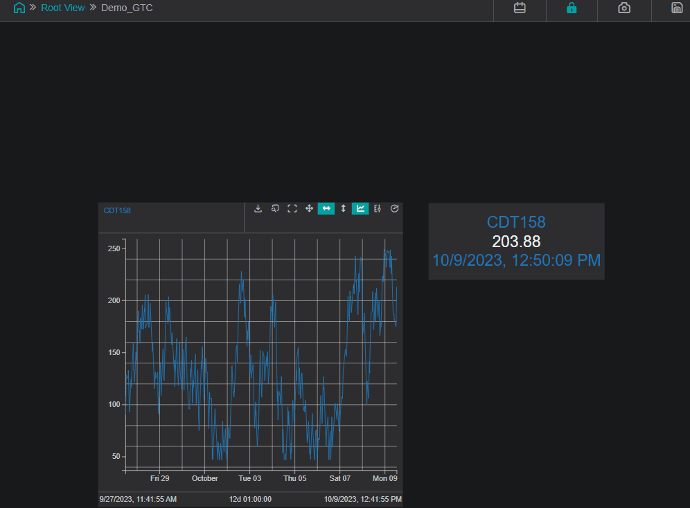
To quickly start using the SQC Chart component, drag and drop it onto the work area. Search for the data you want to visualize and map it onto the component:
Generic Settings
Each IOTA Component has a set of generic settings shared among most of the components. The generic settings are described below:
Workspace
These settings are applicable to the whole view.
Grid Properties
The grid is provided for convenience when developing dashboards as visual guides and snapping capability.

By default the work area grid is enabled and can be customized or even disabled in this menu.
| Property Name | Description |
|---|---|
| Grid Color | Color of the grid |
| Grid Size | Size of the grid step |
| Snap to Grid | Enable/Disable snapping to the grid |
| Show Grid Lines | Show the grid as lines |
| Show Grid Dots | Show the grid as dots |
Align Controls
The Align controls provides a means to align and distribute selected objects on the display.

Align Objects
- You can align several components horizontally using the
Align-left,Align-centerorAlign-rightcontrols - You can align several components vertically using the
Align-top,Align-vertical-centerorAlign-bottomcontrols
Distribute Objects
- You can distribute several components on the vertical/horizontal axis by selecting them (select at least 3 components) and pressing
Align-vertical/Align-horizontal - You can make all the selected components the same width/height by selecting them and pressing
Adjust Width/Adjust Height
Tips
Hold the Ctrl button to select several components. The oldest component is used as a reference.
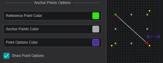
Anchor Points Options
The anchor points are eight squares around an object that allow you to resize the object. The anchor point options allow you to define the appearance of the anchor points.
| Property Name | Description |
|---|---|
| Reference Point Color | Sets the color of the reference point (see Rotation and Position for more details) |
| Anchor Points Color | Sets the color of the rest of the seven anchor points |
| Point Options Color | Sets the color of the point options (only for Line and Bezier Curve) |
| Show Point Options | Show/Hide the point options |
Locked View Options
These options define the appearance of the component border in the locked view for the selected component.

| Property Name | Description |
|---|---|
| Active Border Fill | Sets the fill color of the border |
| Active Border Width | Sets the width of the border |
Variable

Every component has a unique variable name. This variable name can be used to reference the component in multi-state configurations and other scripts.
On creation, every component is given a default name. This can be overwritten to be more user-friendly. To do so simply overwrite the value in the variable input field.
Arrange / Remove
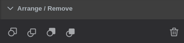
- Send Backward - move object one layer down
- Bring Forward - move object one layer up
- Send to Back - place object under all layers
- Bring to Front - place object above all layers
To send/bring objects to the front/back use the first four buttons. - Any set of components can be deleted by either using the
 button or
 delete/delkeyboard keys.
Rotation and Position

Reference Anchor Point- allows you to select one of the anchor points as a reference so that you can set anAngle(clockwise) of incline relative to this point.
By default the reference anchor point is the top left corner. You can also rotate the component by dragging one of the yellow corner points.- You can set the position of the component by setting the
XandYcoordinates relative to theReference Anchor Pointand the top-left corner of the work area. - You can drag any of the anchor points to change the width and height of the component, or you can set it manually by editing the
WidthandHeightboxes. - Set
Lock Aspect Ratioso that while changing width and height, the component width to height ratio stays the same Transformallows you to view the component as a mirror or a reflection of itself
Actions
Actions or multi-states are programmable conditional states handled by user-generated code.

Note
Actions that have script handlers are marked with a circle
in the top right corner.
The currently supported actions are described in the table below:
| Action | Trigger |
|---|---|
| OnCreate | When the component is created |
| OnFocus | When the component is selected |
| onClick | When the component is clicked or the selection is changed |
| onData | Each time the data changes for assigned channels |
| onTick | 20 times per second |
| onDblClick | On mouse double click |
| onHover | When the mouse is over the component (and not when the mouse is not) |
Further Reading
For helping you in writing your own actions, consider exploring the available Actions Deep Dive, as well as the Quick Start manual.
Also, multiple articles are available in IOTA's Knowledge Base.
Attribute Mapping
When an asset is assigned as a channel, IOTA Vue allows you to map only necessary attributes to the component. This is done via Attribute Mapping, which exists for every asset channel.
In fact, Attribute Mapping is tied to the template of the asset. You can edit or remove the selected Attribute Mapping.

Note
This section is shown in the component settings only if there is an asset mapped to the component.
Properties
Using the Attribute Mapping Dialog you can add attributes to the current mapping and change their properties:

- Add attributes to the current mapping one by one with the
Addbutton or all at once with theAdd Allbutton - To hide an attribute click on
Toggle Visibility - To access to Attributes properties click on
Properties - To save the attribute mapping (without adding the current channel) press
Train Only - To save the attribute mapping and add the current channel press
Train and Add - To exit the screen without saving your changes, press
Close
Global Time Control
To activate the Global Time Control panel click on  button in the upper area of the
 View:
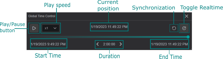
Additionally, you can configure the Global Time Control option in Settings for every component on the current display.

Use Component as Global Time Control: if enabled, the component is able to set the time context for all components on the current display.Ignore Global Time Control: when enabled, the option allows the component to function independent of global time set elsewhere.
The example below demonstrates the usage of the Global Time Control panel and how the value changes in the space of an hour:
Channels
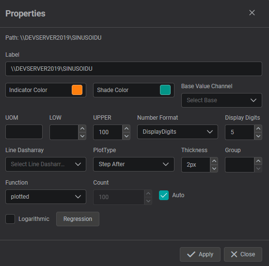
The Channels section lists data that is assigned/mapped onto the component.
In this menu, you can change the data value color, adjust the display properties and un-assign or remove the data from the component.

Properties
The properties menu for Channels allows you:
- to modify the Label of the DataSource
- to set UOM, lower and upper values
- to choose number format and displayed digits
- to adjust the line formatting for trend line components
- to configure the additional regression lines that can be plotted for supported components
Supported Multi-State Parameters
Each of the visual parameters listed below can be used as a multi-state, i.e. used in actions and scripts:
- Title and Text
- Text
- Rotation and Position
- Rotation
- Common
- Blink
- Hidden
- Visual Properties
- Border Color
- Border Width
- Bar Color
- Background Color
- Label Color
- Scale Label Color
- Center Zone
- One Sigma Zone
- Two Sigma Zone
- Outside Three Sigma Color
- Font
- Label Font Family
- Label Font Size
- Label Italic
- Label Bold
- Label Underline
- Format
- Show Full Name
- Show Scroll
- Component Specific
- Histogram Bars
- Number of samples
- Sample Size
- Chart Type
- Method of calculating Sigma
- Alpha for EWMA Chart
- SQC Control Parameters
- Upper Specification Limit
- Upper Control Limit
- Center line
- Lower Control Limit
- Lower Specification Limit
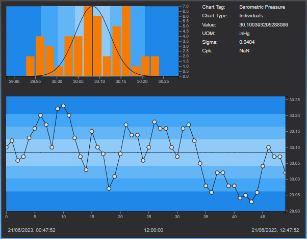
SQC Chart Settings
Chart Layout
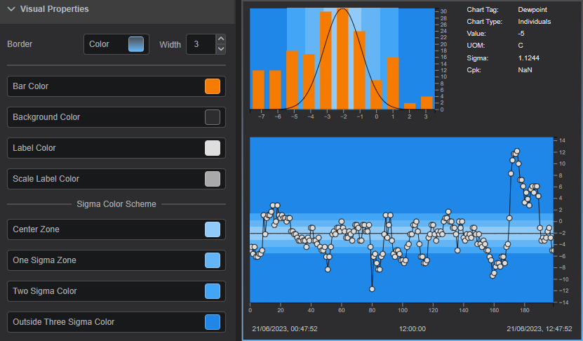
The Component area of the SQC Chart is divided into three sub-areas: Histogram, Legend and Control Chart.

Histogram
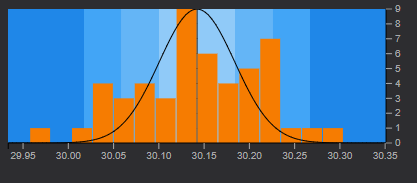
The histogram area of a SQC Chart shows the frequency of data distributed in a bar graph.
The horizontal scale spans five sigma from the center line in both directions. At three standard deviations (sigma) from the center line, the scale is marked. The colors of each zone correspond with the colors displayed on the control chart.
A normal distribution curve is drawn on the histogram based on the sample mean
and the standard deviation of the sample.
Control Chart
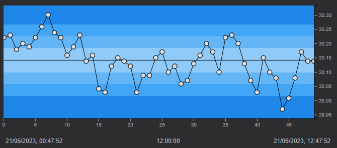
The control chart area shows connected data markers, that represent sample values, plotted over time:
- The vertical axis displays label markers for the source item
- The horizontal axis displays values for each data marker that are evenly spaced
The timestamps on the horizontal axis represent the timestamp for the first (left-most) and last(right-most) data marker. All plotted points are equally spaced on the control chart regardless of the timestamp of each individual point.
The Control chart contains a target center line with control zones equally spaced on either side of the target line.
These zones represent the number of standard deviations from the center line. The colors of each zone correspond with the colors displayed on the histogram.
Legend

Chart Tag: Name of the value plottedChart Type: Type of the SQC ChartValue: Value of the Chart TagUOM: Units of Measurement of the Chart TagSigma: Standard deviation for the data set being analyzed which is used in determining control limitsCpk: Calculation based on specification limits, also known as the Process Capability index
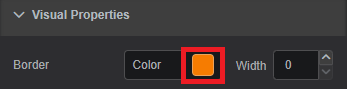
Visual Properties
The Visual Properties section provides options for customizing the component's appearance by changing the color schema.
Border Color: Defines the component's border colorBorder Width: Defines the width of border frame. Default: 0 - invisible borderBar Color: Defines the color of the barsBackground Color: Defines the component's background colorScale Label Color: Defines the color for the scalesCenter Zone: Defines the color of the Center ZoneOne Sigma Zone: Defines the color of the One Sigma ZoneTwo Sigma Zone: Defines the color of the Two Sigma ZoneOutside Three Sigma Zone: Defines the color of the Outside Three Sigma Zone
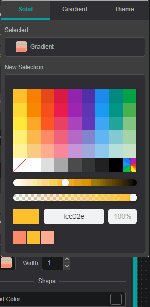
To pick color of your interest
To change color for specific visual property, click on the color box next to property description. The color picker dialog will be displayed.
Visual Properties: Color Picker Dialog Pick the color of interest. The video below shows how to choose a solid, gradient or theme color.
Color Picker Dialog: Workspace You can add
Gradient Stopsby double clicking and to remove - by pulling it up.To close the color-picker dialog - click on the property color box (Step 1).
Closing color-picker dialog
Clicking on the workspace area instead of Settings Tab area -
component settings will disappear since component focus will be lost.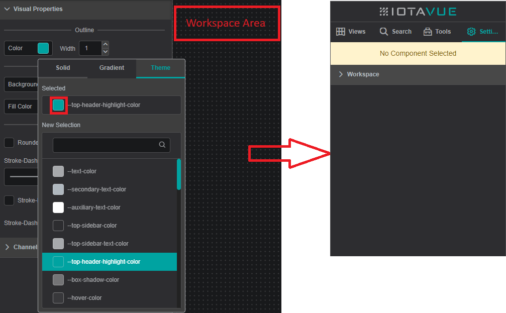
Color Picker Dialog: Workspace
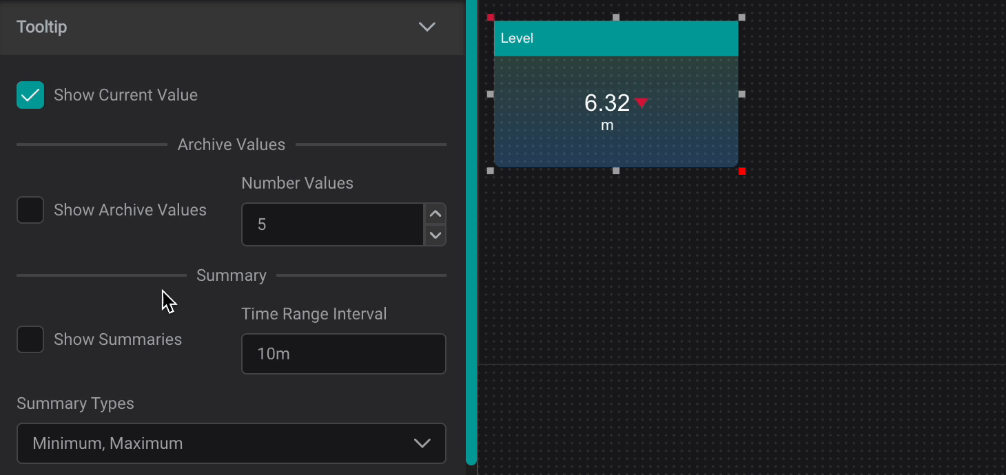
Tooltip
The Tooltip Setting provides data reference for PI AF attributes and descriptive statistics when user interacts with a component by hovering over it.
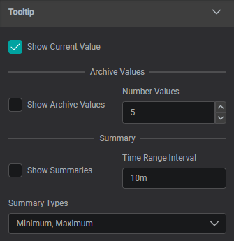
Show Current Value: Shows Current ValueShow Archive Values: Shows Archive Values, the number can be set inNumber ValuesShow Summaries: Shows Summaries for set Time Range Interval (can be set in seconds (s), minutes (m), hours (h), days (d), weeks (w), months (mo), years (y))
Summary Types:
Average: the average value in the set periodMinimum: the minimum value in the set periodMaximum: the maximum value in the set periodPercentGood: the percent good value in the set periodStdDeviation: The standard deviation of the value in the set periodPStdDeviation: The percent standard deviation of the value in the set periodTotal: The sum of the values in the set periodCount: The number of data points in the set periodRange: The difference between the largest and smallest value in the set period
Font
The Font section provides options for customizing the label font properties.

Font Properties
Font properties available for edit:
Font Family: Allows to select different font family. Default: ArialFont Size: Controls the font size. Default: 12Italic: Sets font to italicBold: Sets font to boldUnderline: Sets font to underline
Format
The Format section provides options for customizing displayed information.

Show Full Name: shows the asset path and nameShow Scroll: shows the scrollbar if the content does not fit into the size of the component
Component Specific
The Component Specific section provides options for modifying various properties for the SQC Chart.
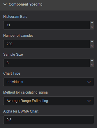
Histogram Bars: Number of bars on the histogramNumber of Samples: Number of samples on the control chartSample Size: A number of raw data points, that are combined in a statistical calculation to produce a single sampleChart Type: The type of control chart you want to display. Each control chart presents a different view of sample data, and represents different mathematical calculations based on the type of plot, sample size, and other factors.
All the chart types are described in a separate Chart Type section below.Average Range Estimating: Calculate an estimate of the process standard deviation based on the average of moving rangesAverage Standard Deviation Estimating: Calculate an estimate of the process standard deviation based on the average of moving standard deviations
Alpha for EWMA Chart: Associates a weight with each new data point as compared with the remaining data points in the designated sample.Alphapertains only to EWMA charts, and does not appear for other chart types.Alphamust be between 0 and 1. A smaller value ofAlphaprovides greater smoothing effects and the resulting chart will emphasize trends as opposed to point-to-point fluctuations.
The default value forAlphais 0.5, with values between 0.2 and 0.5 most typical.
Chart Type
Individuals
An Individuals chart leverages single sample values rather than sample groups to determine process stability.
An Individuals chart should be used when it does not make sense to calculate group averages from measurements. These charts can detect variability when used with Range or Moving Range charts.
Since the Individuals charts uses single sample values, the Sample Size field is not taken into account (it defaults to 1). Additionally, the center line reflects the process average (mean).
Info
Pattern tests are not applicable because values are not independent of one another; only values beyond the control limits should be treated as significant.
X-Bar (Average)
An X-Bar chart uses the average of a set of data to generate a value, and plots that value against other sample averages. Unless otherwise specified, the mean of the data set is used as the center line.
An X-Bar chart should be used where individual measurements are assumed to be independent. It provides information about where a process is centered and the level of process control.
Generally, anything that impacts the X-Bar chart will have an influence on the process as a whole.
The advantage of using an X-Bar chart over an Individuals chart is that by averaging data, the effect of random error is greatly reduced which results in a more accurate display of process variation.
Moving Average
A Moving Average chart calculates the average of a data set using all n data points and compares them against the previous n-1 average.
Moving Average chart should be used when it is impractical to take multiple measurements per sample.
However, rather than using the Individuals chart, the Moving Average is better at detecting process shifts and lessening the impact of random errors by averaging the results.
To further your analysis, Moving Average charts can be using in conjunction with Moving Range charts. In analyzing your results, consider only whether data is within 3 sigma. The Sample Size must be 2 or greater to use the Moving Average chart.
Some disadvantages of the Moving Average chart are the oscillatory effect as a result of correlated random error in successive samples and lag effect since sample measurements are derived from n-1 measurements.
Exponentially Weighted Moving Average (EWMA)
An Exponentially Weighted Moving Average (EWMA) chart uses a method that averages current and previous data to create a "smoothed" moving average.
This technique is of average current and previous data is referred to as "exponential". The EWMA chart is ideal for evaluating process stability.
Each data point is weighted against remaining data points using an Alpha factor. The Alpha factor is applied to each data point which reduces the contribution of older data and puts more emphasis on current data.
The EWMA chart has advantages over the Moving Average chart through the emphasis on current data. This also makes the EWMA chart more sensitive to minor process changes.
Info
The Alpha weighting factor has a default value of 0.2 and is typically between 0.2 and 0.5.
Standard Deviation (S)
A Standard Deviation (S) chart calculates a standard deviation for each sample and plots it on the chart. This chart can be used in place of the Range chart when the Sample Size is greater than 8.
Info
The default Sample Size for the Standard Deviation chart is 10. Recommended Sample Size is greater than or equal to 10, but must be greater than 1.
Moving Standard Deviation Chart
A Moving Standard Deviation chart calculates the current sample standard deviation by replacing the oldest value with the current value. The Moving Standard Deviation chart uses the last n observations to determine process stability.
This chart can be used in place of the Moving Range Chart when the Sample Size is greater than 8. A disadvantage of the Moving Standard Deviation chart is the oscillatory effect as a result of correlated random error in successive samples.
Range (R)
A Range chart uses the range for each sample, calculated by subtracting the minimum from the maximum value, to determine process stability. These calculated ranges can estimate process variability over short periods caused by chance.
For example, a pump in need of repair does not operate the same way each time it is used. The Range chart can be used to examine the inconsistency in pump operation and the effect on the product at different points.
To draw adequate conclusions, the Range chart should be used with an Average or Individuals chart.
Info
The default sample size for Range charts is 2. Recommended Sample Size is between 1 and 8. The Range charts are not recommended for sample sizes larger than 8.
Moving Range (Rm)
A Moving Range chart calculates the current range by substituting the oldest value with the current value. The Moving Range chart uses the latest n observations to determine process stability.
A disadvantage of the Moving Range chart is the oscillatory effect as a result of correlated random error in successive samples.
Info
The Moving Range charts are recommended for sample sizes from 1 to 8.
SQC Control Parameters
The SQC Control Parameters allows you to define certain specification limits.
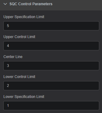
Upper Specification Limit: Defines the Upper Specification limitUpper Control Limit: Defines the Upper Control limitCenter Line: Defines the Center LineLower Control Limit: Defines the Lower Control limitLower Specification Limit: Defines the Lower Specification limit