The User Profile settings allows to personalize your IOTA experience by adjusting the profile picture and setting defaults for themes, view modes, quick settings, component styles, global time control, and the search section.
Access these settings by clicking the user icon, located either on the right side of the top panel or within the hamburger menu.
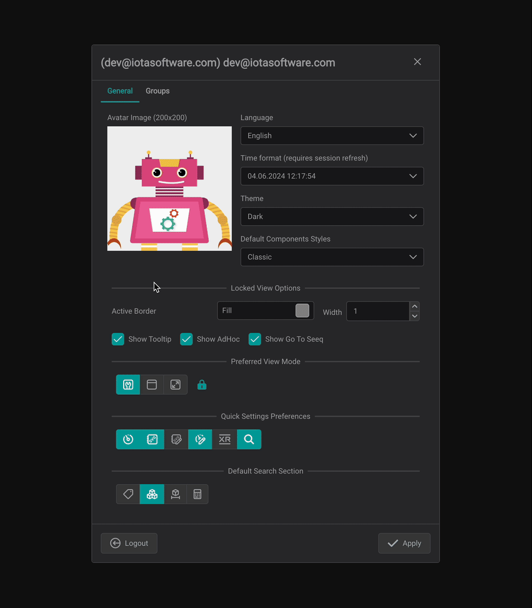
Change User Profile Picture
To change your profile picture, follow these steps:
- Click on your current picture in the profile user settings.
- Choose a new picture from the available options or upload one from your computer. To upload, click the upload icon or drag and drop the file into the designated area.
- Click "Apply" to save your changes.
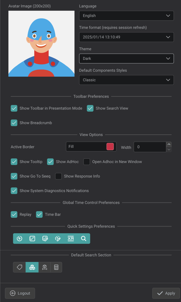
General Settings
Customize your experience by defining several general settings:
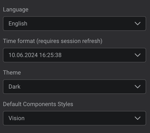
Language: Select your preferred language (English, German, French).Time Format: Choose your desired time format. Note that this change requires a session refresh.Theme: Set your default theme. Themes can be customized in the Theme Settings.Default Components Styles: Set the default style for your components. You can create and customize component styles in the Component Style menu.
To switch between different styles for a component, use the Quick Settings panel or the dropdown menu in the Components panel.
Toolbar Preferences
The toolbar can be customized with the following options:
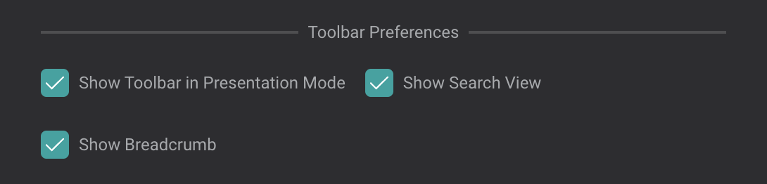
Show Toolbar in Presentation Mode: Determines whether the toolbar remains visible when presentation mode is active. If disabled, the toolbar can be accessed by hovering over the top of the screen.Show Search View: Toggles the availability of search functionality for specific views on the toolbar. When enabled, clicking on this button opens a pop-up with search options.

Show Breadcrumb: When enabled, allows you to display views on the same level or subordinate levels relative to the current view. Navigation to a different view is possible by clicking on the displayed options.
View Options
Several options allow for personalized view customization:
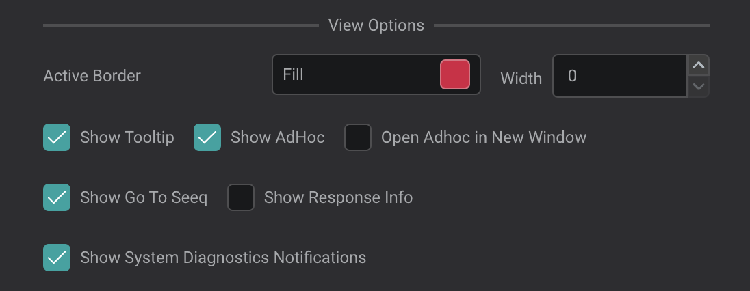
Active Border Fill: Set the color of the active border, which appears around a selected component in locked mode.Active Border Width: Specify the width of the active border.Show Tooltip: Tick to display tooltips when hovering over components. Customize tooltip content in each component's settings.Show AdHoc: Tick to enable ad hoc trend popups when double-clicking a component.Open AdHoc in New Window: Tick to enable ad hoc trend popups when double-clicking a component.Show Go To Seeq: Tick to add an option in the right-click menu for components with data. When selected, this will open Seeq in a new tab, displaying the specific channel(s):
Show Response Info: When enabled, provides additional information to assist with troubleshooting and diagnostics.Show System Diagnostics Notifications: When enabled, a notification bell will appear if there are error messages or diagnostic information available.
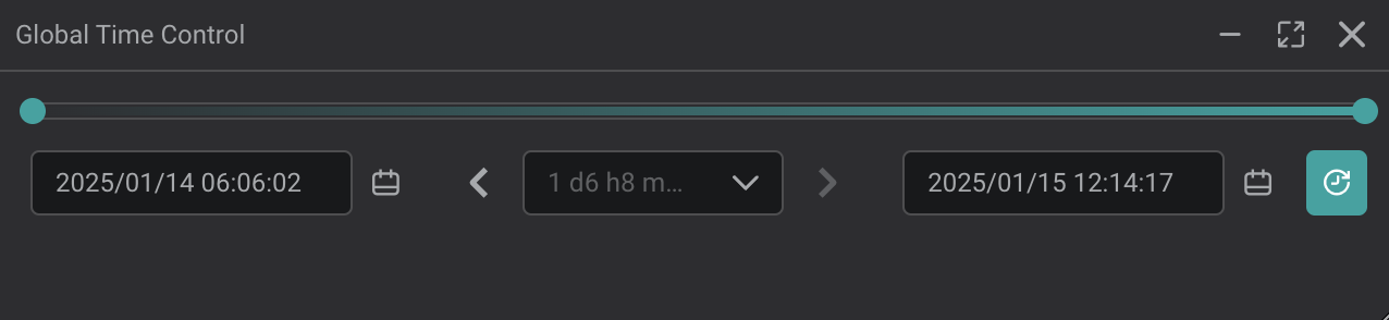
Global Time Control Preferences
This section provides customization options for the Global Time Control:
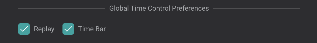
Replay: Enables the ability to replay a specific time period, with options to adjust the playback speed.
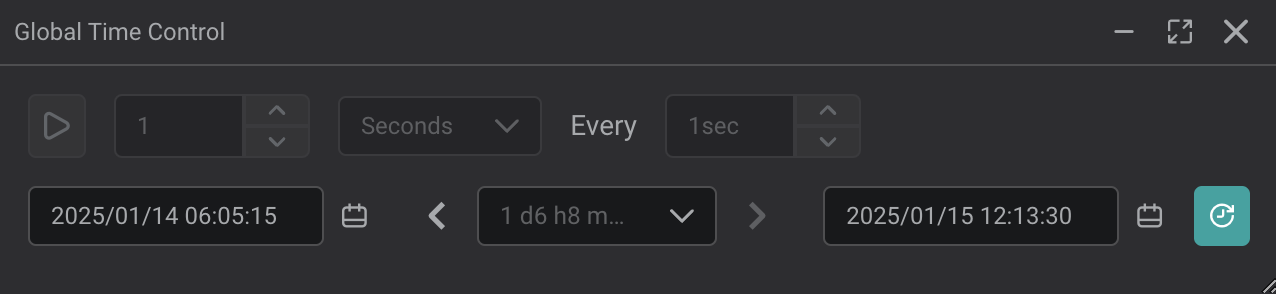
Time Bar: Adds a time bar to the Global Time Control, allowing navigation to different timestamps using a slider.
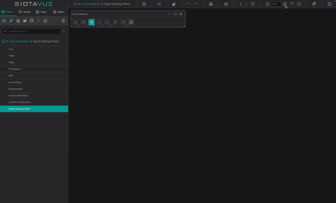
Quick Settings Preferences
The Quick Settings Preferences allow you to customize the Quick Settings panel. Choose the options you want to add to the Quick Settings for easy access:
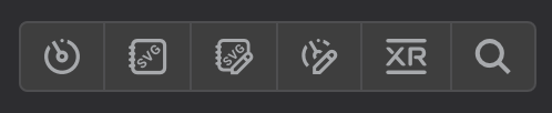

Components: Opens the components panel.
SVG Library: Opens the SVG library panel.
Custom SVG Library: Opens the custom SVG library panel.
Custom Components: Opens the custom components panel.
XR Library: Opens the XR library panel.
Search: Opens the search panel.
Default Search Section
In the Default Search section, you can set a default data structure type to be automatically selected each time you open the search tab.
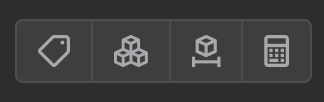
 Tags
Tags Assets
 Timeframes
 Calculations