
Building First Display
Building First Display
Now that you have your workspace and themes set up, it's time to start building! This page walks you through creating your first display, placing and connecting components to live data, and arranging your layout.
Create a New Display
Displays in IOTA Vue are called views. Before you can build, you need to create one.
- Click the Add button
 in the Views panel.
 - In the New View dialog, enter a name and, optionally, a description.
- To nest this display under another, use the Parent View picker or check Add as Child View.
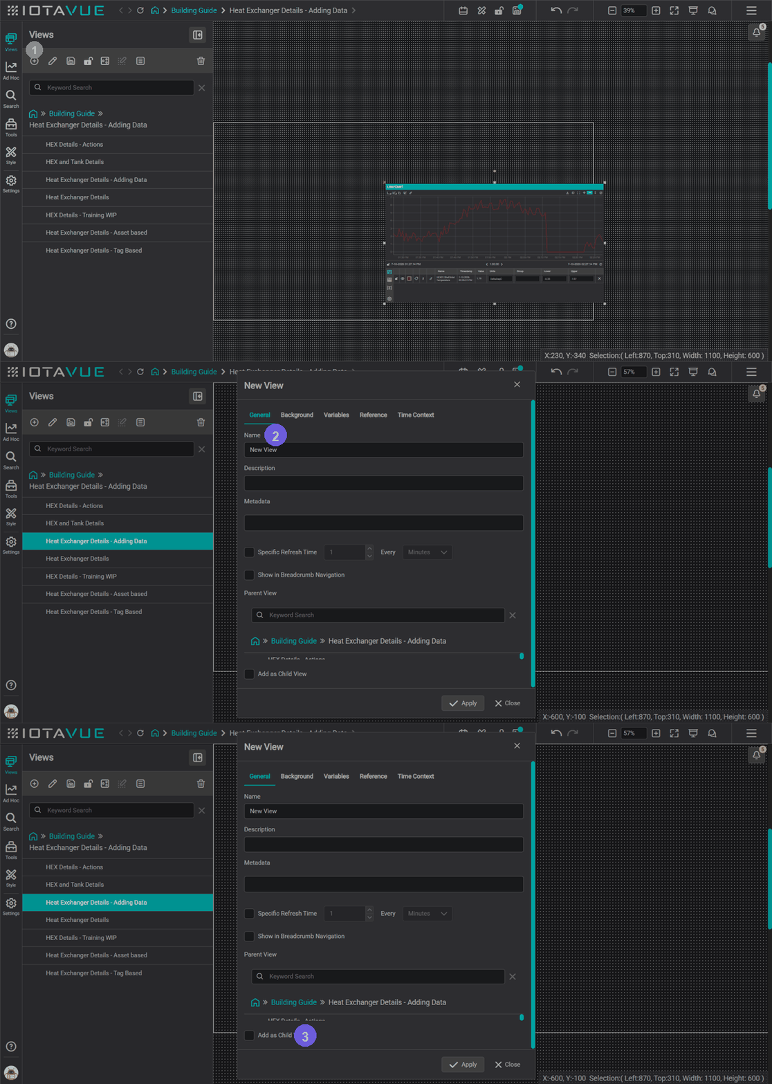
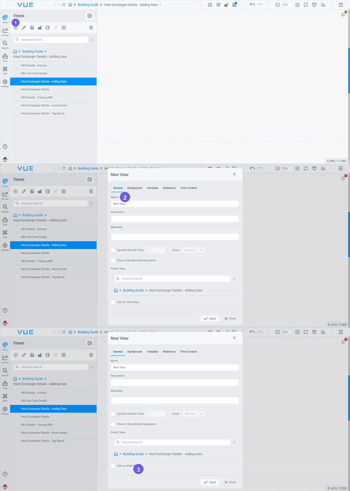
Child views appear as branches under their parent in the side menu, which makes it easy to build hierarchical navigation later (for example, a site overview that drills down to individual unit displays).
Editing Display Properties
After creating a view you can change its properties at any time: click the edit (pencil) icon next to the view name in the Views panel. Properties are grouped into tabs:
- General: name, description, metadata, a Specific Refresh Time, Show in Breadcrumb Navigation, and the Parent View (its place in the hierarchy).
- Background: the workspace size and the display background (solid color, gradient, or an uploaded image/GIF). See Setting workspace dimensions below.
- Variables, Reference, and Time Context: advanced options for reusable variables, referencing other views, and per-view time settings.
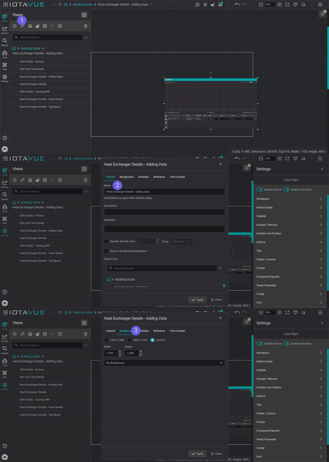
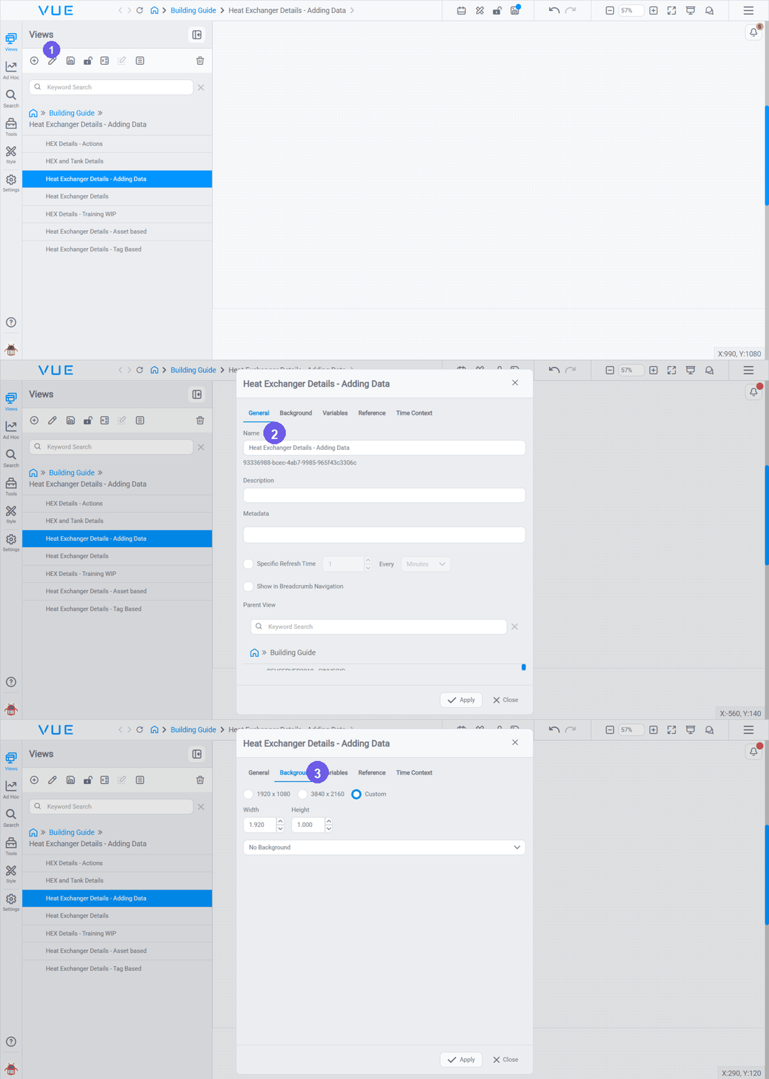
- Click the edit (pencil) icon next to the view to open its properties.
- General; set the name, description, parent view, and options like refresh time and breadcrumb visibility.
- Background; set the workspace size and the background.
Setting workspace dimensions
Workspace size lives on the view's Properties → Background tab (shown in the GIF above). Pick a preset, 1920×1080 or 3840×2160, or choose Custom and enter your own Width and Height. This defines the visible area: the region the viewer sees when the display first loads without scrolling, so match it to the resolution your viewers use.
Common sizes:
| Screen type | Width × Height |
|---|---|
| Full HD monitor | 1920 × 1080 |
| HD / smaller screen | 1280 × 720 |
| Large control room display | 2560 × 1440 |
| Tablet (landscape) | 1366 × 768 |
Check the viewer's screen first
Ask your administrator or site team what resolution the displays will be viewed on before you start placing components. Changing workspace dimensions after you have built a layout will shift where components sit relative to the boundary: you may need to reposition content.
Content placed outside the visible area behaves differently depending on direction: below and to the right is scrollable, above and to the left is hidden. For a full explanation of the three zones see Editor Basics → Zooming and the Visible Area.
View Modes and the Visible Area
IOTA Vue displays have three modes (Edit, Lock, and Presentation) and a defined visible area that controls what viewers see. For a full explanation including GIFs and diagrams, see Editor Basics → View Modes and Editor Basics → Zooming and the Visible Area.
Place Components and Connect Data
With a display created and Edit Mode active, the basic building workflow is:
- Drag a component from the toolbox onto the canvas.
- Search for data using the Search panel.
- Drag and drop a tag from the search results onto the component.
This is the direct (non-asset-relative) approach: you are binding a specific tag to a specific component.
When you Search for data, first choose your data source (server) from the source selector at the top of the Search panel, then find the tag by name. For a full walkthrough of searching data sources and working with tags, see Creating Displays with Tags.
You can open the Components panel two ways: the Tools tab in the sidebar (docked on the left) or the Components button in the Quick Settings toolbar, which opens a floating panel. Both list the same components, so use whichever fits your layout. Before placing anything, pick a component style from the Style dropdown at the top of the panel: this gives everything you drop onto the canvas a consistent look (fonts, colors, borders). For this example we chose the Operational style; the styles you can pick from depend on what your team has set up. For how component styles are created and set as your default, see Set Up Your Workspace → Component Styles.
The full workflow (open the Components panel, pick a component, place it, then bind a tag), looks like this:
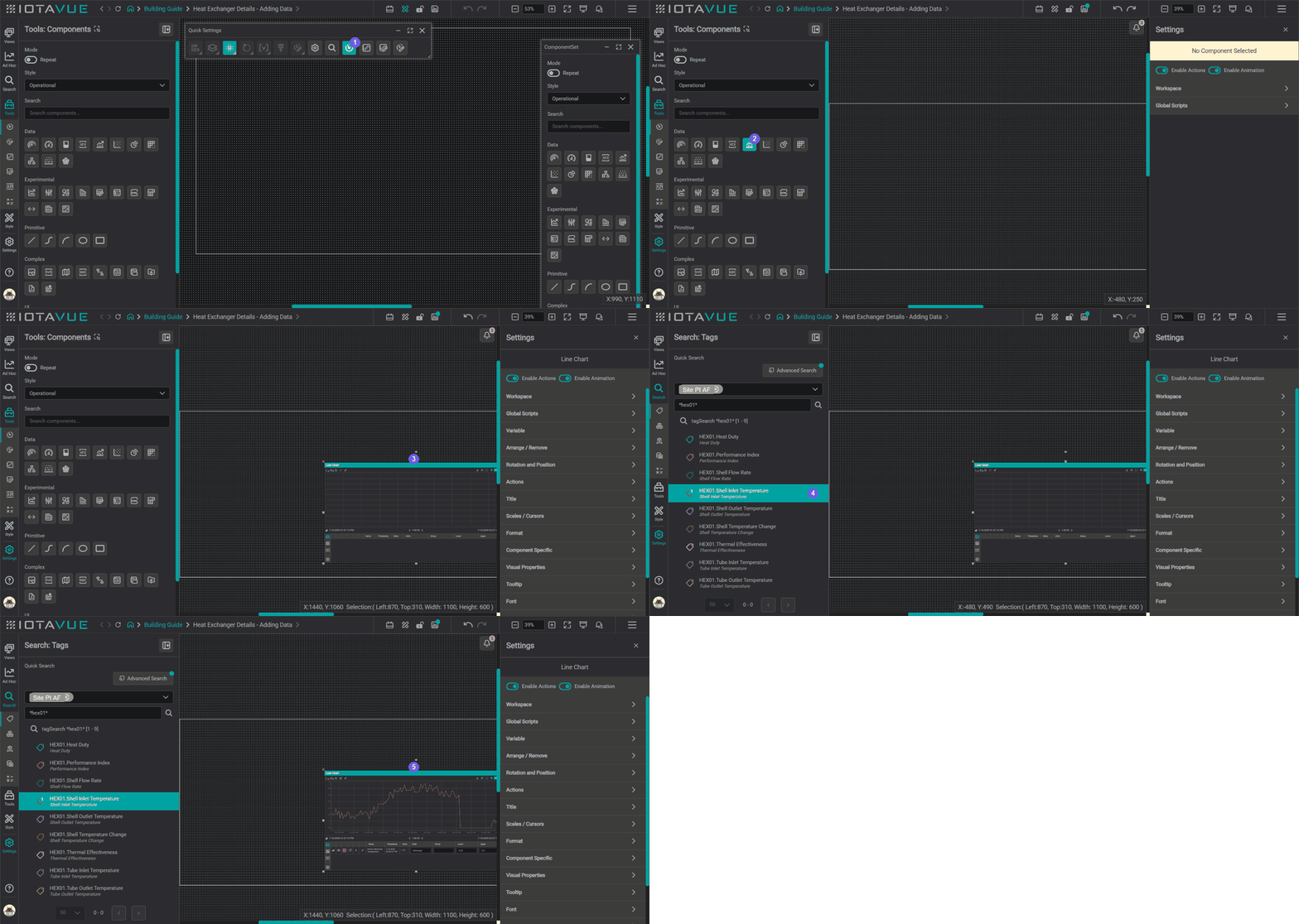
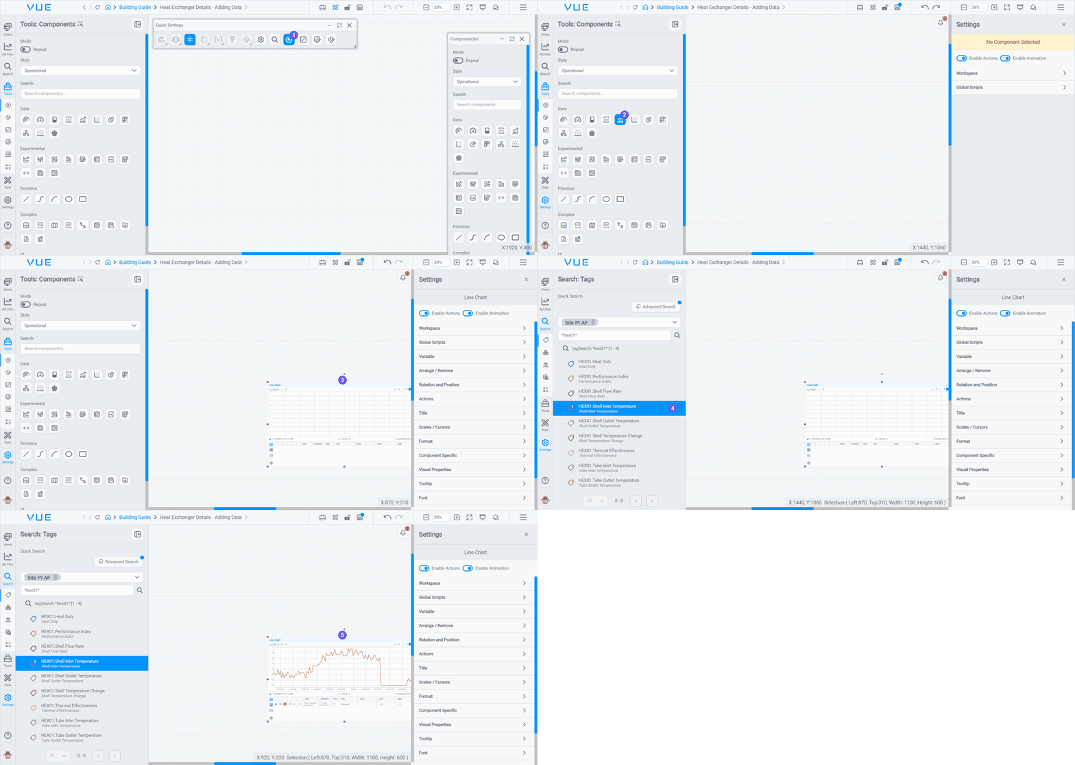
- Open the Components panel: the Tools tab in the sidebar (docked, left) or the Components button in the Quick Settings toolbar, which opens a floating panel (right). Both show the same components.
- Select a component, for this example, a Line Chart with the Operational style we chose above.
- Drag it onto the canvas.
- In Search, choose your data source (server) and select a tag.
- Drag the tag onto the component: it binds and the chart fills with live data.
Dragging a tag directly onto the canvas
You can also drag a tag from search results directly onto an empty area of the canvas without placing a component first. IOTA Vue will automatically create a Value component and bind the tag to it. This is a quick way to get live data on screen: you can then reposition, resize, and style the component as needed.
Components you might use most for data display
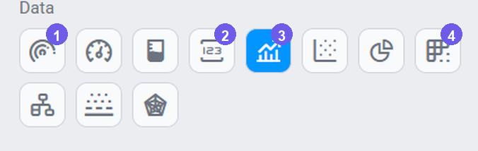
A handful of components in the Data group of the Components panel cover most data displays: numbered here to match the toolbar:
- Gauge: a dial showing one value against a range (min/max), good for at-a-glance status.
- Value (the numeric 123 icon): a single live number for one tag.
- Line Chart (the trend-line icon): one or more tags plotted as a trend over time.
- Table: several tags shown as rows in a grid.
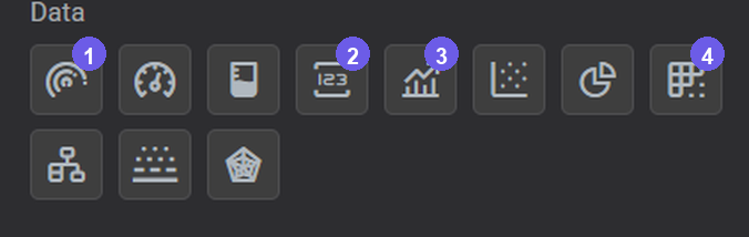
Place any of them the same way: drag it onto the canvas, then drop a tag on it. A Line Chart or Table takes multiple tags; a Gauge or Value shows one.
Selecting, Moving, and Resizing Components
Once a component is on the canvas, these are the operations you will use most.
To select a component: click it on the canvas. A selection outline appears and the Settings panel on the right fills with that component's settings. Every component shares a common set of these (Workspace, Variable, Actions, Channels, and more), described in the Generic Settings reference.
To select multiple components: hold Shift and click each component, or drag a selection rectangle across them on an empty part of the canvas. With multiple components selected, the Settings panel shows shared settings only.
To move a component: click and drag it to the new position. For precise placement, use the X and Y fields in the component toolbar above the canvas, or nudge with the arrow keys (hold Shift for larger steps).
To resize a component: drag any of the corner or edge handles. For exact dimensions, type values into the W (width) and H (height) fields in the component toolbar.
To deselect: click any empty area on the canvas, or press Escape.
To delete: select one or more components and press the Delete key, or click the delete icon in the component toolbar.
Snap to Grid
With Snap to Grid enabled in Quick Settings, components automatically align to the nearest grid point as you drag and resize: which keeps your layout tidy without manual measurement. See Set Up Your Workspace → Quick Settings for how to enable it.
Aligning and Distributing Components
The Workspace section of the Settings panel has an Align Controls area for tidying up your layout. Select two or more components first to activate the buttons, then use:
- Align Objects: line up the edges or centers of the selected components (left, right, top, bottom, center horizontally or vertically).
- Distribute Objects: spread them out with equal spacing between them.
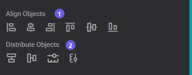
Below these, Anchor Points Options set the rotation, reference, and anchor point colors used when aligning.
Saving Your Display
IOTA Vue tracks unsaved changes as you build. A blue indicator appears in the side menu and top bar whenever there are unsaved changes. Click the save button  to save.
When you are done building, lock the display to publish it for viewers. Locking makes the display read-only and includes all recent changes.
Tips
When a Line Chart is set as the GTC source, moving the cursor across historical data updates other components, such as Value displays, smoothly. Components show their last known value while the updated value loads, so the display stays readable during cursor scrubs.
Tips
For a comprehensive walkthrough, see the video tutorials.
What's Next
You now have a display with a component wired to live data, and the step that makes or breaks that flow is finding the right tag. The next page covers the Search panel in depth: choosing a data source, quick versus advanced search, wildcards, and locating tags, assets, and calculations. Continue to Searching for Data.
Related
- Discovering IOTA Vue Tools: Video walkthrough of the Components toolbox
- Tailoring Component Appearance: Video guide to borders, colors, fonts, and component styling
- Primitive Components: Video: draw process diagrams with lines, shapes, and curves; note: some UI steps may differ from the current version