
Editor Basics
Editor Basics
This page covers the everyday operations you will use while building displays: unlocking, saving your work, and using the canvas tools. For selecting, moving, and aligning components see Building Your First Display. For a map of every panel and what each one contains, see The Editor Interface.
The example we build together
This guide follows one running example: the Heat Exchanger monitoring display, with an equipment schematic, live value overlays, a performance trend, and a KPI table. Each section builds another piece of it, so by the end of the training you will be able to reproduce this display yourself. You first assemble it in Creating Displays with Tags, then extend it in the scenarios that follow. It is also the same display used throughout the Viewer guide, so builders and viewers train on one shared example.
View Modes
Every display has three modes. You switch between them constantly while building.
| Mode | When to use |
|---|---|
| Edit Mode | Building and modifying the display. Click the lock icon to unlock and enter this mode. |
| Lock Mode | Reviewing and interacting with the finished display. Click the lock icon to lock it. Editing is disabled. |
| Presentation Mode | Showing the display without the side panel or top bar; see Control Rooms and Presentation Mode. |
Tips
When you lock a display, it saves automatically and switches to Lock Mode. Viewers always see the display in Lock Mode: they cannot access Edit Mode unless they have builder permissions.
Unlocking a Display
Displays open in viewer mode. To start editing, click the lock icon in the top toolbar. When unlocked, the sidebar panels become available and you can place, move, and configure components on the canvas.
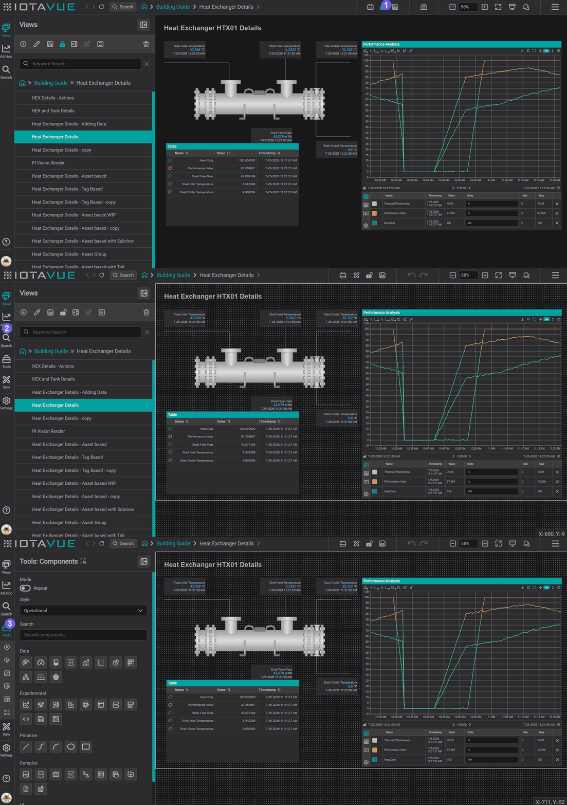
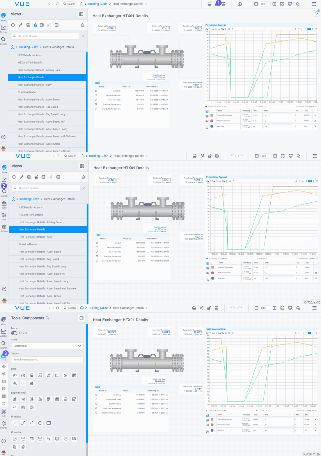
- Lock icon: click the lock icon in the top toolbar to toggle between viewer mode and editor mode. Click it again to return to viewer mode when you are done editing.
- Sidebar: the icon bar on the left opens editor panels: Views, Ad Hoc, Search, Tools, Style, and Settings. Click any icon to expand that panel.
- Tools: click the Tools icon in the sidebar to open the Components toolbox. Browse the available components by category and drag any component onto the canvas to add it to your display.
Undo, Redo, and Saving
Undo: press Ctrl+Z (Windows) or use the Undo button in the top bar to reverse the last action. You can step back through multiple actions.
Redo: press Ctrl+Y (or Ctrl+Shift+Z) to re-apply an undone action.
Save: when there are unsaved changes, a blue indicator appears on the Save button in the top bar. Click it to save, or press Ctrl+S. IOTA Vue does not auto-save: save regularly, especially before locking the display or navigating away.


Warning
Navigating away from the display without saving will lose unsaved changes. Lock the display first, then navigate: locking triggers an auto-save prompt in some versions.
Zooming and the Visible Area
Use zoom controls to zoom in and out of the editor area. Zooming only affects how you see the canvas in the editor: it does not change what viewers see.
The visible area and workspace dimensions
Every display has a defined workspace size: a width and height set in the display settings. This size determines the visible area: the region the viewer sees when the display first loads, without scrolling. Think of it as the "screen" your viewer is looking at.
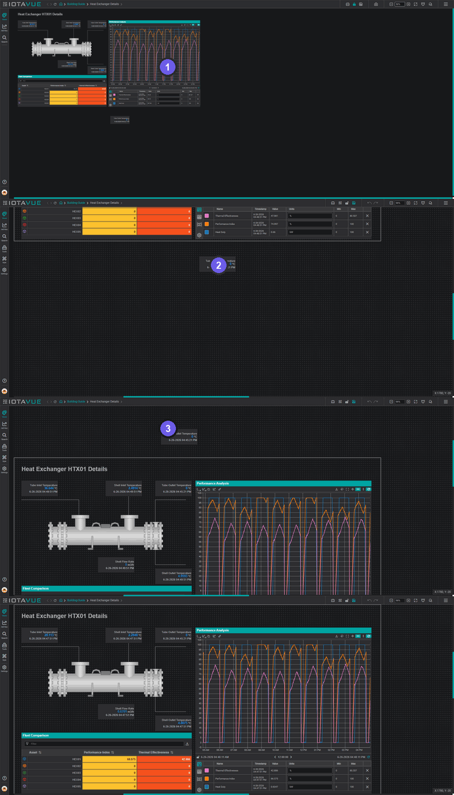
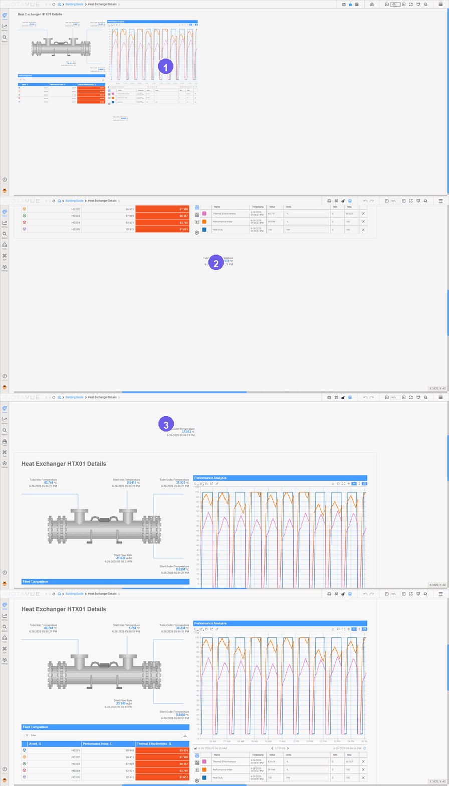
- Visible area (Edit Mode): the bordered canvas outline marks the region viewers see on load.
- Scroll zone (Lock Mode): scroll down to reach content below the boundary.
- Hidden zone (Lock Mode): content above the boundary cannot be accessed by viewers.
- Default viewer view: what every viewer sees when the display first opens.
The canvas has three zones relative to that boundary:
- Visible area: the bordered rectangle matching your workspace dimensions. Content here is what viewers see on load. Keep your primary content inside this region.
- Scroll zone: the area below and to the right of the visible area boundary. Content placed here is accessible: viewers can scroll down or right to reach it. Use this for secondary detail, expanded charts, or supplementary data that does not need to be immediately visible.
- Hidden zone: the area above and to the left of the boundary. Content here is inaccessible to viewers and cannot be scrolled into view. Avoid placing anything here.
Match workspace size to the viewer's screen
Set your workspace dimensions to match the resolution your viewers use: typically 1920×1080 for full HD screens or 1280×720 for smaller displays. A mismatch means content either gets cut off or leaves empty space. See Building Your First Display → Setting workspace dimensions for a reference table of common sizes and where to find the setting.
Scrolling is intentional, not a fallback
The scroll zone is a deliberate layout choice, not a safety net for overflow. If viewers are regularly scrolling to find key data, consider restructuring the display using tabs or navigation rather than relying on scroll.
Global Time Control
The Global Time Control (GTC) is the central time navigator for a display. It controls the time range that all time-aware components (line charts, value components, KPI tables), use to fetch and display data. When a viewer opens a display, they use the GTC to move through time: shifting the window forward or backward, zooming into a specific incident, or switching to real-time updates.
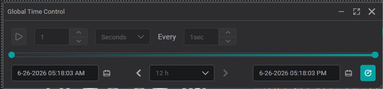
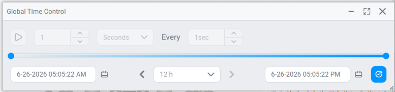
As a builder, the GTC matters for two reasons:
- It sets the viewer's starting context. When you lock a display, the time range currently set in the GTC is saved as the default. Viewers open the display at exactly that range. If you lock with "last 8 hours" configured, every viewer who opens the display sees the last 8 hours by default.
- It controls what you see while building. While you are in Edit Mode, the GTC determines the time window your components load data for, so you can build and preview with realistic data at the right time range.
Set the default time range before locking
Before you lock a display for viewers, set the GTC to the range that makes most sense for the use case, for example, "last 8 hours" for an operational display or "last 24 hours" for a shift overview. Viewers can always adjust the range after opening, but this becomes their first view.
For a full description of how viewers interact with the time control (time pickers, duration selector, real-time indicator), see Exploring Data → Time Control.
Before You Start
Before your first build session, open User Profile, click your avatar at the bottom-left of the sidebar, and set your theme, default component style, and toolbar preferences. These settings persist across sessions and affect how the editor behaves from your first component drop.
See User Profile Settings for Builders for the settings that matter most before you start building. Viewers use the same dialog: options available to end users are documented in Viewer User Profile.
Now that you're comfortable with the day-to-day mechanics (unlocking, saving, zooming, and the GTC), see The Editor Interface for a full map of every panel and what each one contains.
What's Next
You now know how to drive the editor day to day. Next, get the full map of every panel and control it contains, so you know where each tool lives before you start building. Continue to The Editor Interface.
Related
- Navigating the User Interface: Video tour of the IOTA Vue interface, view modes, and top bar controls
- Discovering IOTA Vue Tools: Video walkthrough of the Components toolbox and editor libraries