
Set Up Your Workspace
Set Up Your Workspace
Before you place your first component, take a few minutes to configure two things: Quick Settings and Component Styles. Together they control how the editor behaves and what a new component looks like the moment you drop it onto the canvas.
This setup is worth doing once at the start of a project, not page by page. If you skip it, you can always come back, but you will likely end up manually reformatting components you have already placed.
Quick Settings
Quick Settings is a small toolbar panel that appears when you unlock a display. Open it by clicking its icon in the top bar:
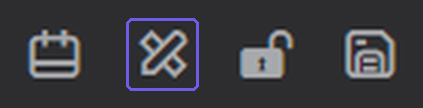
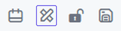
It gives you fast access to the tools you reach for constantly while building:
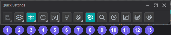
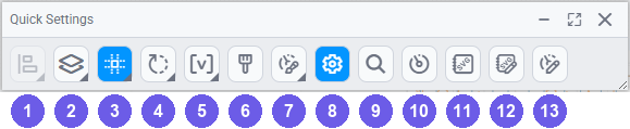
- Align & Distribute: line up multiple selected components along an edge or distribute them with equal spacing (available when two or more components are selected).
- Arrange: bring a component forward or send it back when it overlaps others.
- Snap to Grid: toggle grid snapping on or off while positioning components.
- Rotation and Position: adjust a component's rotation and exact X/Y placement.
- Variable: rename the selected component, useful when referencing it in Actions.
- Formatting Brush: copy the visual formatting of one component and apply it to another in two clicks.
- Component Style: swap between named Component Styles directly from the toolbar without opening a menu.
- Settings; open the general Settings panel for the selected component.
- Search; open the Search panel to find tags, assets, or calculations.
- Components; open the Components panel without navigating away from the canvas.
- Symbol Library; open the built-in SVG symbol library.
- Custom SVG Library; open your organization's uploaded SVG assets.
- Custom Components Library; open your team's saved custom component presets.
You can also personalize which shortcuts appear in the panel from your User Profile, so it shows exactly what you use most.
Library panels (Components, Symbol Library, Custom SVG Library, Custom Components Library) all open at the same default position, so opening a second one stacks it directly on top of the first. Drag a panel by its title bar to move it aside and see both at once:
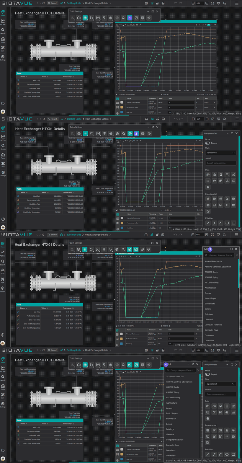
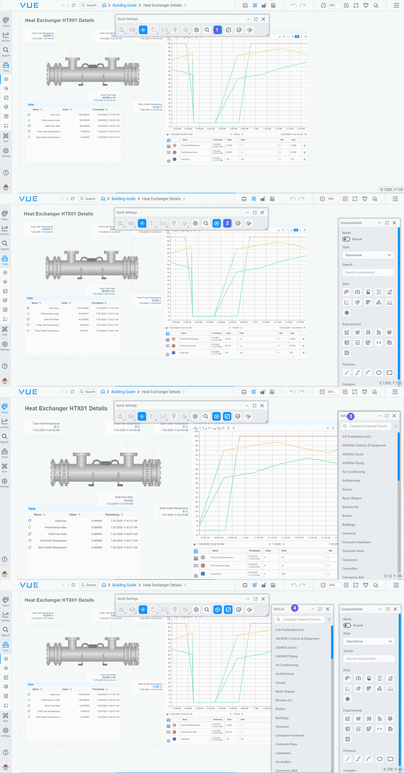
- Components: click to open the Components panel.
- Symbol Library: click to open the Symbol Library panel; it opens directly over the Components panel.
- Drag to separate: drag the top panel's title bar aside by clicking and holding it.
- Both visible: the Components panel is now revealed alongside the Symbol Library panel.
Managing a panel with the mouse
Each Quick Settings panel has controls in its title bar, plus a resize grip in the corner:
- Minimize to Bar: collapse the panel to its title bar to free up canvas space; click it again to restore the panel.
- Remove: the × button closes the panel.
- Resize: drag the panel's bottom-right corner to make it larger or smaller.
Component Styles
Before you start placing components, create a Component Style for each type you plan to use. Styles define the default look for a component (colors, fonts, borders, and layout), so every new placement is already configured rather than requiring manual formatting.
Create your styles on the Component Styles page, then come back to set your Default Component Style in User Profile so new placements use it automatically.
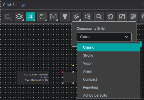
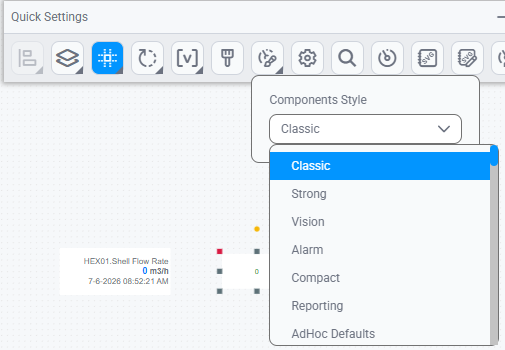
Once a component has more than one style available, use the Component Style option in Quick Settings to switch between them without leaving the canvas: select the component, open Quick Settings, and pick a style from the dropdown:
User Profile Settings for Builders
Open User Profile from your avatar at the bottom-left of the sidebar. The settings below are the ones that matter most before you start building. For the full list of available settings, see User Profile & Preferences.
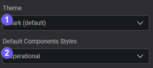
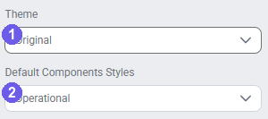
- Theme: sets the overall look of the editor and your components.
- Default Component Style: the style applied to new components automatically.
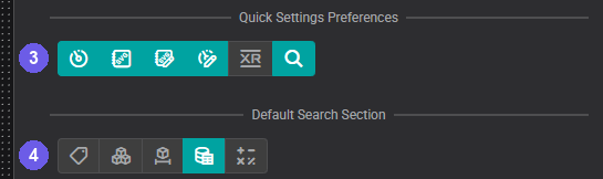
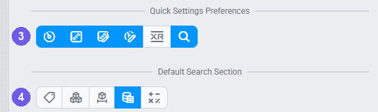
- Quick Settings Preferences: which panel shortcuts appear in the Quick Settings toolbar.
- Default Search Section: which tab opens first in the Search panel.
Theme
Set your theme before placing any components. Component colors and styles reference the active theme, so switching themes after you have built a display can shift colors or break the look you intended.
- If your organization has a branded theme, select it here. Your administrator sets the account default, but you can override it per session.
- If no branded theme exists yet, select one of the built-in default themes, or ask your administrator before committing to a look.
Need a custom theme instead of a default one? See Create Your Own Theme.
Default Component Style
This controls which named component style is applied when you drag a new component onto the canvas. Without a style active, every component arrives with the system defaults and you have to format each one manually.
- Set this after you have created your component styles (see Component Styles above).
- If your administrator has already set up styles, select the one your team uses as the starting point.
Need to create a new style? See Component Styles.
Quick Settings Preferences
Controls which shortcut buttons appear in the Quick Settings toolbar when a display is in edit mode. Once enabled here, each library appears as a toggle button in the Quick Settings bar: click it while building to open or close that panel instantly, without navigating away from the canvas.
- Components: opens the Components toolbox directly from the toolbar
- SVG Library: opens the Symbol Library panel for built-in process graphics
- Custom SVG Library: opens your organisation's uploaded SVG assets
- Custom Components: opens your team's saved custom component presets
- XR Library: opens the XR (extended-reality) asset panel
- Search: opens the Search panel for finding tags and assets
Add these before you start building so the toolbar is configured for your workflow from the first session.
Default Search Section
Sets which tab is active when you open the Search panel: Tags, Assets, Timeframes, or Calculations. If most of your work involves asset-relative displays, set this to Assets. For tag-based displays, set it to Tags.
Tips
Click Apply to save any changes. Use Restore Defaults to reset all profile settings to the account defaults your administrator configured.
Recommended Order
- Work with your admin to define your custom theme: brand colors, fonts, and logo. Apply it before creating any displays. See Themes & Branding.
- Open User Profile and set your Theme, Default Component Style, Quick Settings Preferences, and Default Search Section (see User Profile Settings for Builders above).
- Open a display in edit mode.
- Click the Quick Settings icon in the top toolbar and add any panel shortcuts you want.
- Open the Style panel in the sidebar and create a Component Style for each component type you plan to use. Style colors should reference the theme palette set in step 1.
- Activate the style: new placements will use it immediately.
- Start building.
What's Next
Your workspace defaults are set. The next step is making it look right: themes control the color palette, fonts, and branding every display inherits. Continue to Themes & Branding.
Related
- Themes & Branding: color schemes and global visual defaults
- Component Styles: default visual settings for each component
- Editor Basics: unlocking, selecting, and editing