
Themes & Branding
Themes & Branding
Set your theme before you place your first component. A theme controls colors, fonts, and component defaults for every display you build. Changing themes mid-project is possible, but it requires manually reviewing each component, especially any multistate rules and conditional colors you have already configured.
Themes vs Component Styles
These two concepts work together but control different things. Understanding the difference before you start building saves a lot of rework later.
| Theme | Component Style | |
|---|---|---|
| Scope | Entire workspace, all displays | Per component type, Value, Line Chart, Table, etc. |
| Controls | Color palette, fonts, canvas background, header, logo | Default visual settings for each component type when placed |
| Set by | Admin or senior builder, once per project | Builder, once per display project |
| When to change | Rarely: changing mid-project requires reviewing every component | When you want a different default look for a component type |
The right order: set your theme first, then configure component styles that use the theme's colors as their defaults. If you set up component styles before the theme, you may end up manually reassigning colors after the theme is applied.
See Component Styles for how to create and activate styles after your theme is in place.
What a Theme Controls
A theme defines the following defaults across your displays:
- Logo: the organisation logo displayed in the workspace header, applied consistently across all displays that use the theme
- Background color: the canvas background applied to all displays using the theme
- Primary and accent colors: used by buttons, borders, and highlighted elements
- Font family and size: the default text rendering for labels, values, and headings
- Component default colors: the initial fill, stroke, and text colors when a new component is placed
- Multistate color presets: a set of named color groups (RunStop, OnOff, OKWarningError, SeverityLevels, and others) that builders can apply to multistate rules in one step
Note
Multistate color presets are an upcoming feature being added to the theming system. Once available, they will appear in the Actions panel when configuring conditional rules. See Multistate Behavior for the current multistate configuration workflow.
Preset Themes
IOTA ships with a set of built-in preset themes: light and dark variants suited for different operational environments. Your administrator sets the account-wide default; you can override it in your User Profile or per session in the editor.
| Theme | Mode | Best for |
|---|---|---|
| Dark (default) | Dark | Control rooms, continuous operation, low-light environments |
| Original | Light | General use, office environments, reporting |
| Light Blue | Light | Takes an IOTA preset color palette on blue: a lighter, brand-accented alternative to Original |
Your administrator may have created additional custom themes; see the full list in the Themes panel or your User Profile.
A theme controls both standard UI elements (background, header, logo, sidebar, and buttons) and the content you build. Components inherit their default colors from the active theme, so the same display can look at home in both dark and light environments when built with the theme palette in mind. Where possible, build and review your displays in both a dark and a light theme before sharing them with viewers, to make sure colors, contrast, and multistate states are readable in both modes.
The same Heat Exchanger display looks different in each theme: table row colors, chart traces, and backgrounds all pick up the active palette. Editor chrome, top bar and side rail, is included below so you can see how each theme affects the whole workspace, not just the canvas:
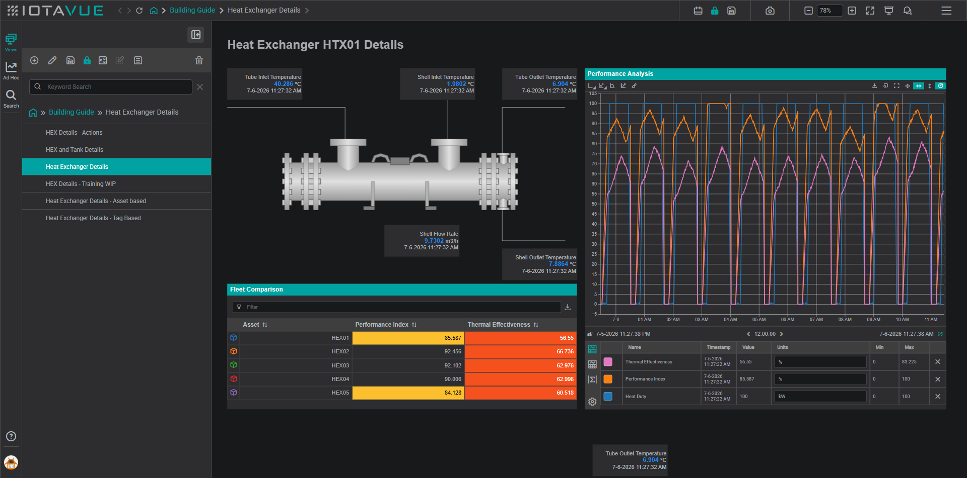
Dark (default): the account default, suited for control rooms and continuous operation.
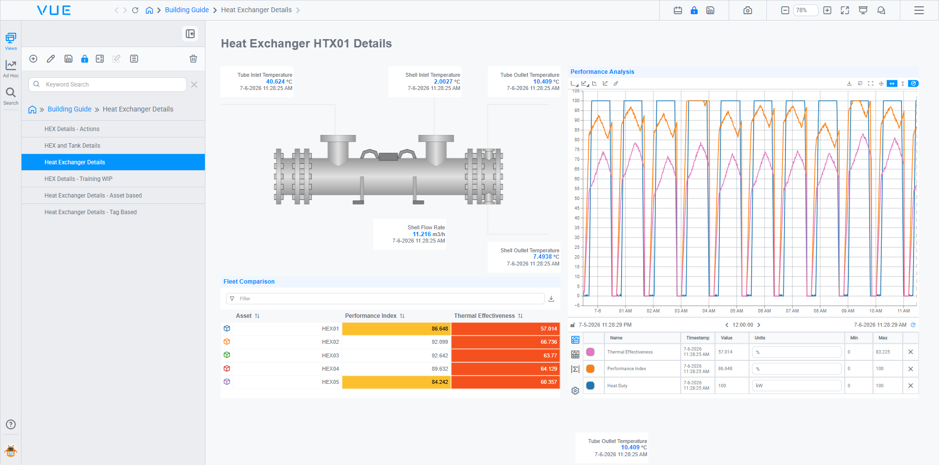
Original: the standard light theme for general use and reporting.
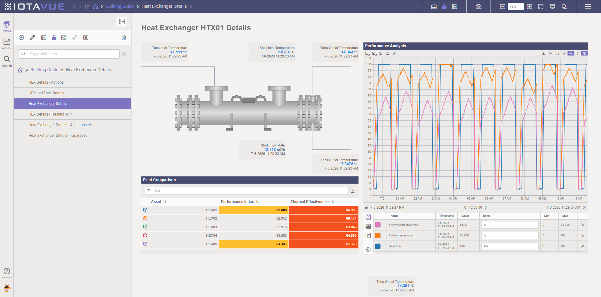
Light Blue: an IOTA preset built on a blue color palette, a lighter alternative to Original.
You can browse and switch between preset themes at any time from the Themes panel (paint bucket icon in the sidebar), or quickly from User Profile. Built-in and custom themes both appear in both places.
Applying a Theme
Themes can be set in two places depending on whether you want a personal default or a display-level choice.
From User Profile: sets your personal default theme across all displays you open. Open User Profile from the avatar at the bottom-left of the sidebar, find the Theme setting, and select your preferred theme. This is the recommended starting point; set it once before you begin building so every new display inherits the right look. See User Profile Settings for Builders for the full list of profile options.
Setting the default theme for other users
The steps above set the theme for your own account. Assigning a default theme for other people (per user, group, or role), is an administrator task, done from the Administration page rather than here. See Setting defaults.
From the Themes panel in the editor: overrides the theme for the current display session:
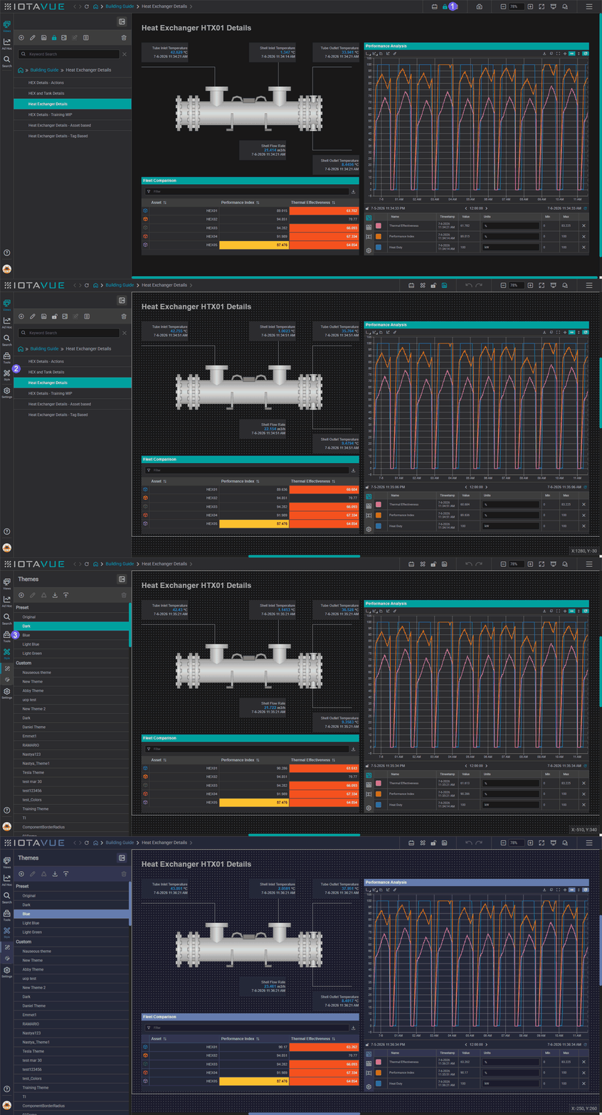
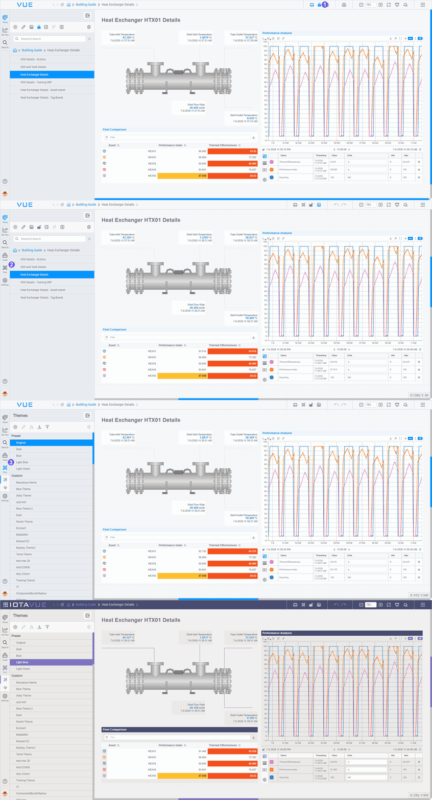
- Unlock: unlock the display to enter editor mode.
- Open Themes; open the Themes panel from the left sidebar (the paint bucket icon).
- Select a theme, pick a theme from the list, the canvas preview updates immediately.
- Canvas recolored: new components placed after switching will inherit the theme's defaults.
Changing the active theme does not automatically recolor components that are already placed. It only affects newly added components and the canvas background.
Light and Dark Modes
IOTA ships with light and dark variants of each built-in theme. Choose based on your operational environment:
- Dark themes: suited for control rooms and low-light environments where operators work with displays continuously
- Light themes: suited for reporting dashboards, office environments, and documentation screenshots
You can switch the active variant in the Themes panel without losing your component layout.
Custom Themes
Custom color palettes, brand fonts, and custom SVG component libraries can be created and customized directly from the Themes panel. See Create Your Own Theme for step-by-step instructions on creating a new theme, exporting and importing theme files, and customizing colors, fonts, logo, header, and component defaults.
Tips
Work with your admin to define your custom color palette before you start building. Applying a different theme after building requires manually reviewing every component, especially any multistate rules and conditional formatting that reference specific colors.
Note
Reserved signal colors (red for alarm, green for normal) should be protected in the theme palette so IOTA does not auto-assign them to non-signal channels. Ask your admin to configure the reserved color list before you begin.
What's Next
You now know how to choose and apply a theme. If your organization needs its own branded look, the next page walks through building a theme from scratch (colors, fonts, logo, and component defaults), and exporting it for reuse. Continue to Create Your Own Theme.
Related
- Create Your Own Theme: create themes, customize colors and fonts, export and import theme files
- Libraries: custom component libraries and SVG assets
- Multistate Behavior: apply conditional colors to components