
The Editor Interface
The Editor Interface
When you unlock a display, the editor reveals four main areas. This page maps each one so you know where to find things before you start building.
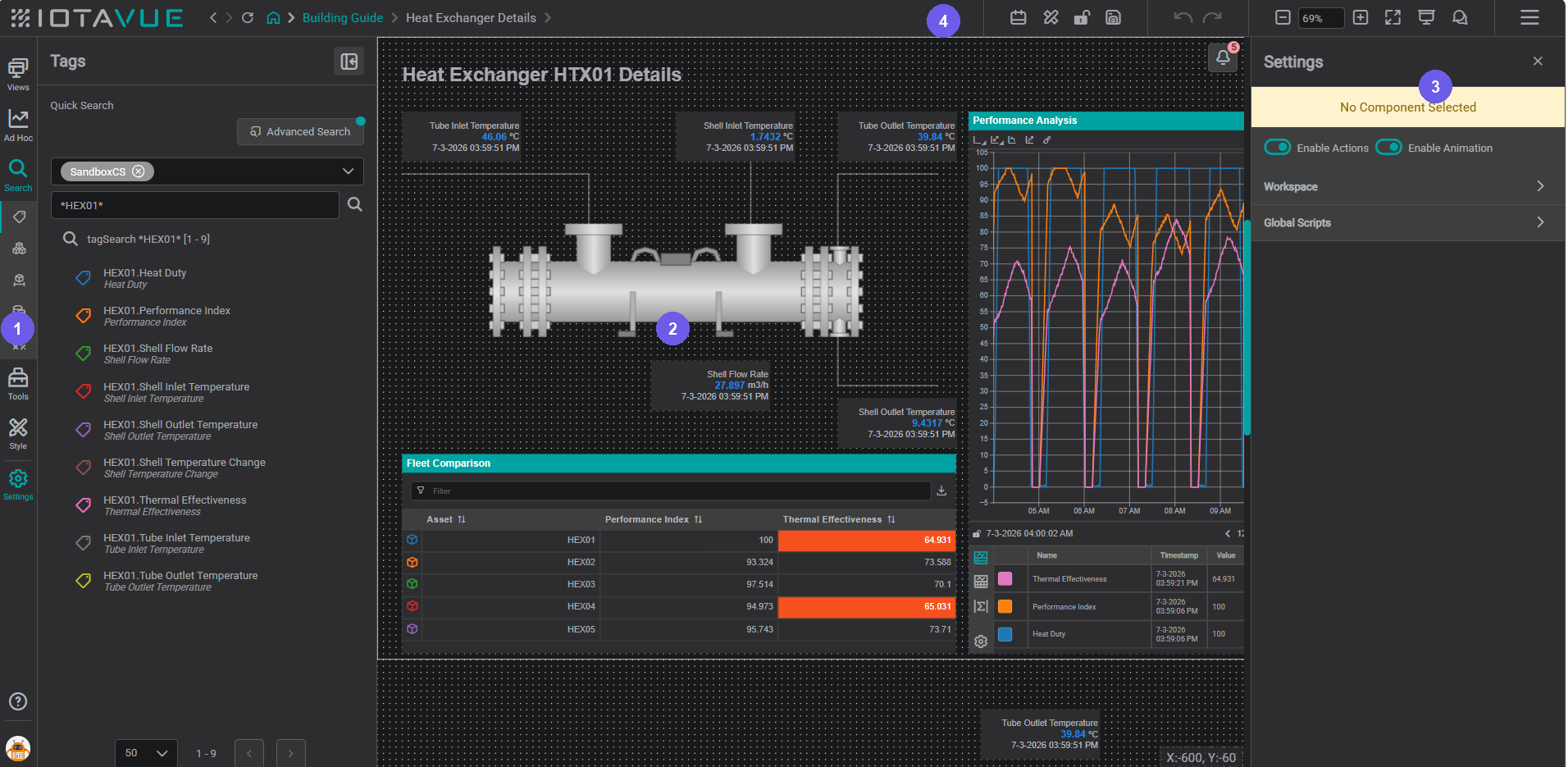
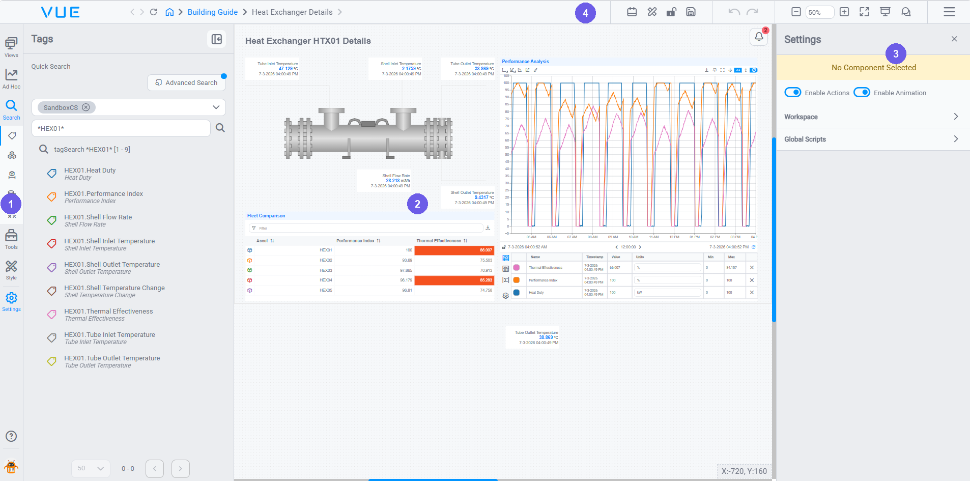
- Sidebar (left edge): icon bar that opens editor panels; click any icon to expand or collapse it.
- Canvas (center): the display you are building; components live here.
- Settings panel (right side): configuration for the currently selected component; empty until you click a component on the canvas.
- Top bar (top): lock/unlock, save, undo/redo, GTC, and Quick Settings.
Sidebar: Icon Bar
The left edge of the editor is a vertical icon bar. Click any icon to expand or collapse that panel. Only one panel is open at a time; clicking the active icon closes it.
Edit Mode only
The full icon bar (including Tools, Style, and Settings), is only visible when the display is unlocked (Edit Mode). In Lock Mode, the sidebar shows the three viewer tools: Views, Search, and Ad Hoc Trends. See Viewer Workspace → Side Pane for how those panels work in Lock Mode.
The sidebar provides five panels in Edit Mode:
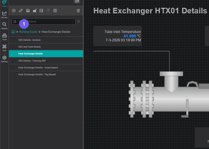
Views: browse and switch between all views in the project. Create, rename, reorder, or delete views from here.
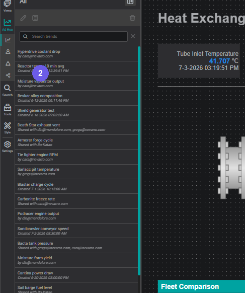
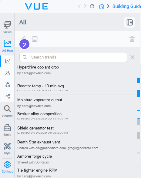
Ad Hoc Trends: explore tag data in a temporary floating trend without modifying the display. Trends created here are saved to your account and can be shared with others.
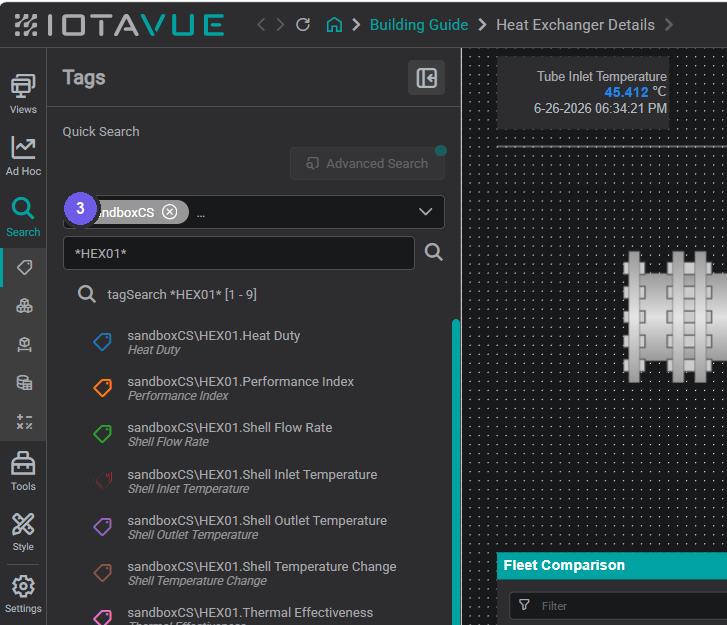
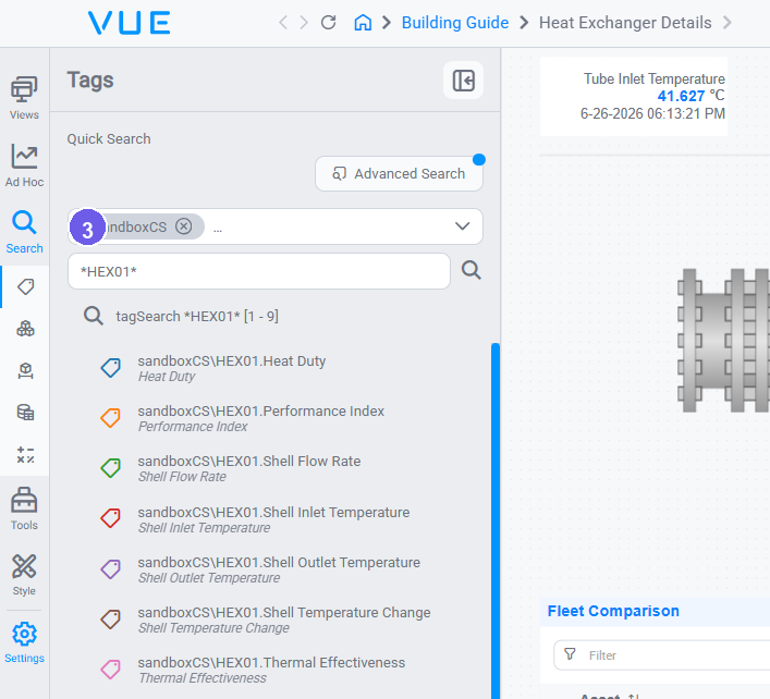
Search: find process tags by name, browse the asset hierarchy, or load datasets. The same search panel is available to viewers in Lock Mode.
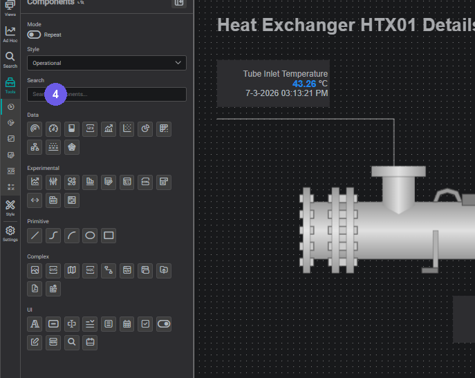
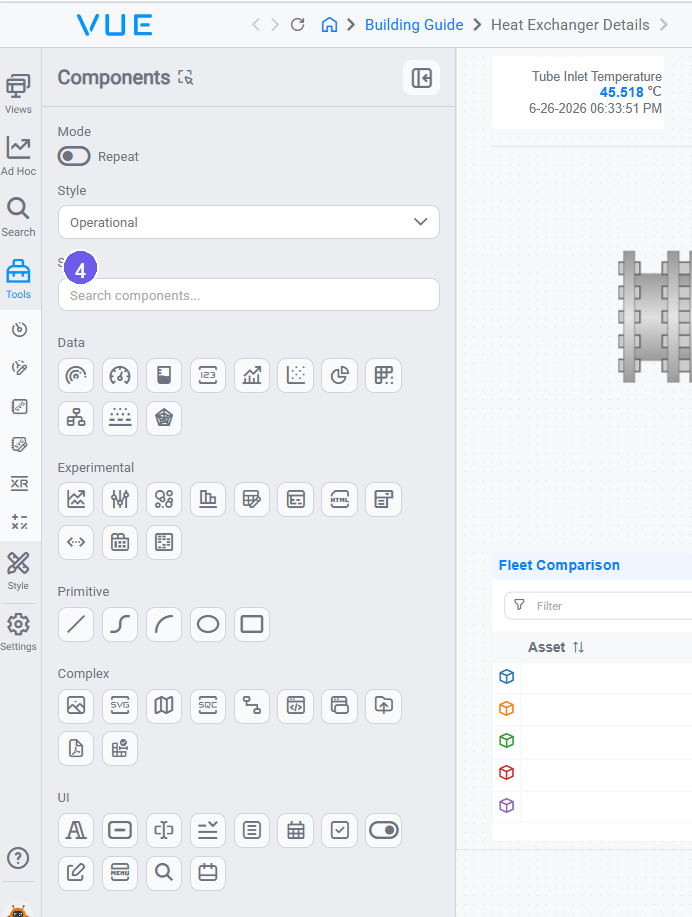
Tools: the component library. Drag components, SVG symbols, custom components, XR models, and calculations onto the canvas. (Edit Mode only)
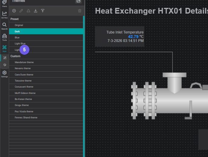
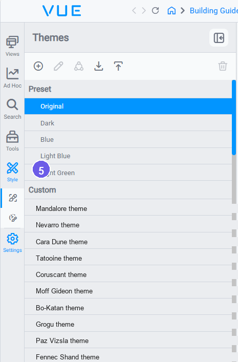
Style: apply themes and manage component style presets for the display. (Edit Mode only)
Views Panel
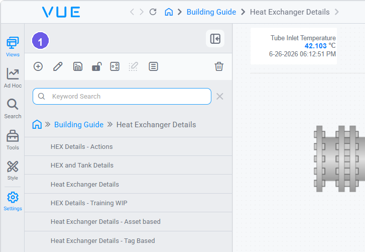
Click the Views icon to open the Views panel. It lists all the views (displays) in the current project and provides a toolbar of actions at the top.
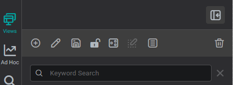
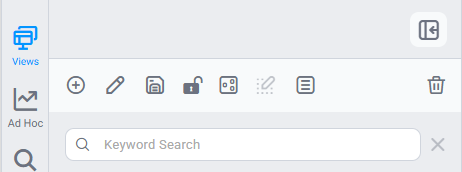
| Action | What it does |
|---|---|
  Add Add | Create a new view. Enter a name, optional description, and choose whether to nest it as a child of the current view. |
  Edit Edit | Edit the selected view's settings: name, description, hierarchy, workspace dimensions, and background (color, gradient, or image). This is where canvas size and background are now configured. |
  Save Save | Save the current state of the selected view. |
  Lock / Unlock Lock / Unlock | Toggle the selected view between editor mode and viewer mode. |
  Toggle Engineering Toggle Engineering | Switch the selected view into Engineering Mode. Engineering Mode exposes additional configuration options not available in standard Edit Mode. |
  Edit Group Mode Edit Group Mode | Enter Edit Group Mode to modify the inner layout of a Group component that repeats across asset instances. Changes made here apply to all instances in the group. |
  Additional Menu Additional Menu | Access less-frequently-used view actions. |
  Delete Delete | Permanently delete the selected view. This cannot be undone. |
Warning
Deleting a view is permanent. Any components, data bindings, and layout on that view will be lost. Lock the view first and confirm it is no longer needed before deleting.
Tools Panel
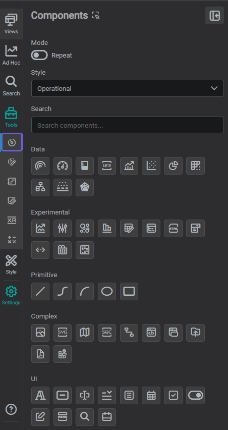
Click the Tools icon to open the component library. It contains six tabs: drag any item from the first five directly onto the canvas to place it.
Components
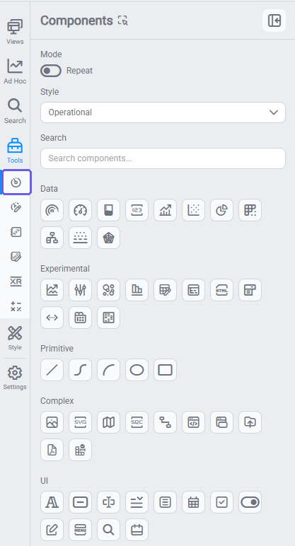
The Components tab organizes all buildable elements into five groups. Drag any component directly onto the canvas to place it. A style selector at the bottom of the panel sets the active Component Style so new placements start pre-configured.
| Group | What's inside |
|---|---|
| Data | Charts, values, gauges, tables, trees, timeframes, and other data-driven components. These are the core of most displays. |
| Experimental | Components currently in testing: heat maps, advanced charts, HTML embeds, and others. Expect behavior to change between versions. |
| Primitive | Lines, bezier curves, arcs, ellipses, and rectangles for building process graphics and backgrounds. |
| Complex | Images, maps, SVG containers, SQC charts, connectors, iframes, and other advanced layout elements. |
| UI | Interactive controls for operator interfaces: text, buttons, inputs, dropdowns, toggles, calendars, menus, and search. |
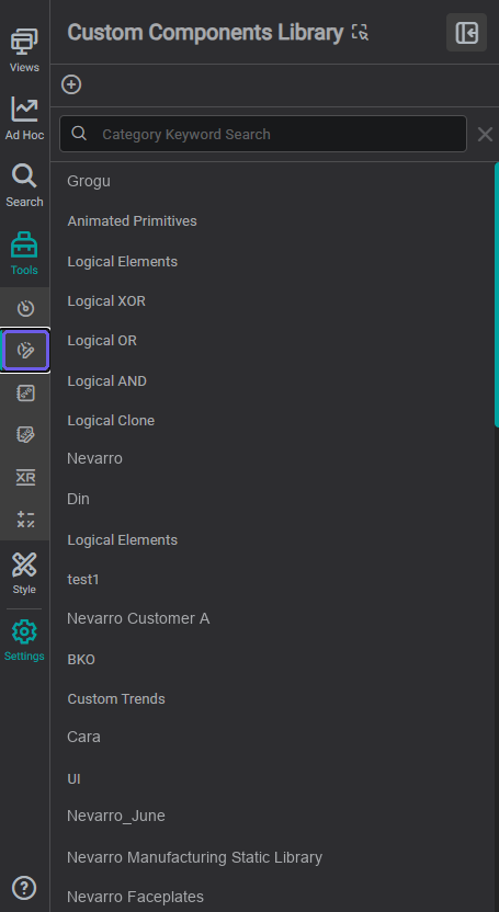
Custom Components Library
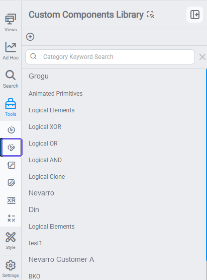
A library of components you or your team have pre-configured and saved for reuse: data bindings, multistates, and formatting already set up. Drag one onto the canvas and reassign the tag as needed. See Custom Components for how to create and publish them.
Symbol Library
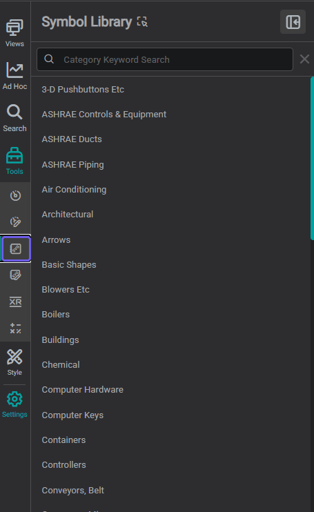
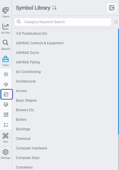
A searchable library of prebuilt SVG process symbols: equipment shapes, arrows, and industry icons. Drag any symbol onto the canvas and resize, recolor, or layer it with data components. See Custom SVG Library to add your own organisation-specific symbols.
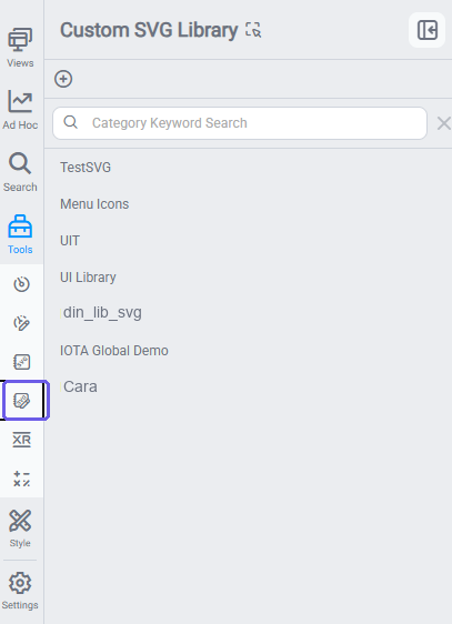
Custom SVG Library
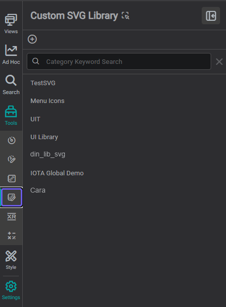
A library of custom SVG symbol sets you or your team have uploaded: organization-specific equipment shapes, icons, and diagrams that go beyond the built-in Symbol Library. Drag a symbol from any saved library onto the canvas the same way you would from Symbol Library. See Custom SVG Library for how to upload your own.
XR Library
A library of saved 3D models, organized into categories, for placing on your displays.
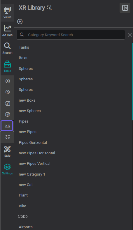
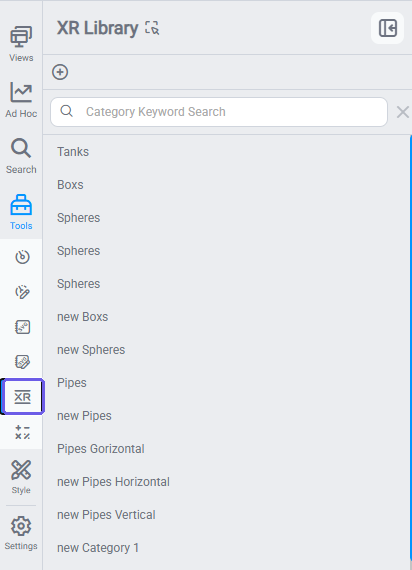
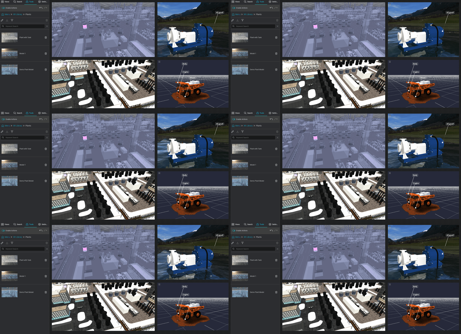
3D models created in IOTA XR. All preconfigured formatting (colors, multistates, data tags, backgrounds), travels with the model when you drag it onto a display.
Calculations
A library of saved calculations: derived tags, assets, and timeframes computed on the fly.
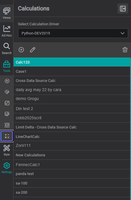
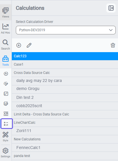
Editor for derived tags, assets, and timeframes using Python or PI Performance Equations. Created calculations appear in tag search like any regular tag. See Calculations for full guidance.
Style Panel
Click the Style icon to open the Style panel. It contains two tabs:
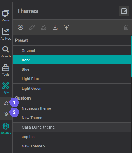
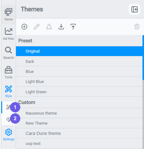
- Themes: controls the global color palette, fonts, and component defaults for the entire display. See Themes & Branding for how to browse, apply, and create themes.
- Component Styles: manages named visual presets for individual component types. See Component Styles for how to create and apply them.
Canvas
The center area is the display you are building. In editor mode it shows the grid and the visible area boundary: the rectangle that defines what viewers see when the display loads. Components placed outside that boundary are hidden in viewer and presentation mode unless the viewer scrolls.
For grid, zoom, alignment, and visible area details see Editor Basics.
Settings Panel
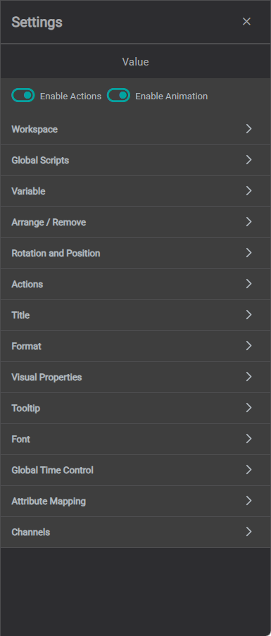
The Settings panel is empty when no component is selected: it shows "No Component Selected" with global display options (Workspace, Global Scripts). Click any component on the canvas and the panel immediately populates with that component's configuration tabs. Later sections in this guide walk through what those options look like for each component type.
When you select a component on the canvas, its configuration appears in the Settings panel. The available tabs vary by component type but typically include:
- Data: bind the component to process tags, assets, or calculations
- Appearance: colors, fonts, sizing, borders, and visual behavior
- Interactions: click actions, navigation links, and conditional formatting
- Layers: reorder the component relative to others on the canvas
Click anywhere outside a component, or press Escape, to deselect it and clear the Settings panel.
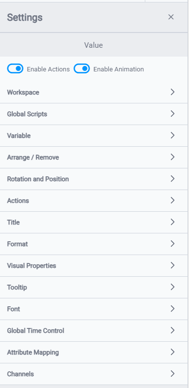
The example below shows the Settings panel with a Value component selected: the full list of configuration sections is visible on the right side of the editor.
Version note
In earlier versions of IOTA Vue, the Settings panel appeared on the left side of the editor. In current versions it is on the right side. If you have the Settings feature flag enabled, a Settings icon also appears at the bottom of the sidebar: clicking it opens the same component configuration in a left-side panel, which is useful on narrower screens or when you prefer to keep focus on the canvas. Ask your administrator to enable it for your organization.
Top Bar
The top bar spans the full width of the editor and provides navigation, locking, time control, and quick access to editor tools.
Navigate between views:


- Navigation controls: back, forward, refresh, and home.
- Breadcrumb trail: shows your location in the view hierarchy; click any segment to navigate back (toggle via Show Breadcrumb in User Profile).
A Search box can be enabled from your User Profile → Show Search View to jump straight to any view by name; when on, it appears to the left of the breadcrumb.
Toolbar controls:


- Global Time Control (GTC); set the shared time range for all time-aware components
- Quick Settings: alignment tools, formatting brush, and style shortcuts
- Lock / Unlock: toggle between editor mode and viewer mode
- Save: a blue indicator appears when there are unsaved changes; click it to save
- Undo / Redo: step backward and forward through your edit history
- Zoom controls: zoom in and out, set a zoom percentage, and use Fit to Page (the expand icon) to fit the whole display to your screen
- Presentation Mode: expand the view to fill the screen for large monitors and control rooms
For GTC layout options see Editor Basics. For Quick Settings details see Set Up Your Workspace.
Now that you know where everything lives in the editor, the next step is to configure your workspace (canvas size, background, and other display-level defaults), before you start placing components. Continue to Set Up Your Workspace to get your first display ready to build.
What's Next
Now that you know your way around the editor, set up your workspace defaults (themes, styles, and toolbar shortcuts), so every new component starts with the right look. Continue to Set Up Your Workspace →.
Related
- Navigating the User Interface: Video tour of the IOTA Vue interface and its key areas
- Discovering IOTA Vue Tools: Video walkthrough of Components, Workspace, Symbol, and Custom Component libraries