
Custom SVG Library
IOTA includes a large built-in Symbol Library (see The Editor Interface), but for use cases that require custom icons the Custom SVG Library provides a way to upload and centrally manage your own SVG icons.
This is ideal for company-specific icons or visuals tailored to a particular domain or equipment type: ensuring consistency and simplifying reuse across multiple views.
1. Open the Custom SVG Library
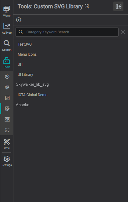
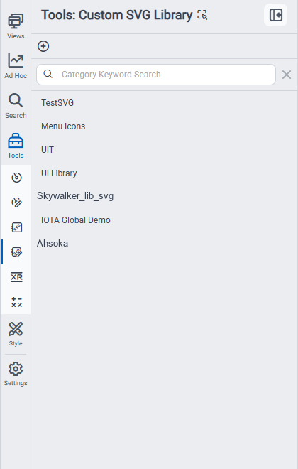
Navigate to the Tools panel in the left-hand menu and select Custom SVG Library.
2. Create a New Library
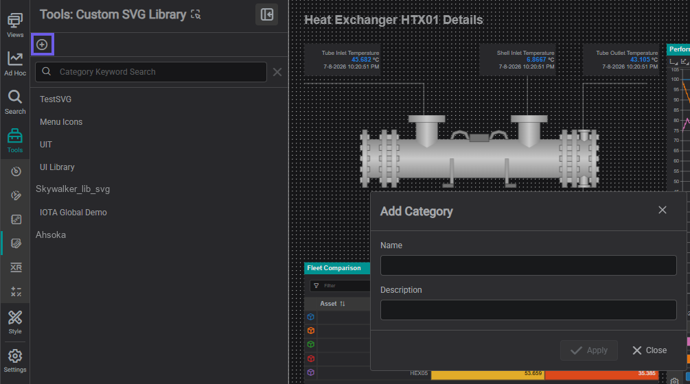
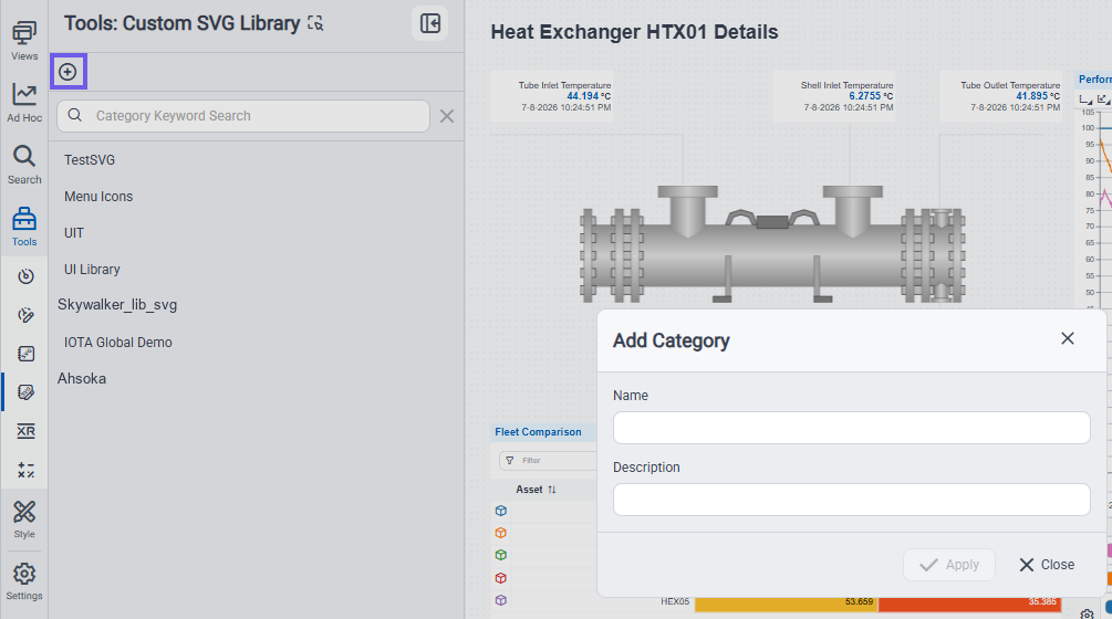
- Click the + icon to create a new library.
- Enter a name and an optional description in the popup.
- Click Apply to create the library.
3. Upload Custom SVGs
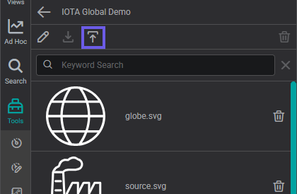
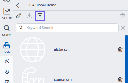
- Click the upload icon.
- In the popup, select Choose Component.
- Choose one or more
.svgfiles from your computer.
4. Review and Finalize Upload
The selected icons appear in the popup preview window.
- Use Select All or manually choose which icons to upload.
- Click Apply to complete the upload.
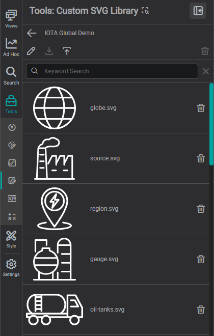
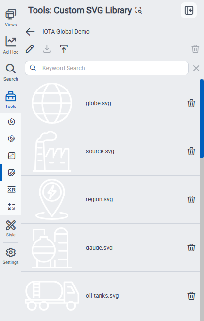
Once uploaded, the icons will be listed in your custom library.
5. Use Icons in a View
Icons in the custom library can be added to views via drag and drop, just like standard components.
To configure visual settings such as size or color, refer to SVG Component.
6. Edit the Name or Description
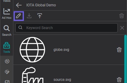
To update the library's name or description, click the edit (pen) icon at the top of the library view.
7. Delete Icons or the Entire Library
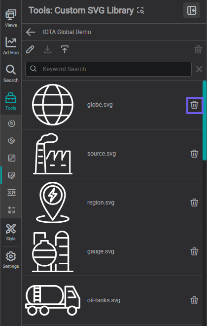
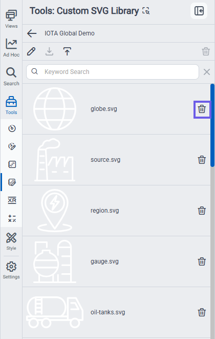
To remove an individual icon, click the trash icon next to it.
To delete the entire library, use the trash icon at the top of the library view.
Note
The library can only be deleted once all icons have been removed.
One-Time Use Icons
To insert a single SVG into a view without saving it to a library, refer to SVG Component.
What's Next
With themes, component styles, and both shared libraries in place, your workspace is fully set up: every reusable asset your team needs is now a drag away. The next step is to put it all to work: continue to Building Your First Display to place your first components on a canvas and bind them to live data.
Related
- Custom Components: reusable component groups
- SVG Component: place an SVG on a display
- Set Up Your Workspace: where libraries fit in setup