
Custom Components
You've been building displays: placing value components, styling them, arranging layouts. At some point, you build something that works exactly right: a KPI card with the right font and colors, a temperature gauge paired with a trend, a header block your team will want on every display. Custom Components let you package that work into a reusable building block that lives in your Custom Component Library and can be dragged onto any display in seconds.
Build it once. Save it to the library. Use it everywhere: no rebuilding from scratch, no drifting styles between displays.
This page covers how to create, publish, and use custom components in your displays.
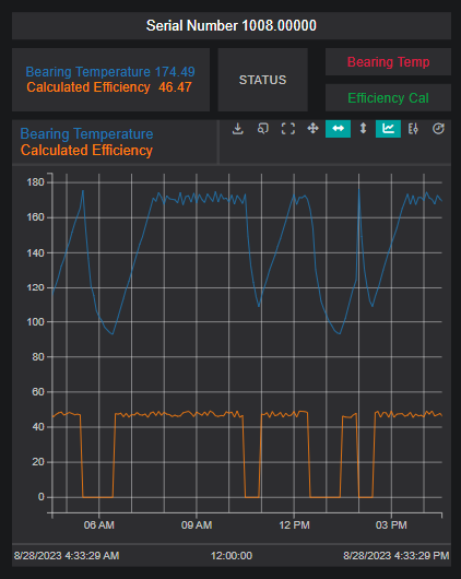
Some visuals reflect an earlier version
A few of the animations and the instrument-faceplate example below were captured on an earlier build (and the faceplate values are representative). The create → group → publish workflow itself is current; only some panels and menus may look slightly different from your version.
Creating and Managing Custom Components
Creating a Group
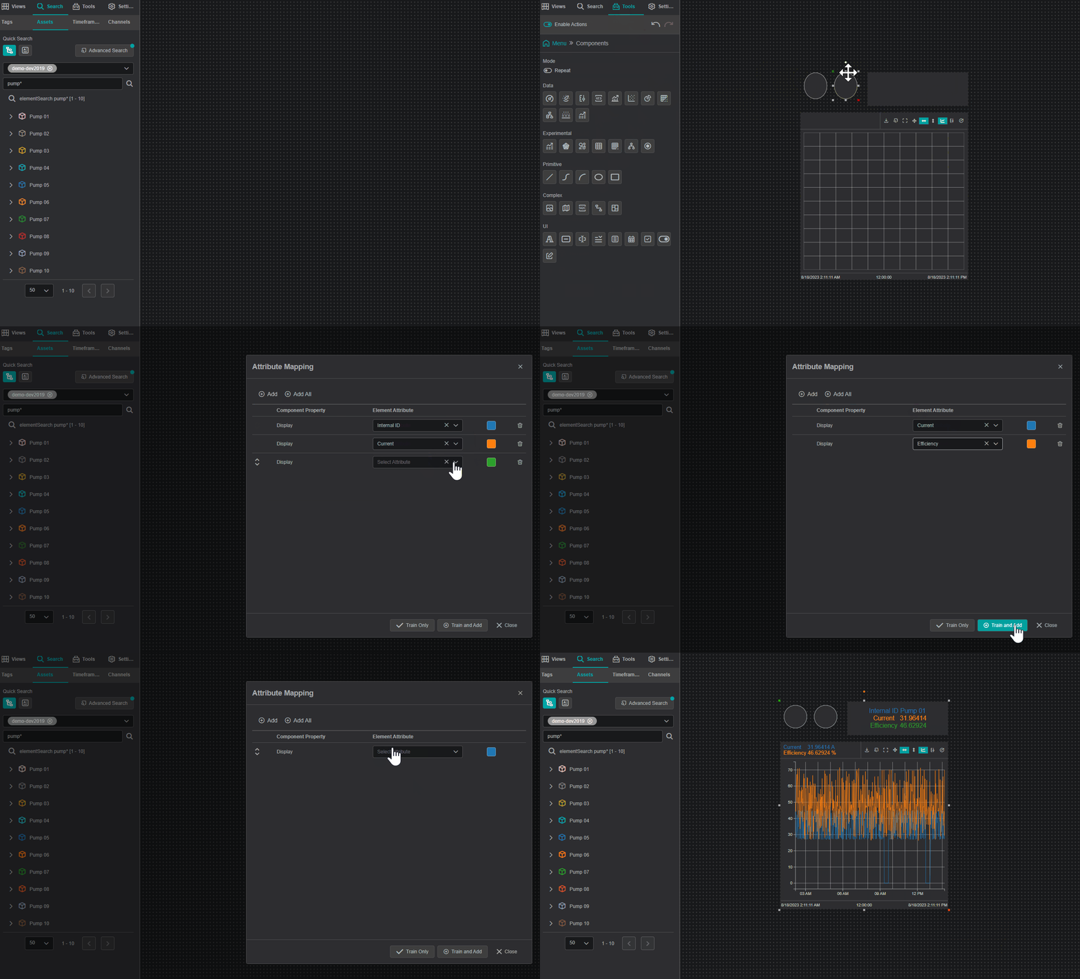
To create a custom component, start by assembling the desired component or group of components. This can range from a single line chart to a complex structure of multiple interlinked components.
- Drag the required component(s) onto the view.
- Configure as needed (e.g., train with Attribute Mapping, set Actions).
- Select all components by clicking and dragging over them, or by clicking each while holding
Ctrl. - Right-click and choose Group.
Editing a Group
To modify a group:
- Right-click the group and select Edit Group. The canvas switches to single-group editing, showing only the group's inner layout.
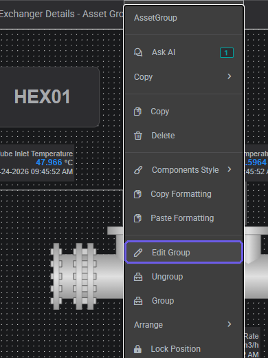
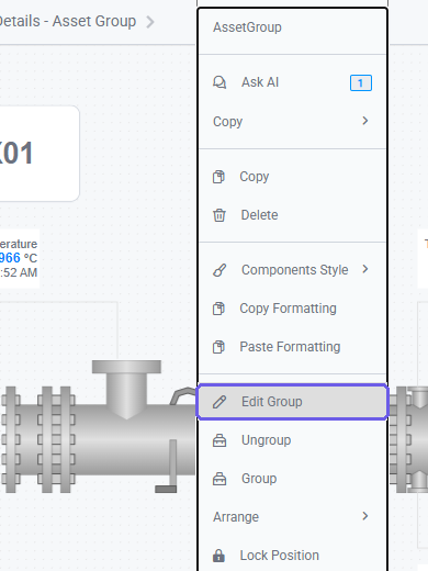
- Make the necessary changes: every edit applies to the group's definition.
- Exit editing mode via the Views panel back-arrow.
Exiting group edit mode
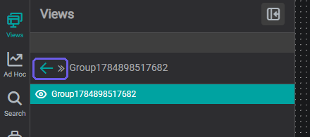
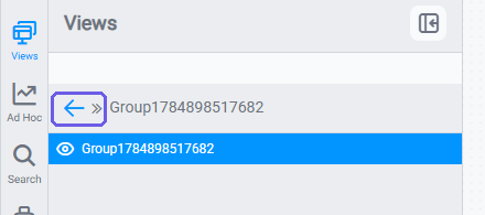
To exit and return to the full display, open the Views panel in the sidebar and click the back arrow (←) at the top of the panel. Clicking anywhere outside the group on the canvas does not exit group editing mode: you must use the Views panel arrow.
Creating a Custom Component
Once a group is configured, it can be converted into a reusable Custom Component:
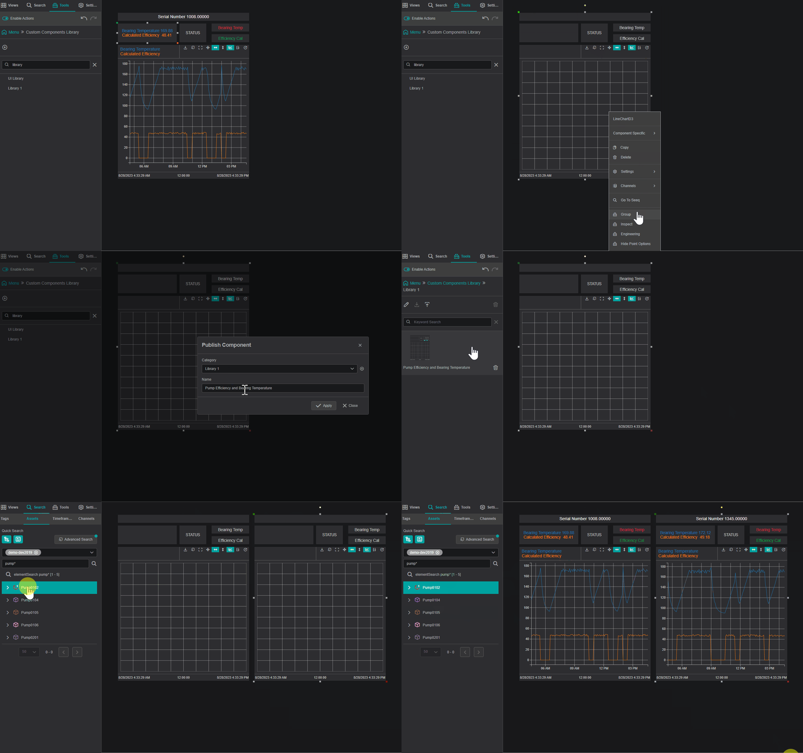
- Right-click the grouped component.
- Select Generate Component.
- In the pop-up window:
- Choose an existing Custom Component Library category, or
- Click the + icon to create a new category.
- Enter a name for the custom component and click Apply.
The new component will be available in the Custom Component Library under the Tools panel (see Using Custom Components below) and can be used across multiple views.
Example
Using Custom Components
Once a custom component has been created and published to the library:
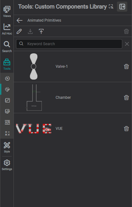
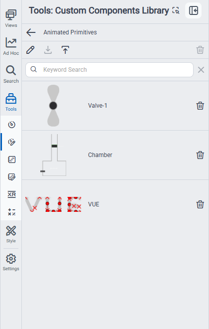
- Open the Tools panel from the sidebar.
- Click the Custom Components tab.
- Find the component by name or browse by category.
- Drag it onto the canvas. It lands fully configured: reassign the data tag in the Settings panel as needed.
Warning
Existing placed instances of a custom component are independent copies: updating the library definition does not retroactively change displays where the component was already placed. Re-drag from the library if you need the latest version.
Example: Instrument Faceplate
An instrument faceplate is one of the most common custom components in process HMI work: a compact card that shows the key values for a control loop: setpoint (SP), process value (PV), and output (OUT).
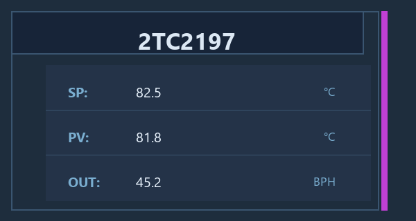
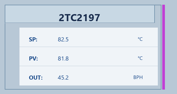
Build the faceplate layout once in IOTA Vue: wire SP, PV, and OUT each to their corresponding tag suffix. Save it to the Custom Component Library. From then on, drop it onto any display and point it at a different instrument root tag: all three values resolve automatically without rebuilding the layout.
The same principle works for any HMI element you build repeatedly: valve status cards, pump summaries, tank level indicators. Design once, save to the library, reuse everywhere. This is especially useful when migrating existing HMI screens into IOTA Vue: standard faceplate layouts from the legacy system can be recreated as custom components, making it practical to rebuild large screen sets without starting each one from scratch.
Scripting for advanced behaviour
Custom components cover visual layout and data binding. For interactive HMI behaviour: valve positioning feedback, dynamic component arrangement, mode switching, or writing values back to the control system: you will need to add scripts to the component. See Scripting for how to attach component-level scripts.
What's Next
Custom Components package your own component groups for reuse. The other half of the shared-library story is graphics: uploading your own equipment shapes and site icons so they sit alongside the built-in symbols for everyone on your team. Continue to the Custom SVG Library to set that up.
Related
- Custom SVG Library: reusable SVG graphics
- Component Styles: default visual settings for components
- Set Up Your Workspace: where libraries fit in setup