
Component Styles
Component Styles
Component Styles let you define named sets of default visual settings for each component type. When you drag a new component onto the canvas, it appears already configured with the style you have active (the right font, colors, border, and layout), instead of the system defaults. This removes repetitive per-component configuration and keeps every display in your project visually consistent.
Set this up before you start building
Component Styles are most effective when configured before you create any displays. Once a style is active, every new component you place uses it automatically. Setting styles after the fact means manually updating components you have already placed.
When to Set This Up
Set your theme first
Configure Themes & Branding before creating component styles. Component styles reference the theme's color palette: creating styles before the theme is in place means you may need to reassign colors after switching.
The best time to configure Component Styles is during your initial workspace setup, after you have applied your theme and before you open your first blank canvas. If you are working in a shared environment, ask your administrator whether a default style has already been configured for the organization. If one exists, you can activate it and start building immediately.
If you are starting from scratch, create and activate your styles first, then build your displays.
Creating a Component Style
Component Styles are managed from the Style panel in the sidebar.
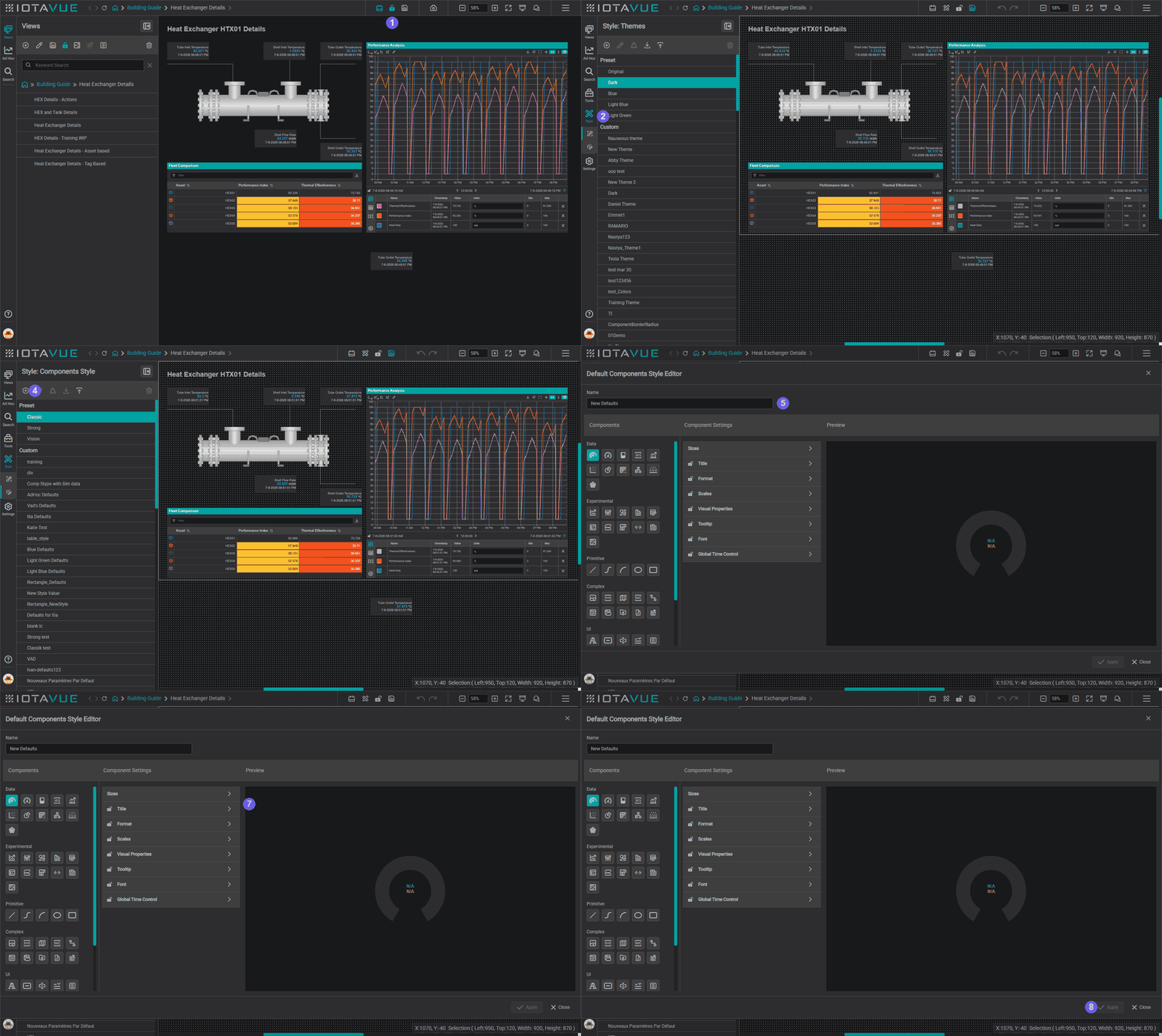
- Open any display in edit mode (unlock the view if it is locked).
- Click the Style icon in the sidebar to open the Style panel.
- Select Component Styles.
- Click the Add button to create a new style.
- Enter a name for the style (for example,
Standard KPIorProcess Diagram). - Select a component type from the Components list: each component type (Value, Line Chart, Table, etc.) can have its own style.
- Configure the component's settings as you want them to appear by default: font size, color, border, background, units display, and any other available options.
- Click Apply.
The whole sequence is numbered to match the steps above, from unlocking the display through to applying your first style:
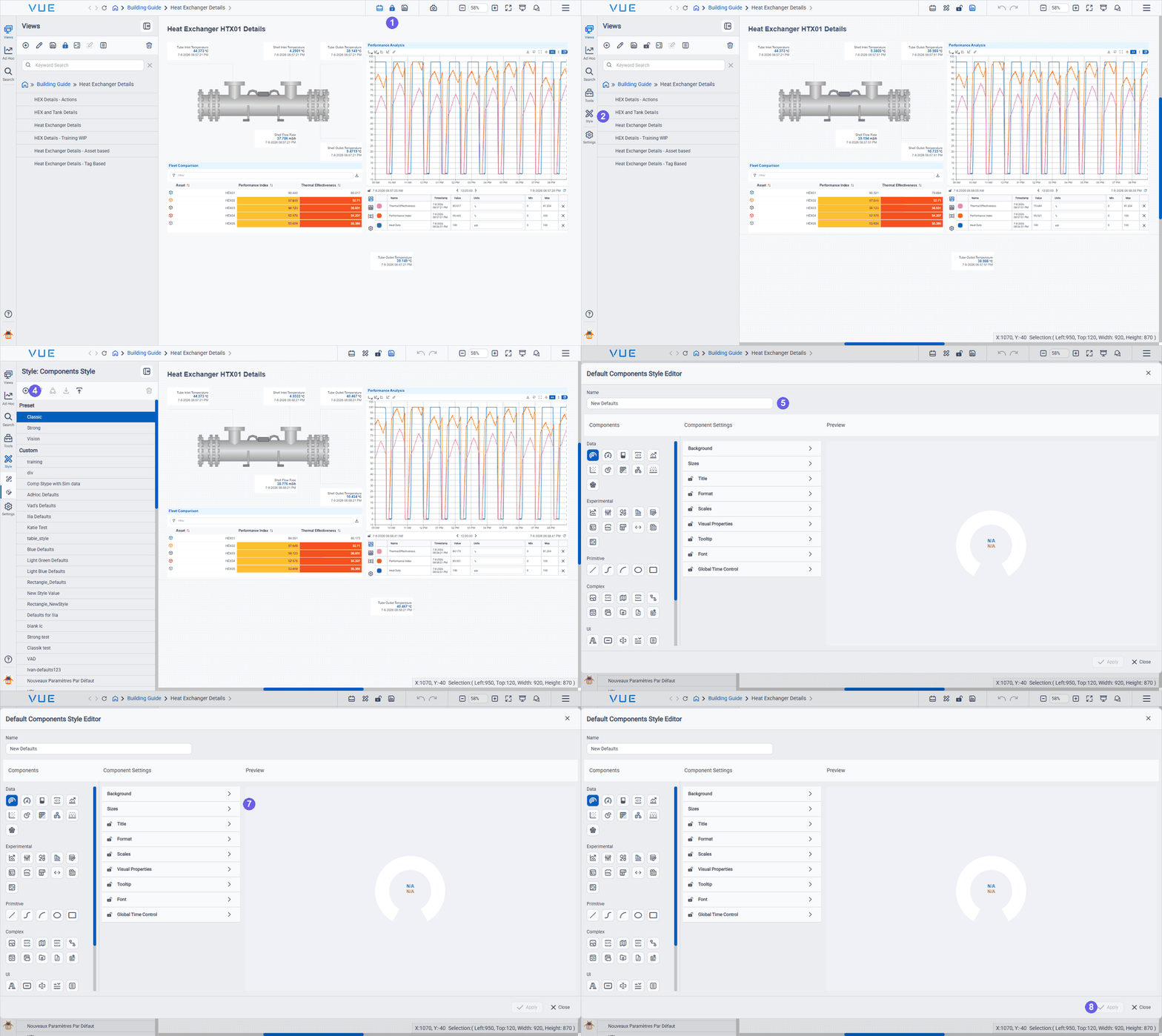
Repeat for each component type you use regularly. You can create multiple named styles per component type and switch between them as needed.
Configuring the Line Chart trend layout
A Component Style for the Line Chart controls more than fonts and colors: it defines the chart's whole layout: the interface areas that make a chart behave like an interactive ad hoc trend. In the style editor, select Line Chart from the Components list, expand the Format section, and configure:
- Which interface areas are shown: Chart Layout holds five elements: Chart, Legend, Controls, Time, and Table (the channel table). Every element is optional; an element you do not place simply does not appear.
- Layout: arrange and resize the elements by drag-and-drop, so every chart built from the style opens the same way.
- Legend: transpose it between columns and rows, add the Indicator Color column (the per-channel color), and hide columns you do not need.
Cursors are not a layout element: turn them on under Scales / Cursors (Show Cursor, Legend Follows Cursor, Cursor Color). Tooltip statistics live under Tooltip (Show Summaries, plus Summary Types and Time Range Interval).
The channel table's columns are part of the style too, but they are not in the settings list: configure them from the Preview. The preview chart shows a working channel table; open the gear at the bottom of its left-hand rail to get Columns Configuration, tick the columns you want, and click Apply. Each column can appear in the Basic Legend, the Advanced Legend, or both. See Channel Table columns for what the columns do.
Configure this separately for the Data → Line Chart and the AdHoc → Line Chart; they keep their own column sets.
Re-opening Columns Configuration resets it
Each time you open Columns Configuration in the style editor it re-initialises from the component defaults, not from the style you are editing. Any column choices you saved earlier appear undone. Set every row you care about before clicking Apply, rather than changing one column and trusting the rest to persist.
Because the active legend tab is not saved, put the columns users need by default in the Basic Legend. A good split is Basic for reading values (name, value, units, timestamp, limits) and Advanced for analysis and formatting (statistics, regressions, trace formatting, plot type).
Because a style applies to every chart that uses it, this gives operators a consistent trending experience across the project. To add these features to a single chart without a style, see Ad Hoc Trend features on a Line Chart.
How styles apply to ad hoc trends
Styling an ad hoc trend is not the same as styling a Line Chart you place on a display. Two things catch people out.
Configure the AdHoc component, not just the Line Chart. The style editor's Components list is grouped into Data, Experimental, Primitive, Complex, UI, and AdHoc. The Line Chart under Data governs charts you place on a display. Ad hoc trends are configured from the AdHoc group: configuring the Data → Line Chart alone leaves ad hoc trends untouched.
Ad hoc trends follow the style set in the user's profile. Which style a user's ad hoc trends use comes from User Profile → Default Components Styles, not from whichever style is active in the editor. Creating a style, or activating it for new placements, does not change what a user's ad hoc trends look like until that profile setting points at it.
The AdHoc group contains two components, matching the two tabs an ad hoc window offers:
- Line Chart: the trend itself: layout, scales and cursors, tooltip, fonts and colors.
- Table: the ad hoc Table view. This is where you set the table up for your operators: Columns, Column Format, and Value Table (including its summary columns).
Both the chart and the table an operator sees in an ad hoc window are therefore part of the style, rather than something each user configures for themselves.
To give operators a consistent ad hoc trend experience:
- Create the style and configure the AdHoc group: its Line Chart and its Table (as well as Data → Line Chart, if you also want placed charts styled).
- Set Default Components Styles to that style, per user in their profile, or for everyone at once via the organization defaults described under Sharing Styles Across the Team.
If a user's profile does not point at a custom style, their ad hoc trends fall back to the organization's or the system default style.
Switching Between Styles
You can switch the active Component Style in three ways:
- Component Style Menu: open the Tools Menu and select Components Style. Choose the style you want to activate.
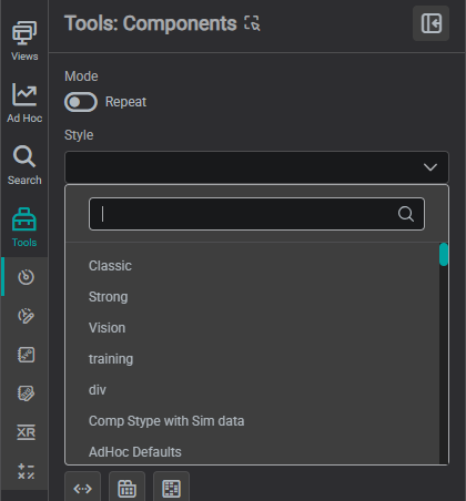
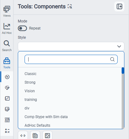
- Style dropdown in the Components toolbox: open the Tools panel and select Components; a Style selector sits near the top of the panel (below Mode). Pick a style from the list to change the active style for new placements.
- Right-click on a placed component: right-click any component already on the canvas and choose Apply Style to update that component to match the currently active style.
Locking Settings
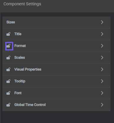
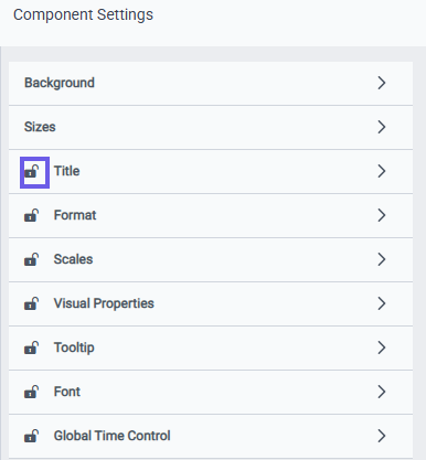
When creating a Component Style, you can lock individual settings. Locked settings cannot be changed by end users viewing the display in read mode. This is useful when you need to enforce visual standards, for example, ensuring that all Value components on a display use the same font size, or that a Line Chart always shows the legend in a fixed position.
Unlock settings only when you want to give viewers the ability to personalize their view. Each settings group in the style editor has its own lock toggle:
Sharing Styles Across the Team
Component Styles can be exported as a .b64 file and imported on another IOTA VUE instance, the same way themes are shared.
Both actions use the download and upload icons in the Components Style panel toolbar (the same pattern as the theme export/import):
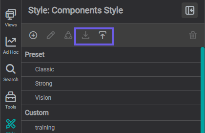
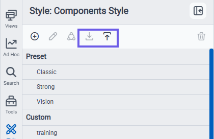
To export: select a style and click the download icon to save it as a .b64 file. To import: click the upload icon and choose a .b64 file.
For organization-wide defaults, ask your administrator to set the default Component Style, alongside the default theme and landing pages, from the Roles, Users & Groups → Setting defaults page. Defaults set there apply per user, group, or role across all new displays.
What's Next
Styles control how one component type looks. The next step is reuse at a larger scale: shared libraries that save whole configured components and your own graphics for the entire team. Continue to Libraries.
Related
- Themes & Branding: set color schemes and global visual defaults
- Set Up Your Workspace: the Style Switch button lets viewers switch between styles from the toolbar
- Tools Panel: full reference for the Tools panel, including Component Styles