
Line Chart Deep Dive
The Line Chart is the most versatile data component in IOTA. This page covers channel configuration, trace formatting, scale controls, and known behaviors that affect builders working beyond basic placement. For the settings every component shares (Workspace, Variable, Actions, Channels), see Generic Settings.
Channel Settings
Each trace on a Line Chart corresponds to one channel. Open a channel's settings by clicking the gear icon next to it in the Channels tab of the Settings panel: this opens the channel Properties dialog:
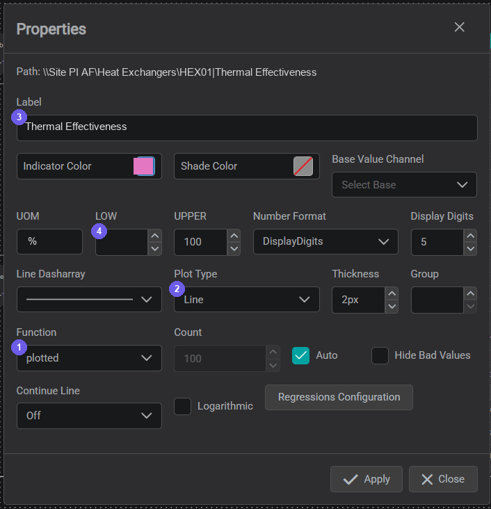
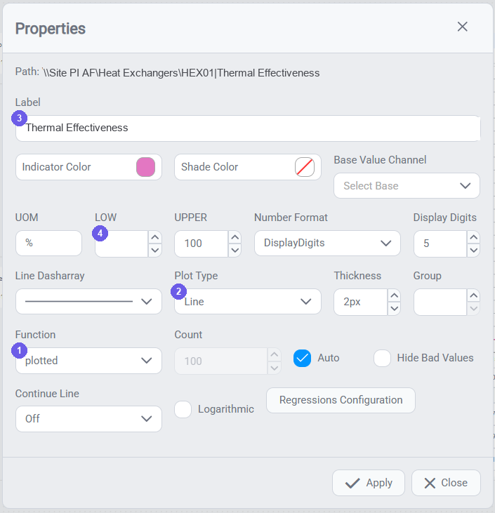
- Function: how the historian returns data for the visible time range.
- Plot Type: how the line is drawn between points (Line vs Step).
- Label: the display name shown in the legend, tooltips, and multistate selectors.
- Scale Limits (LOW / UPPER): fixed Min/Max for the Y-axis (see Scale Controls).
Function
The Function setting controls how the historian returns data for the visible time range:
- Plotted Auto (default): IOTA requests a number of data points appropriate for the chart's pixel width. The historian interpolates between recorded values as needed. Use for most continuous process signals.
- Recorded: returns raw historian values with no interpolation, at exact recorded timestamps. Use for step-change signals (valve positions, pump states, discrete digital inputs) where interpolation would misrepresent the actual behavior, or when exact historian timestamps are required for audit purposes.
- Average, Minimum, Maximum: aggregation functions that return a single value per time bucket. Useful for overview charts covering long time ranges (days, weeks) where raw resolution would be impractical.
Plot Type
The Plot Type field controls how the chart draws the line between data points (interpolation):
- Line (default): draws a straight line between consecutive values. Appropriate for continuous analog signals.
- Step: draws horizontal segments that jump at each recorded value. Use for digital state tags (open/closed, on/off, 0/1) where the value holds constant between changes.
Label
The Label field is the display name shown in the chart legend and in multistate rule selectors. Use a clear, human-readable name. If two channels share the same name, IOTA may apply the same formatting to both and may color them identically: always use unique names.
Appearance
The same Properties dialog also controls a trace's static appearance: Indicator Color (line color), Shade Color (fill under the line), Line Dasharray (solid or dashed), and Thickness (line weight). For threshold-based coloring, changing a trace's color when it crosses a value, see Multistate Behavior → Trace Formatting.
Scale Controls
The chart toolbar holds the scale and display controls: the group next to Y: / X::


- Scale mode: how channels share an axis: Single, Individual, UOM, or Group. The Y: and X: controls offer the same options.
- Scale behavior: how axis limits are found: Auto Scale, Data Source Defined, or Custom Limits.
- Reset Scale: return to the configured limits.
- Regressions; open the Regression Configuration window to add regression / trend lines.
- Trace Formatting: quick access to the trace-format dialog (see Multistate → Trace Formatting).
(Zoom is a click-and-drag interaction on the plot, not a toolbar button; see Zoom below.)
Scale mode: one axis or many
Set how channels share a scale; the same four options apply to both the Y: (value) and X: (time) controls:
- Single: all channels share one axis.
- Individual: each channel gets its own axis.
- UOM: channels with the same unit of measure share an axis.
- Group: channels grouped via the Group field (in the channel Properties dialog) share an axis.
Use Single or UOM to compare absolute values; use Individual or Group when channels differ in units or range and need separate scaling: this is how you put signals on separate Y-axes.
Auto Scale, Reset Scale & manual limits
Auto Scale fits the axis to the visible data; Reset Scale returns to the configured limits. For a fixed axis, turn on Custom Levels and set a Min/Max Level in the scale settings (or the LOW / UPPER fields in the channel Properties dialog). Fixed scales matter on operational displays: a chart that rescales on every load makes trend comparison difficult.
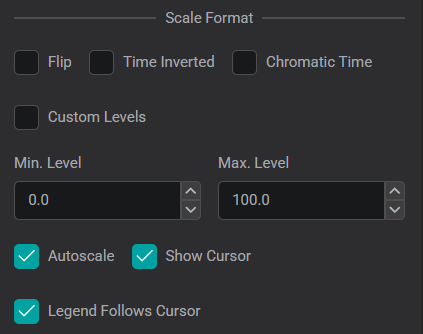
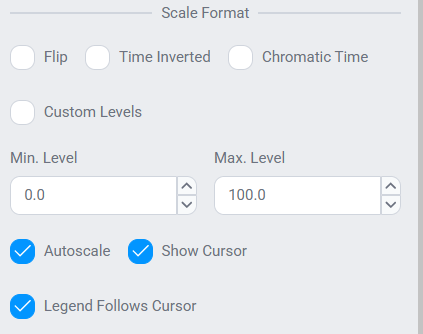
The same panel's Show Cursor and Legend Follows Cursor toggles enable the cursor readout used by the ad hoc trend features below.
Zoom
Click and drag on the chart to zoom into a region within the current GTC window. Zoom changes the display only: it does not change the GTC. For the different zoom modes viewers use (area selection, per-axis (horizontal/vertical), and mouse-scroll), see Analyzing a Trend.
Warning
If you save a display while the chart is in a zoomed state, the X-axis locks to the zoomed range and will not follow the GTC until the zoom is cleared. Viewers loading the display will see only the zoomed range regardless of their GTC setting. To recover: use Reset Scale, or reload the view. Avoid saving while zoomed. This is a known issue planned for a future release.
For the full set of runtime scale interactions: grouping scales by UOM or custom label, per-channel scale locking, and switching between auto and custom limits; see Customizing a Trend.
Regression Lines
Regression (trend) lines fit a curve to a channel's data (Linear, Polynomial, Exponential, Logarithmic, Power, Min, Max, or a Custom formula), with an optional equation and R² readout. Open the Regression Configuration window from the Regressions button in the Scale Controls toolbar (all regressions on the chart) or the ŷ icon in the Channel Table (the selected channel), choose a source channel, and click + to add one. Click Apply to place it; each regression then appears as a row beneath its source channel in the Channel Table.
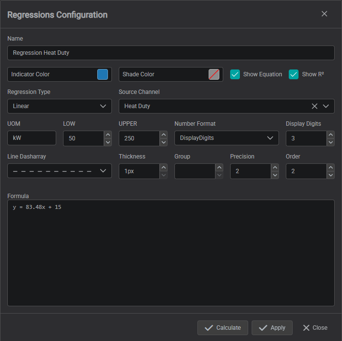
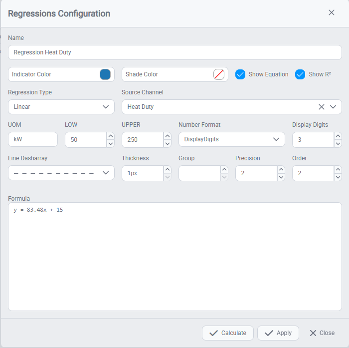
| Field | Description |
|---|---|
| Name | User-defined name for the regression, shown in the Name column of the Channel Table. |
| Indicator Color | Color of the regression line. |
| Shade Color | Optional shading below the regression line. |
| Show Equation | Displays the regression formula in the Name column of the Channel Table. |
| Show R² | Displays the R² value in the Name column of the Channel Table. |
| Regression Type | Type of regression (Linear, Exponential, Logarithmic, Power, Polynomial, Min, Max, Custom). |
| Source Channel | Channel on which the regression is calculated. |
| UOM | Unit of measure for display purposes. |
| LOW / UPPER | Defines fixed Y-axis limits for the regression. |
| Number Format | Defines how numeric values are displayed (%, scientific, decimal places, etc.). If Display Digits is selected, the number of displayed decimals is defined in the Display Digits field. |
| Display Digits | Defines the number of decimal places displayed. Only applies if Display Digits is selected in Number Format (see details below). |
| Line Dasharray | Selects line style (solid, dashed, etc.). |
| Thickness | Defines line thickness in pixels. |
| Group | Grouping label for Y-axis scaling (optional). |
| Precision | Defines calculation precision (rounding behavior) for the regression. |
| Order | Defines the order of the polynomial where applicable. |
| Formula | Editable formula field. Automatically populated but can be modified manually. |
Details on Number Format
The Number Format field controls how numbers are displayed for the regression line:
| Option | Description |
|---|---|
| System | Uses the numeric formatting defined by the user's operating system settings (e.g., decimal separator). |
| Channel | Inherits the formatting from the source channel configuration: either from the connected data source or manually set in the channel's attribute mapping. |
| Display Digits | Allows explicit definition of the number of decimal places shown. |
| Scientific | Displays values in scientific notation (e.g., 1.23E+03). |
| Percentage | Displays values as percentages. |
When Display Digits is selected, you can define how many decimal places are shown. For example: 1 → 12.3, 2 → 12.34, 3 → 12.345. This affects display only and does not impact underlying data or calculations.
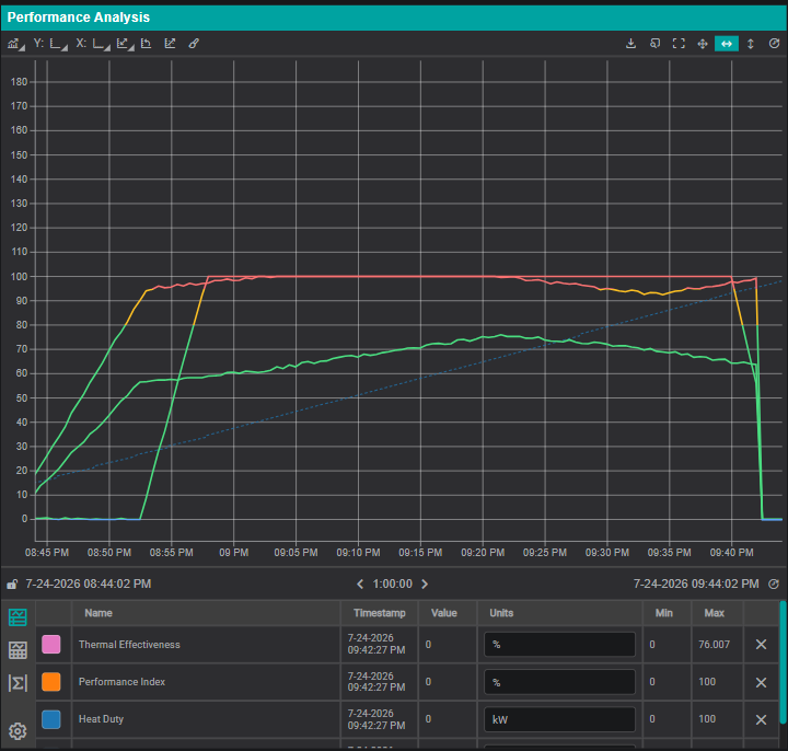
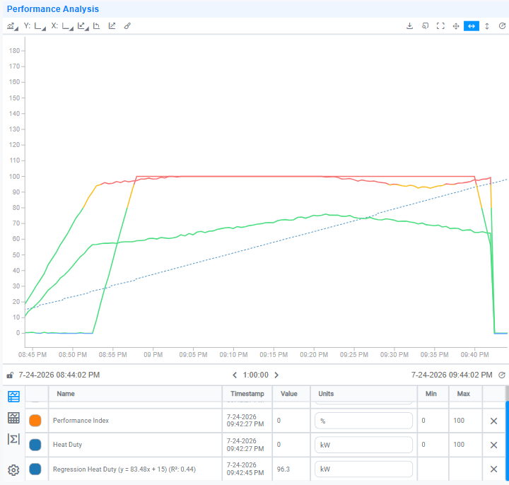
Once applied, the regression appears as a dashed line on the chart and as a row in the Channel Table showing its equation and R² value:
Ad Hoc Trend features on a Line Chart
A standard Line Chart can be given the interactive trending features operators get from an ad hoc trend: a Channel Table (per-channel metadata, statistics, and display settings), Cursors for reading values and interval statistics, and Chart Controls for scrolling, zooming, and export. There are two ways to add them.
Option 1: a reusable Component Style. Configure a Line Chart Component Style that includes the Channel Table, Chart Controls, and any other areas, then apply it. Every chart built from that style gets the features automatically: the best choice when you want a consistent trend layout across many charts.
Option 2: configure one chart manually. To enable the core features on a single Line Chart:
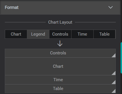
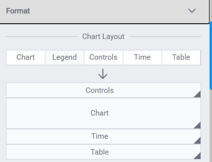
- Add the Channel Table, in the chart's Settings, open Format → Chart Layout and drag the Table element into the layout.
- Enable Cursors, in the chart's scale settings, turn on Show Cursor (the Scale Format panel shown under Scale Controls above).
Use Option 1 for project-wide consistency, Option 2 for a one-off chart.
Channel Table columns
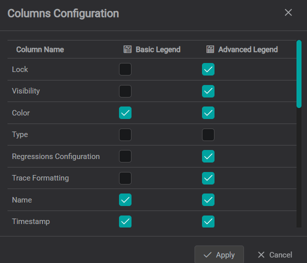
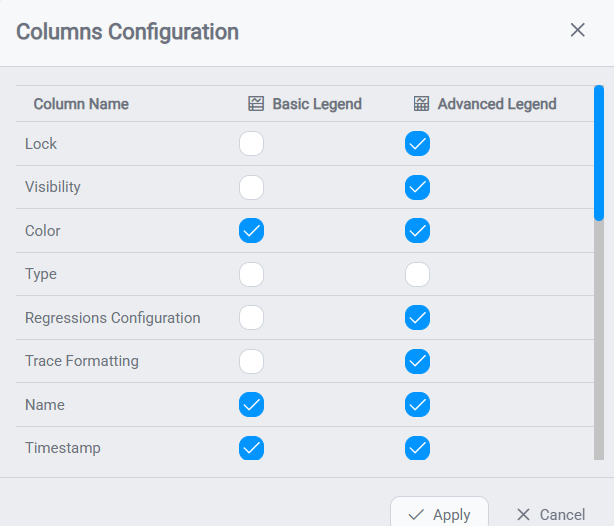
Once the Channel Table is shown, control which columns appear: open the gear at the bottom-left of the table to open Columns Configuration. Each attribute: Name, Value, Timestamp, Units, Group, Lower/Upper, the statistics (Average, Min, Max, StdDev, PStdDev, Total, Count, Range), Color, Plot Type, Regressions, Trace Formatting, and more: can be shown in the Basic Legend, the Advanced Legend, or both.
Put the columns you want visible by default in the Basic Legend: that is the tab the table opens on, and the active tab is not saved with the chart.
To set the same columns for every chart in a project rather than one at a time, configure them in a Component Style instead: the style editor's preview chart has the same gear.
What the columns give you:
| Column | Purpose |
|---|---|
| Units | The channel's UOM. Editable, so you can correct or override a source unit. |
| Group | A label used for Y-axis grouping. Channels sharing a Group value share one axis when the Y-scale Type is set to Group (see [Scale mode](#scale-mode-: -one-axis-or-many)). |
| Lower / Upper | The channel's Y-axis limits. Editing these rescales the chart, so treat them as configuration rather than a readout. |
| Statistics | Average, Min, Max, StdDev, PStdDev, Total, Count, Range: calculated over the chart's current time range, so they change as you pan or zoom. |
Looking for a different chart type?
If the Line Chart isn't the right fit, the Components Reference has alternatives: Bar Chart for shift or batch comparisons, XY Chart for correlation between two signals, and Gauge or Range Gauge for at-a-glance current values.
What's Next
You have now built and refined a tag-based display. Real plants have dozens of near-identical assets, though, and building one display per pump does not scale. The next section introduces asset hierarchies, which let a single display serve an entire fleet. Continue to Understanding Asset Hierarchies.
Related
- Creating Displays with Tags: placing and connecting a Line Chart from scratch
- Multistates & Conditional Formatting: add color rules based on trace values
- Scripting Performance & Scale: managing performance on displays with many charts
- Line Chart (Component Reference): full settings reference