
Creating Displays with Tags
Creating Displays with Tags
Tag-based displays connect components directly to individual tag names from your historian. This is the most straightforward approach to building in IOTA: suited for equipment detail pages, process diagrams, and KPI tiles where each component shows one specific measurement.
When to Use This Approach
Use tag-based displays when:
- You know the exact tag names you want to show
- The display is for a specific piece of equipment, not a reusable template
- The signals shown will not change over time
- You want the fastest path from a blank canvas to a working display
If you need one display to work across multiple assets of the same type (for example, one template for all heat exchangers in your fleet), use the asset-based approach instead. See Training Components.
The Example: Heat Exchanger Details
This page walks through building a display based on a heat exchanger monitoring layout: a common use case for tag-based displays. The same steps apply to any equipment type: reactors, pumps, compressors, or any other asset with a set of named historian tags.
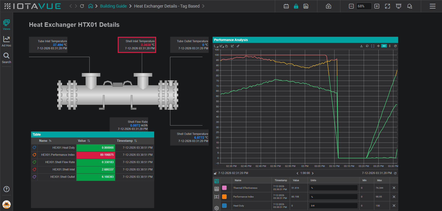
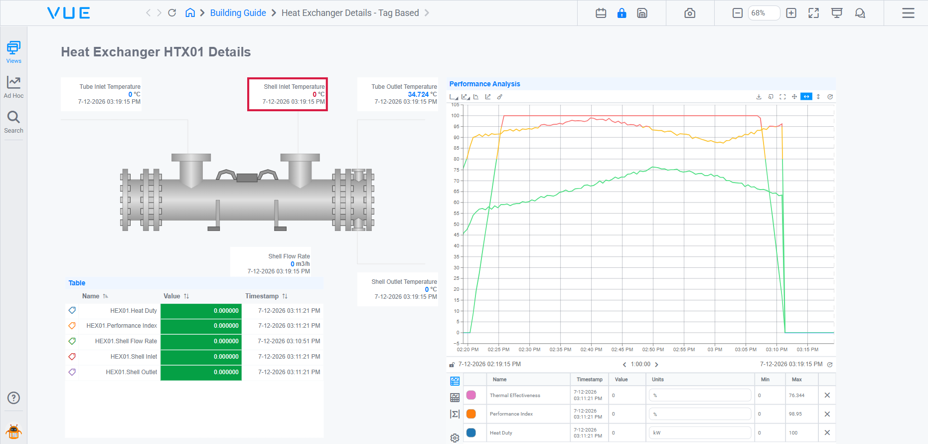
The finished display contains:
| Element | What it shows |
|---|---|
| Title label | "Heat Exchanger HTX01 Details": static display header |
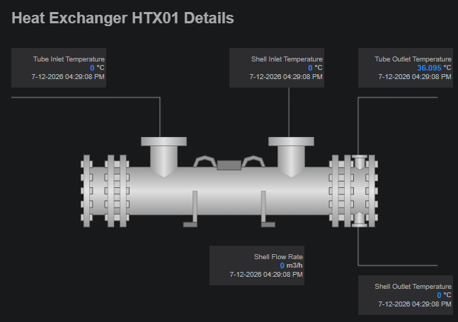
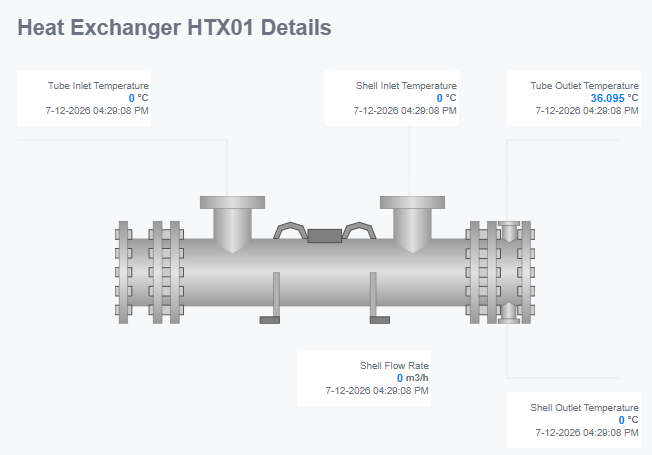
| SVG schematic | Heat exchanger diagram with value components overlaid on the diagram |
| 5 Value components | Tube Inlet Temp, Tube Outlet Temp, Shell Inlet Temp, Shell Outlet Temp, Shell Flow Rate |
| Line Chart | "Performance Analysis": all four temperature traces over the selected time range |
| KPI Table | Thermal Effectiveness, Performance Index, Heat Duty: styled with Min/Max columns and multistate color coding |
| Tag Table | Same signals as a basic Table (raw tag paths, Name/Value/Timestamp columns): shows the default Table configuration before customisation |
Place Your First Value Component
The most fundamental skill is placing a single component and binding it to a tag. A Value component shows one tag's current reading, timestamp, and units; start with one, and you'll reuse the same drag-and-bind flow for every other component on the page.
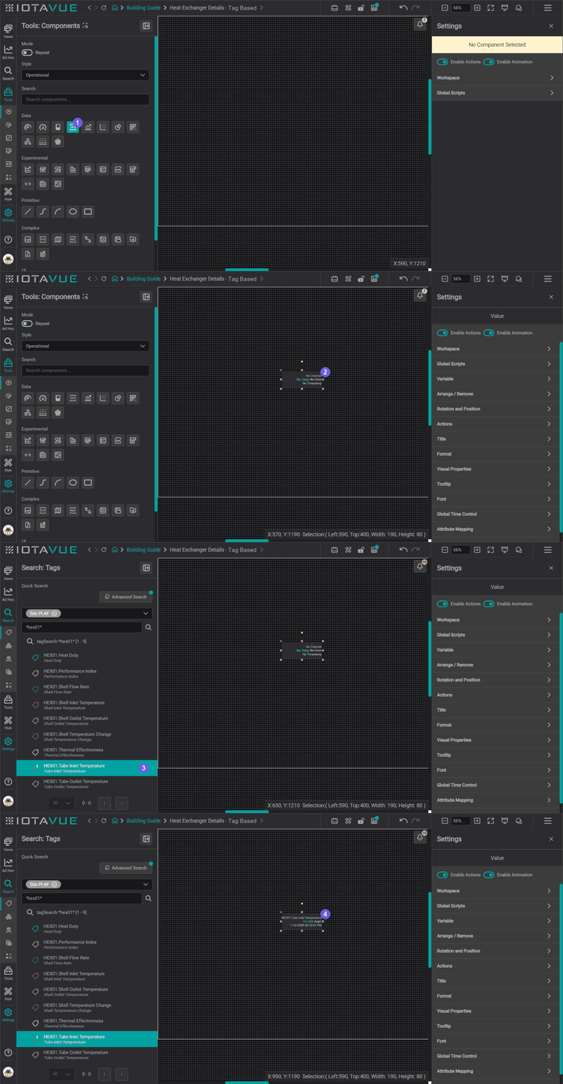
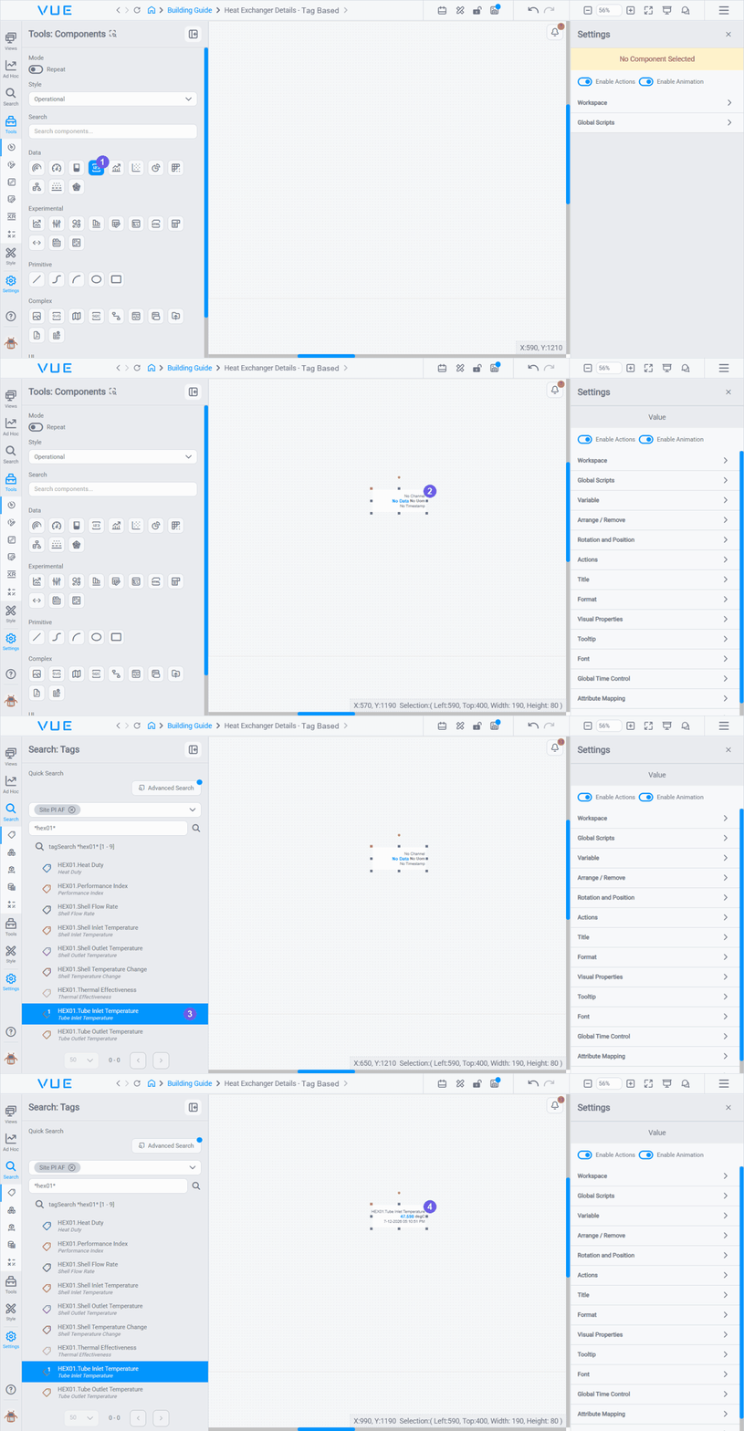
- In the editor, open the Components toolbox from the left sidebar.
- Under Data, drag a Value component onto the canvas.
- Open the Search panel (magnifying glass icon in the sidebar) and search for
Tube Inlet Temperaturein the Tags tab. - Drag the result onto the Value component.
The component now displays the live reading, the timestamp of the last update, and the unit of measure.
Tips
Save after placing each component: click the Save button in the toolbar (or press Ctrl+S). If you close without saving, any unsaved placement is lost.
Build the Schematic
Now that you can place a component, give the display its schematic feel. A title label, an SVG background, and piping connectors form the visual structure that your Value components sit on top of.
Add a Title Label
A text label at the top of the canvas identifies which equipment the display is for. In the heat exchanger example, this is "Heat Exchanger HTX01 Details".
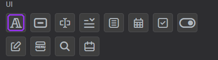
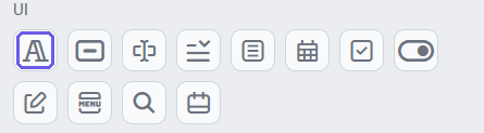
- From the Components toolbox, drag a Label (under UI) onto the canvas.
- In the Settings panel, type the display title in the Text field.
- Adjust the font size and color to match your theme.
Add an SVG Image from the Library
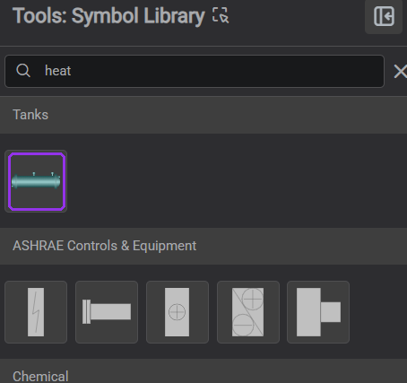
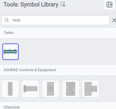
Open the SVG Library under the Tools panel and drag a heat exchanger image onto the canvas. This becomes the visual anchor for all value overlays.
- Click the Tools icon in the sidebar and open the Symbol Library tab.
- Browse or search for a heat exchanger SVG.
- Drag it onto the canvas and resize to fit the layout.
Add Polylines and Connectors
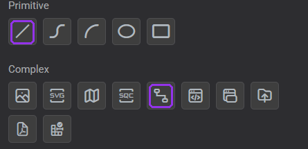
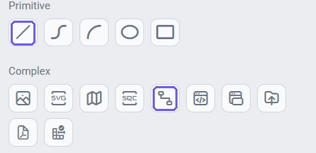
Use either the Line component (under Primitive, for free multi-point paths) or the Connector component (under Complex, which links two anchor points) to draw piping or flow paths around the equipment image; pick whichever suits the path you need.
- Drag a Line (or Connector) onto the canvas.
- Click to set each vertex of the pipe path.
- In the Settings panel, set the line color and thickness to match your piping style.
Overlay More Values on the Schematic
Now place the rest of the Value components, one at each point where a measurement enters or leaves the equipment, using the same drag-and-bind flow from Place Your First Value Component. Positioning them directly on top of the SVG gives the schematic a live-data feel: temperatures, flows, and pressures appear exactly where they belong on the diagram.
- Drag a Value component onto the canvas and position it over the relevant inlet or outlet on the SVG (e.g., tube inlet).
- Open the Search panel, find the corresponding tag, and drag it onto the Value component.
- Repeat for each measurement point on the schematic.
Line the overlays up neatly
To keep the readings evenly placed around the schematic, select the components you want to line up (Shift-click each one, or drag a marquee around them), then open the Workspace section of the Settings panel and use its Align Controls: Align Objects to line up their edges or centers, and Distribute Objects to space them evenly. See Aligning and Distributing Components.
Add a Line Chart
Line Charts trend one or more tags over the selected time range. The example below builds the display's Performance Analysis chart: the three heat-exchanger performance metrics (Thermal Effectiveness, Performance Index, Heat Duty).
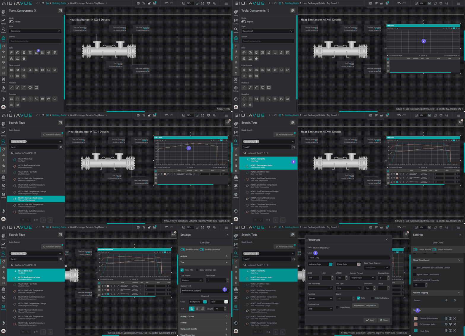
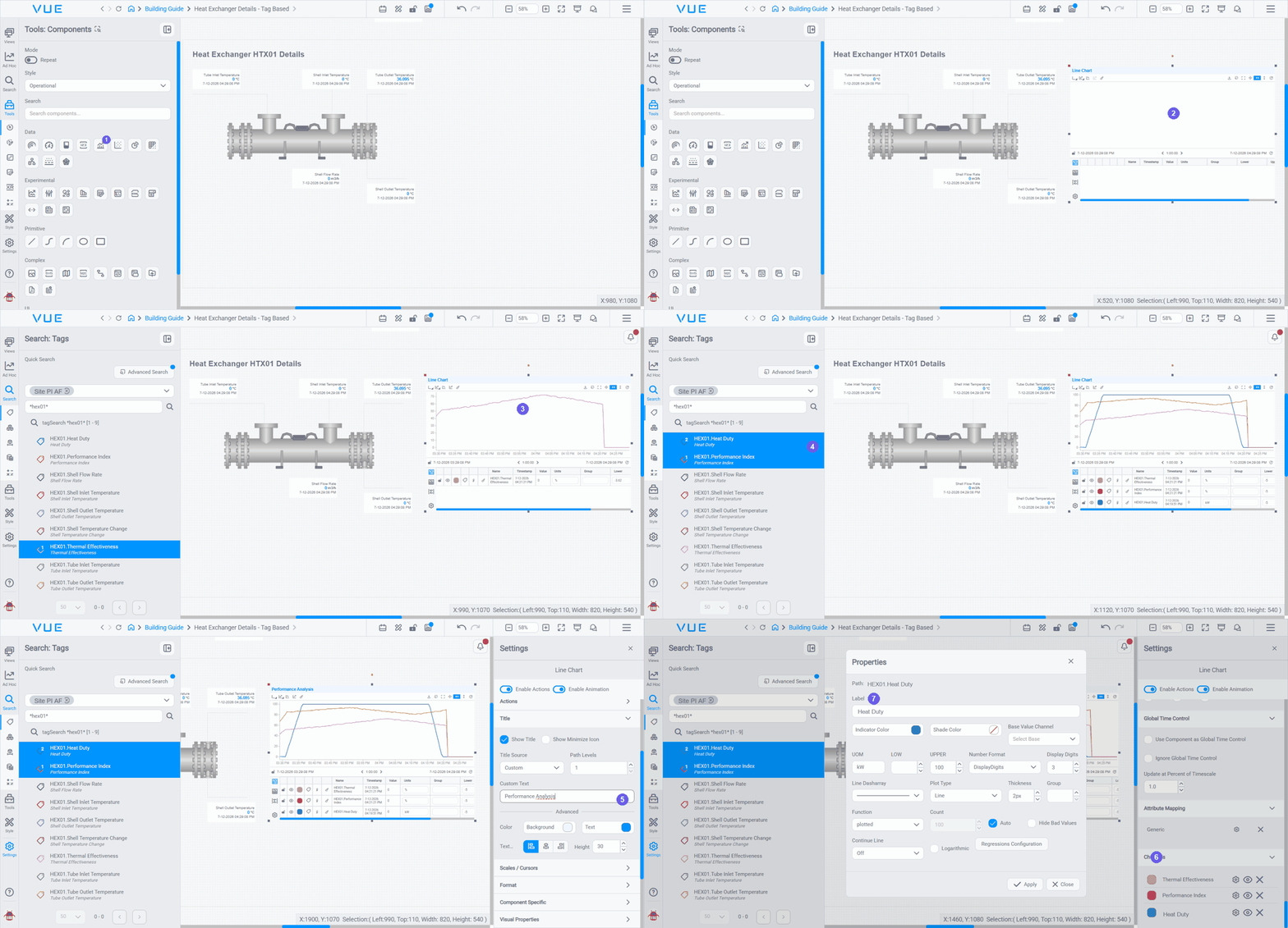
- From the Components toolbox, under Data, select the Line Chart.
- Drag it onto the canvas.
- Open the Search panel, find a channel (e.g.,
Thermal Effectiveness), and drag it onto the chart: it becomes the first trace. - To add more, multi-select: click the channel you want next, hold Ctrl and click the others, then drag them onto the chart together. Each becomes its own auto-colored trace. (You can reorder them later in Settings.)
- Rename the chart: open the Settings panel and set Title → Custom Text: here,
Performance Analysis. - In Settings → Channels, open a channel with its gear icon.
- Change its Label to a friendly name and click Apply. Repeat for each channel.
Legend labels
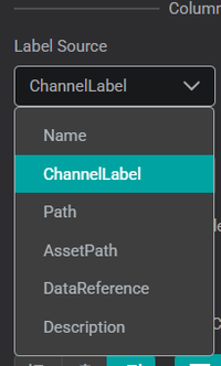
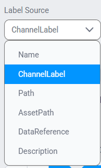
The Legend Data Format → Label Source setting controls what each trace is called in the legend and data table. Set it to Channel Label to show the friendly Label you gave each channel instead of the raw tag path.
The finished chart:
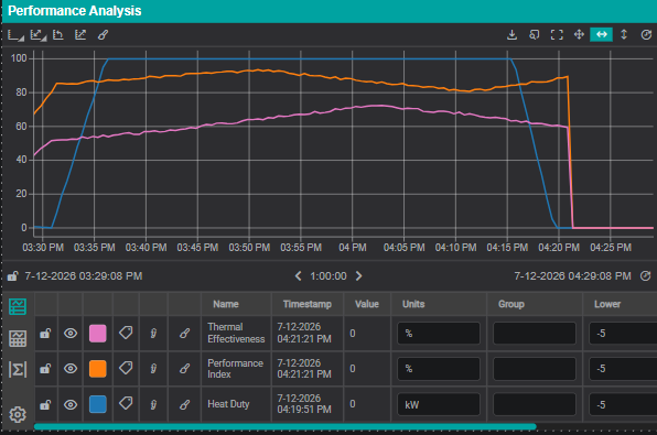
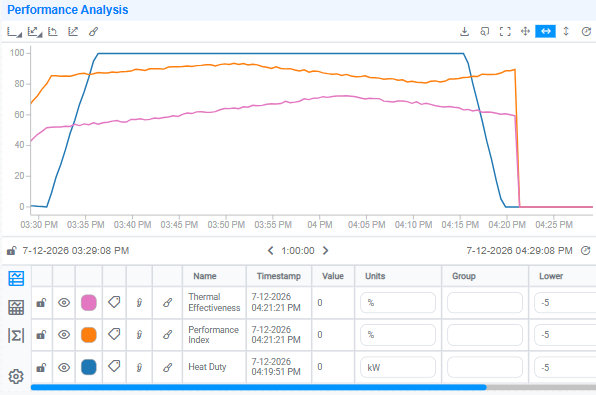
Use the Global Time Control (GTC) to adjust the visible time range. All time-aware components (the chart, any Value components showing timestamps, and table columns), update together.
Make one component ignore the GTC
Sometimes a component should keep its own fixed time range regardless of the GTC, for example, a reference table pinned to a past shift. Select the component, open Settings → Global Time Control, and enable Ignore Global Time Control. See the component settings reference for details.
Add a Table
Table components display multiple tags as rows: useful when you want to show several readings in a compact list without placing individual Value components.
Basic Table: drag and drop tags
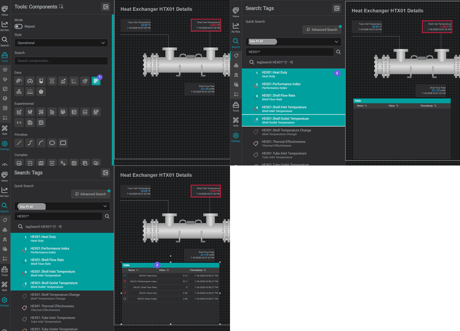
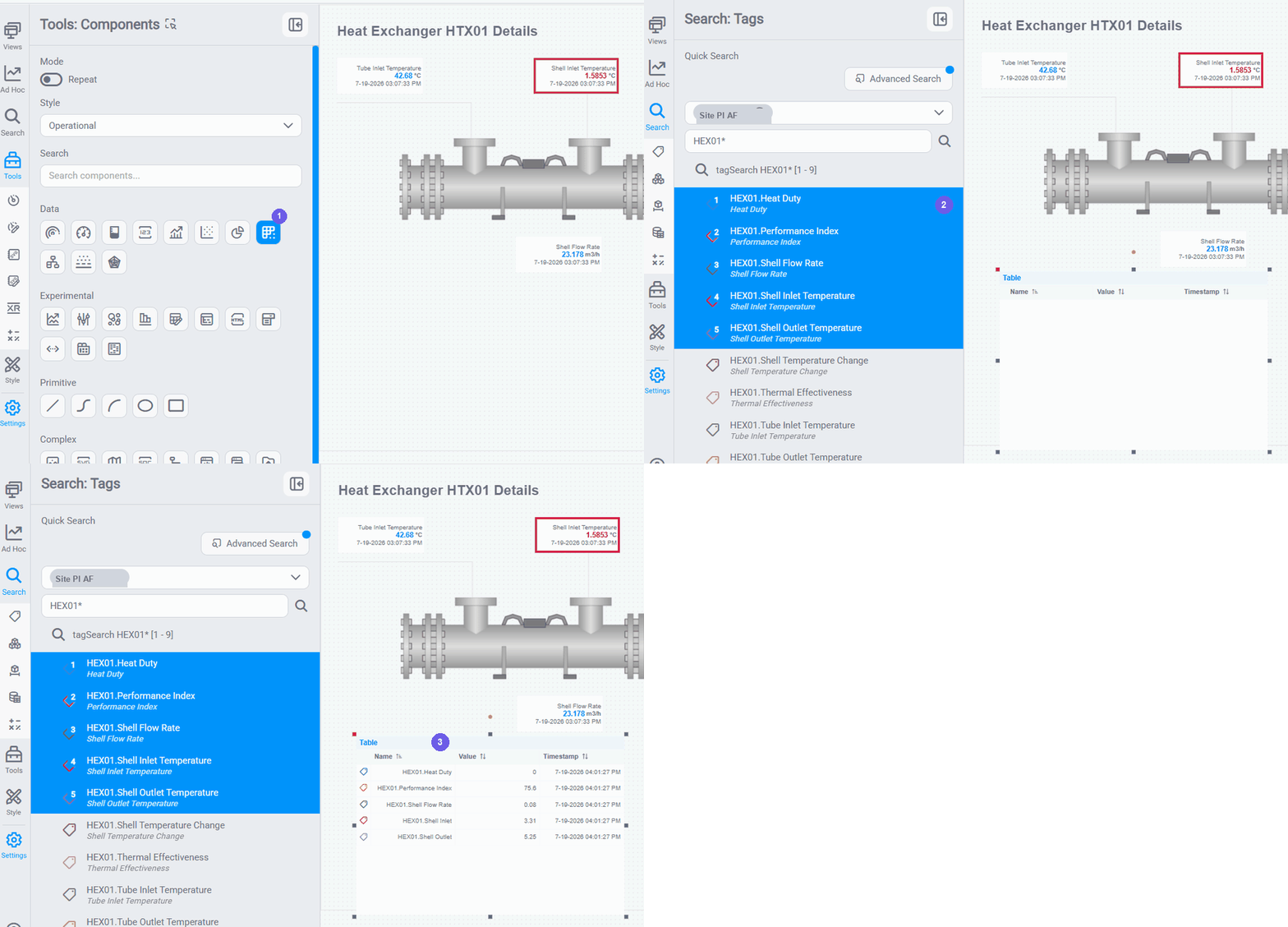
The quickest way to build a table is to drag tags straight from the Search panel:
- Drag a Table component from the Components toolbox onto the canvas.
- Open the Search panel → Tags tab, search for the signals you want (for example
HEX01 Heat Duty,HEX01 Performance Index,HEX01 Shell Flow Rate), and multi-select the results. - Drag the selected tags onto the Table: each one becomes a row.
KPI Table: style columns and add range values
The Basic Table above already holds your channels. Turn it into a polished KPI summary by configuring it through the Settings panel:
- Friendly names; open Settings → Channels, click the gear icon on a channel and edit its Label to a friendly name (e.g.,
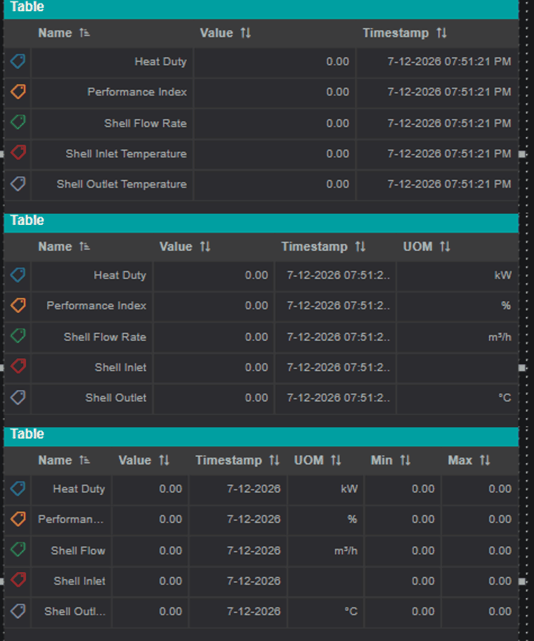
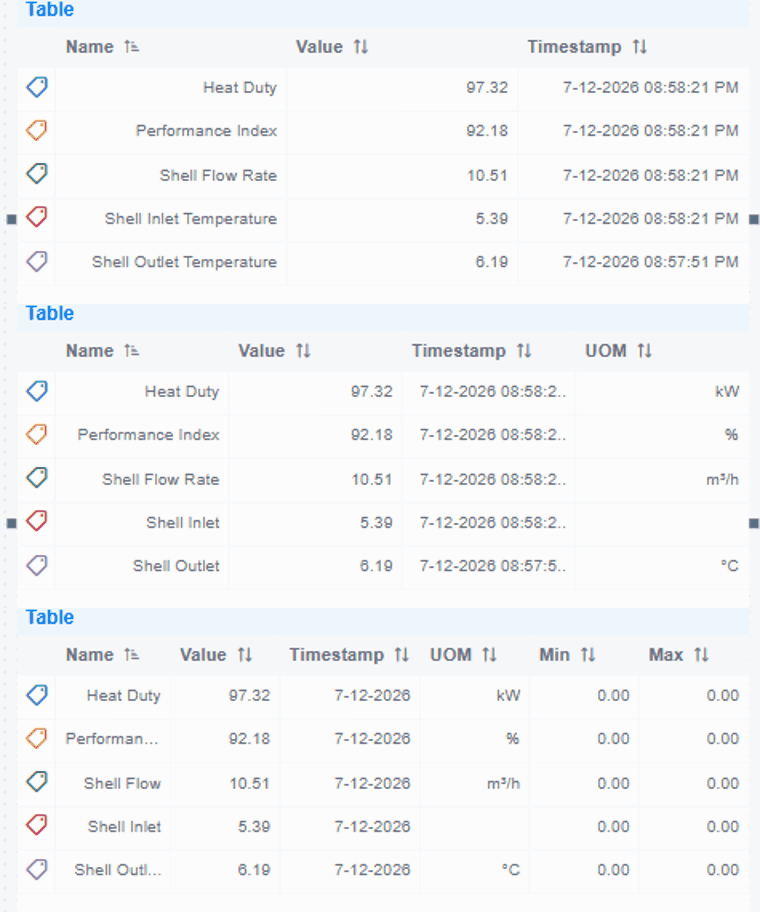
Heat Duty); then set Format → Column Format → Label Source to Channel Label so the table shows those labels instead of the raw tag path. - Choose which columns show, in Format → Column Visibility, toggle the columns you want. Beyond Name, Value, and Timestamp, turn on UOM to show units; State, Type Icon, and Trend are available too.
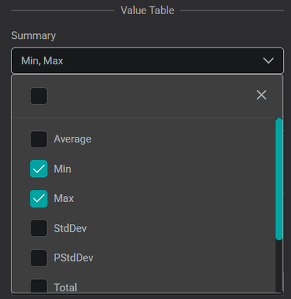
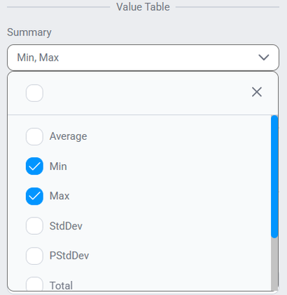
- Add Min/Max range columns; open Component Specific → Value Table and set Summary to Min, Max. This adds Min and Max columns showing each channel's range over the selected time window.
As you toggle these on, the table fills out live: starting with Name, Value, and Timestamp, then gaining the UOM column, then the Min and Max range columns:
- (Optional) Number format: under Column Format, set the number format (e.g.,
0.00for two decimals). The finished example on this page keeps the default format. - Color-code rows with multistate; add threshold rules so rows change color by value (for example, green above 80%, red below 60%). This is covered on the Multistate Behavior page.
Table controls
The Table Controls section of the Settings panel changes how the table behaves: Show Header, Sortable (click a column header to sort), Global Filter and Column Filter (search/filter rows), Paginator (page through long tables), Footer, and Disable Selection.
To rename a column header, open Component Specific → Configure Columns and give a custom name to any column you've enabled in Column Visibility.
Fine-tuning components in Settings
Every component you place has a Settings panel: select the component to open it. The common sections below are shared by every component and documented in full in the Generic Settings reference; the exact options vary by component, but these are worth knowing:
| Section | What you can edit |
|---|---|
| Title | Show/hide a title bar and style it (custom text, background and text color, alignment). |
| Format | How data is displayed: number format and display digits, and Label Source (raw tag path vs. friendly Channel Label). For tables, this is also where Column Visibility and header/body alignment live. |
| Component Specific | Options unique to the component. On a Table: Value Table → Summary (the Min/Max range columns), historic data, and transpose. On a Line Chart: scales, cursors, and regressions. |
| Channels | The data series themselves: rename each channel's Label, set its color, and (for charts) its plot type and thickness. |
| Actions | Value-based color rules and click/navigation behavior. See Multistate Behavior. |
| Visual Properties / Font / Tooltip | General look: background, borders, fonts, and hover tooltips. |
Select any component and skim these sections to fine-tune it: the Value, Line Chart, and KPI Table on this page were all styled this way.
Reuse a channel on another component
When the same tag needs to appear on more than one component, you don't have to search for it each time. Copy the channel from a component that already has it:
- Place the target component on the canvas.
- Select the component that already shows the channel and open Settings → Channels.
- Drag the channel from the list onto the target component. It binds immediately: no searching required.
This is the quickest way to repeat one signal across, for example, a Value, a Line Chart, and a table.
Saving and Locking
When the display is ready for viewers:
- Save the display: click the Save button in the toolbar (or press Ctrl+S).
- Switch the lock toggle in the toolbar to lock the display.
Viewers will see the display exactly as it was when locked, including the GTC state. If you want viewers to start with a default time range, set it in the view's properties (the Time Context tab) before locking; see Editing Display Properties.
Explore more components
Value, SVG, Line Chart, and KPI Table are a starting point: the same tag-connection workflow applies to any data component. Try a Bar Chart for shift or batch comparisons, a Gauge for at-a-glance current values, or a Pie Chart for composition breakdowns. See the Components Reference for the full list.
What's Next
Your display now shows live values, but a reading looks the same whether it is normal or alarming. The next page adds multistate rules so components change color based on their values. Continue to Multistate Behavior.
Related
- Searching for Tags, Assets & Datasets: how to use the Search panel effectively
- Line Chart Deep Dive: channel settings, trace formatting, and known behaviors
- Multistates & Conditional Formatting: add color rules based on data values
- Sharing Displays: publish and manage viewer access
- Components Reference: full reference for all available components
- Data Search and Visualization: Video guide to Quick Search and Advanced Search for tags and assets
- Primitive Components: Video: building process diagram overlays with SVG shapes; note: some UI steps may differ from the current version
- Table Component: Video: configuring tabular data with sorting and filtering; note: some UI steps may differ from the current version