
Customizing a Trend
Customizing a Trend
Once you've built a trend, customize how its traces are drawn so multiple signals stay legible (color, plot type, and scales), and switch state signals to a timebar view. Most of these are driven from the table legend.
Adjust Trace Appearance & Scales
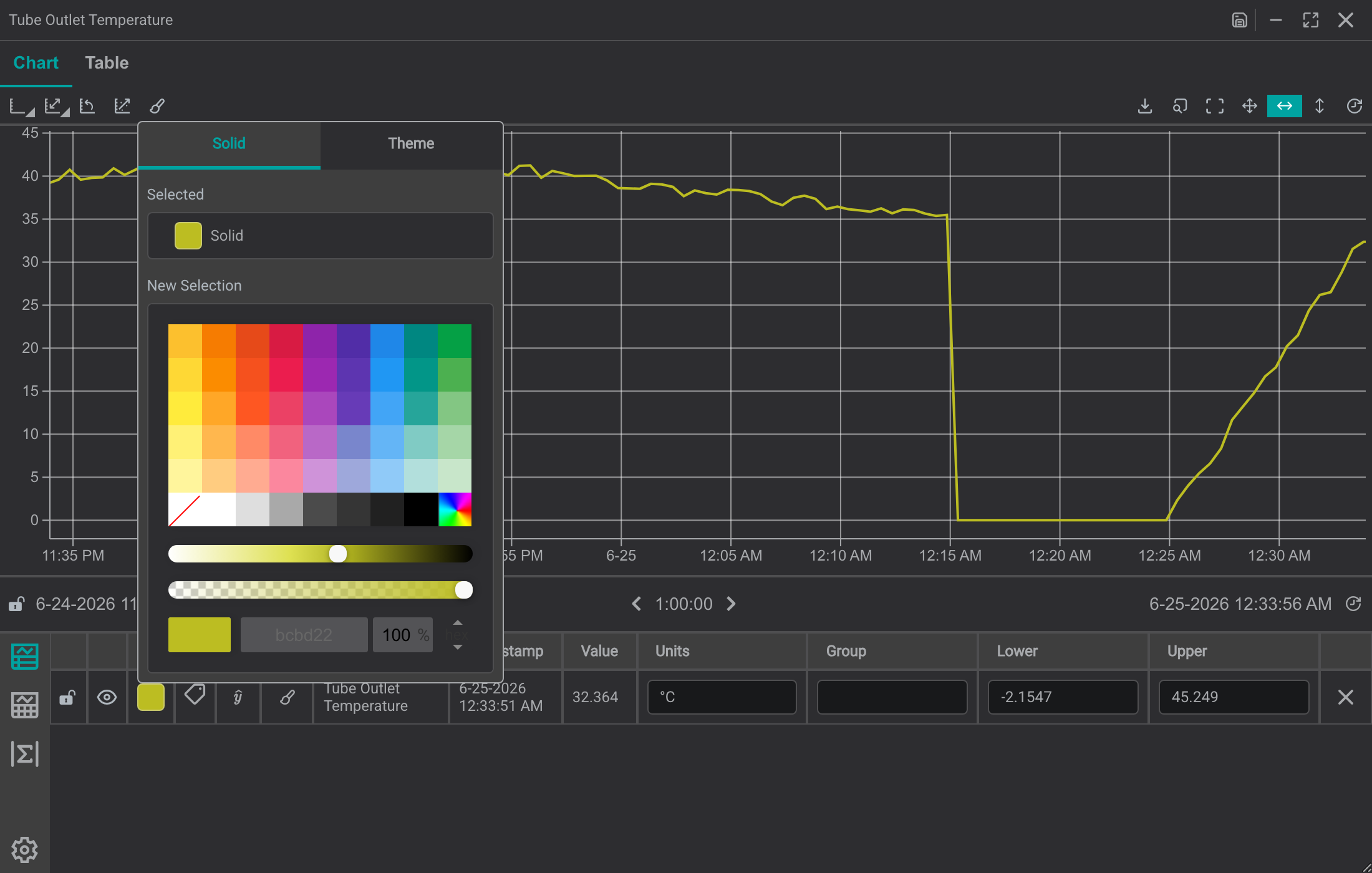
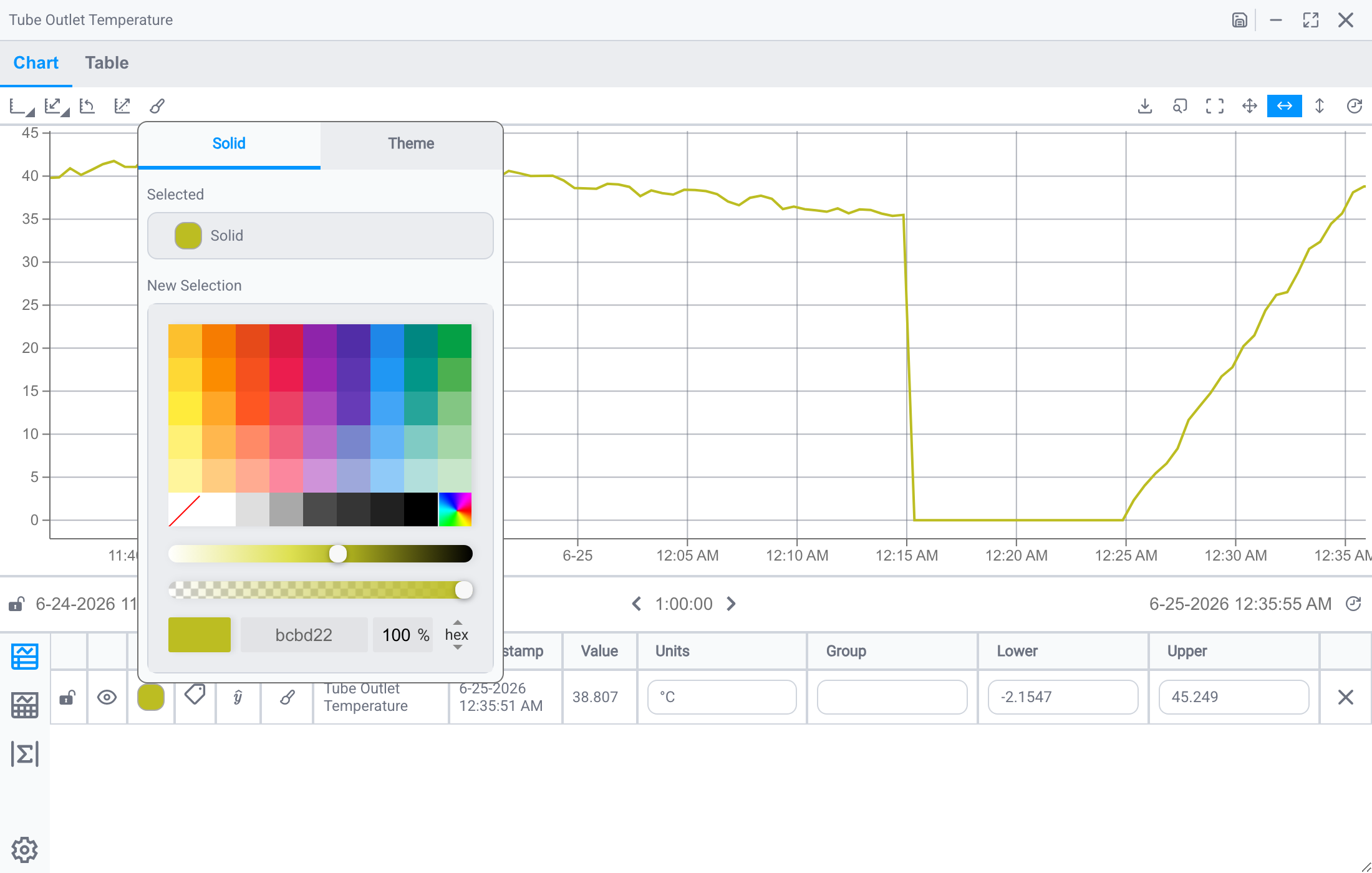
Change Trace Color
You can adjust the color of the trace using the color picker.
Adjust Trace Step Settings
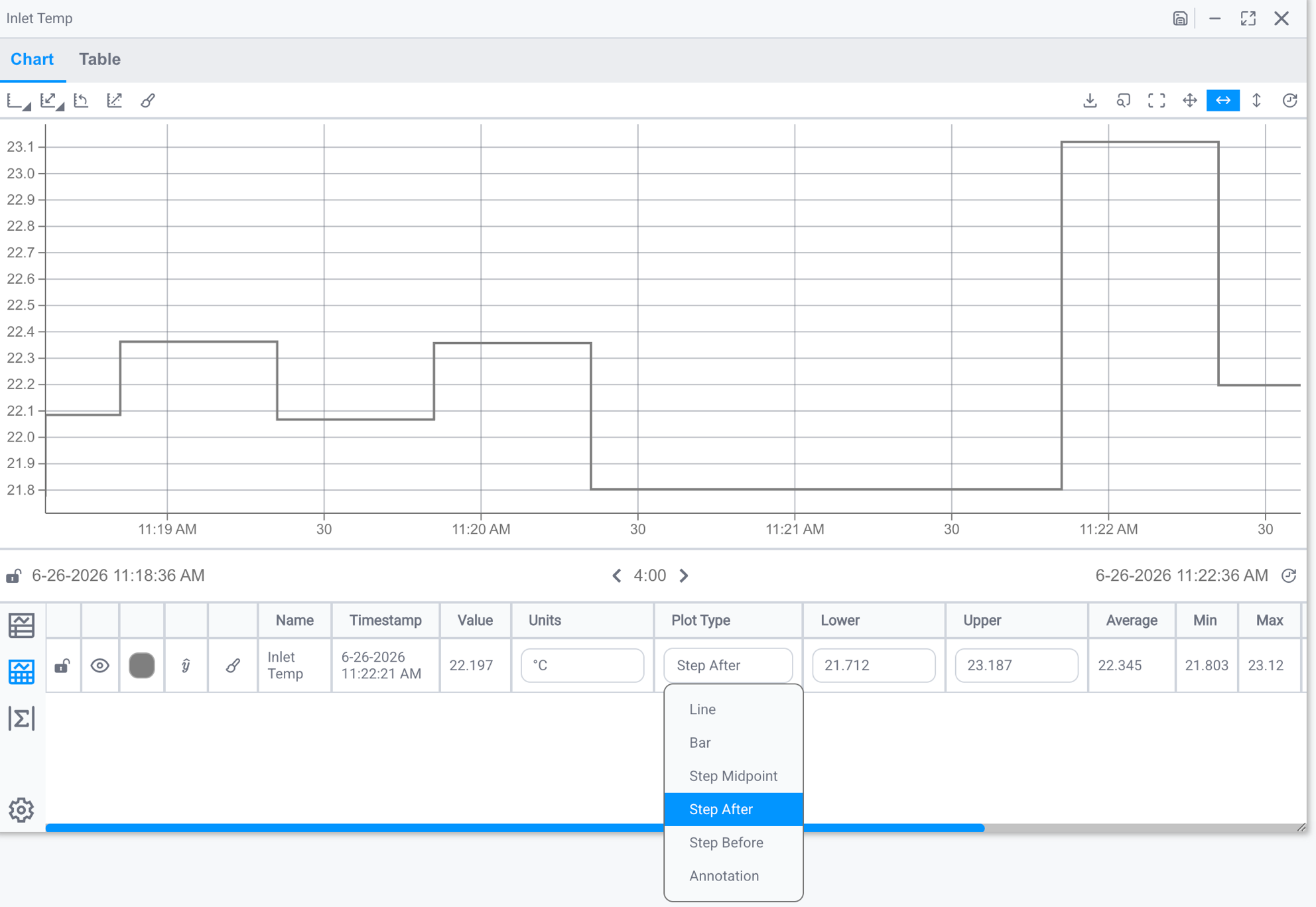
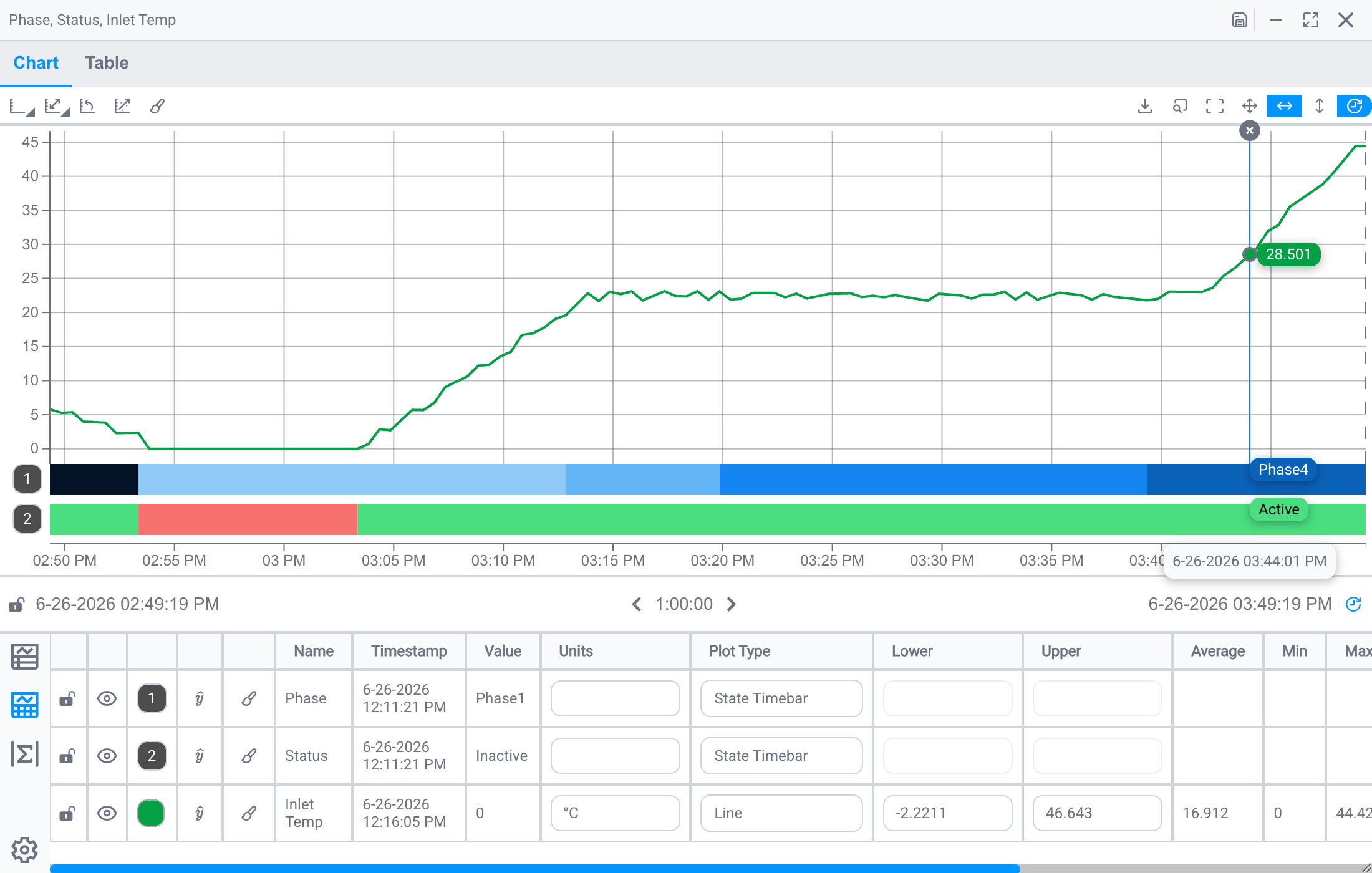
A trace's Plot Type controls how IOTA draws the line between data points. By default IOTA uses the step property from the data source, but you can override it per trace from the Plot Type column in the table legend:
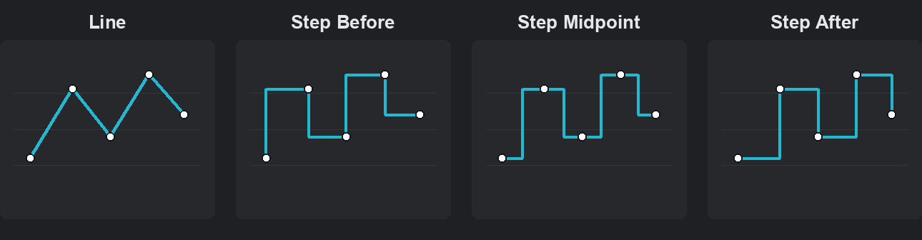
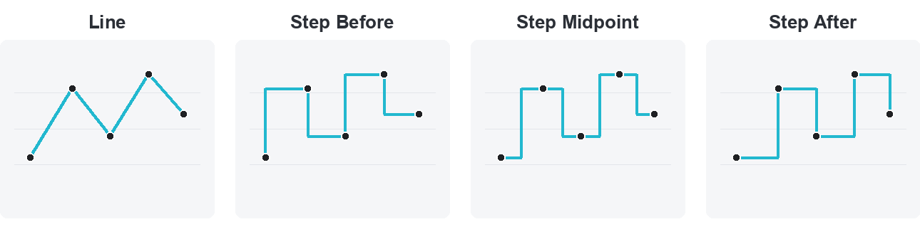
- Line: connects consecutive readings with a straight, sloped line. Best for analog signals that change smoothly between readings, such as temperature, pressure, or flow.
- Step Before: steps to each new reading at the previous point and holds flat up to it (the change is drawn before the point).
- Step Midpoint: holds each value, then steps to the next reading at the midpoint between the two timestamps (the change is drawn halfway between the points).
- Step After: holds each reading's value until the next reading arrives, then steps to it (the change is drawn after the point). This is the classic "sample and hold": the chart shows the value that was actually in effect at each moment, instead of sloping toward the next reading. Best for counters, setpoints, and digital/state signals.
The Plot Type menu also offers Bar (draw each reading as a bar) and Annotation (mark readings as labelled points instead of a connected line).
The diagram below shows the same five readings drawn with each Plot Type: the dots are identical, only the line between them changes:
Set it from the Plot Type column in the table legend:
Show Signals on Different Scales
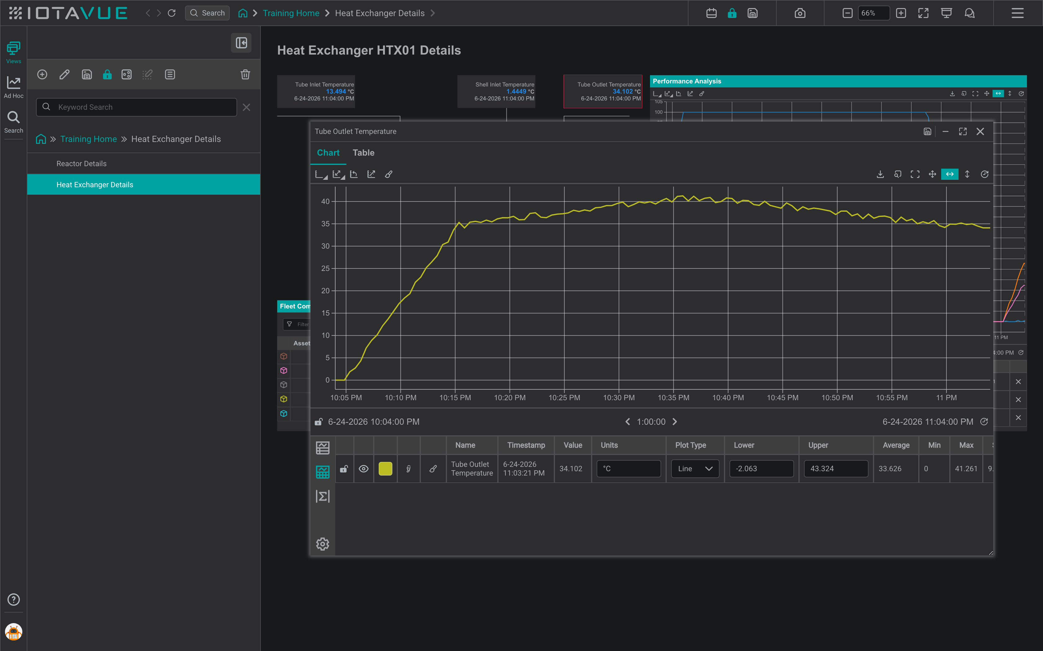
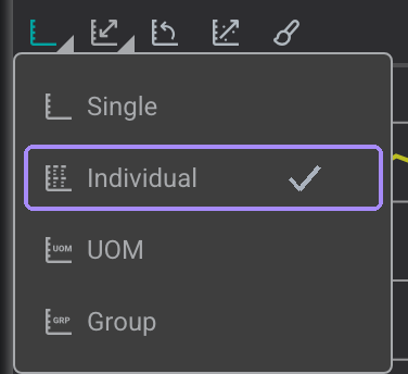
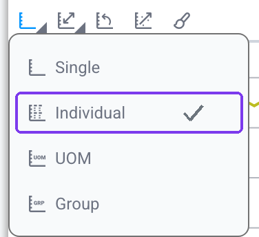
When signals have different value ranges, use separate scales so each signal is displayed clearly. Use the scale selector and choose Individual.
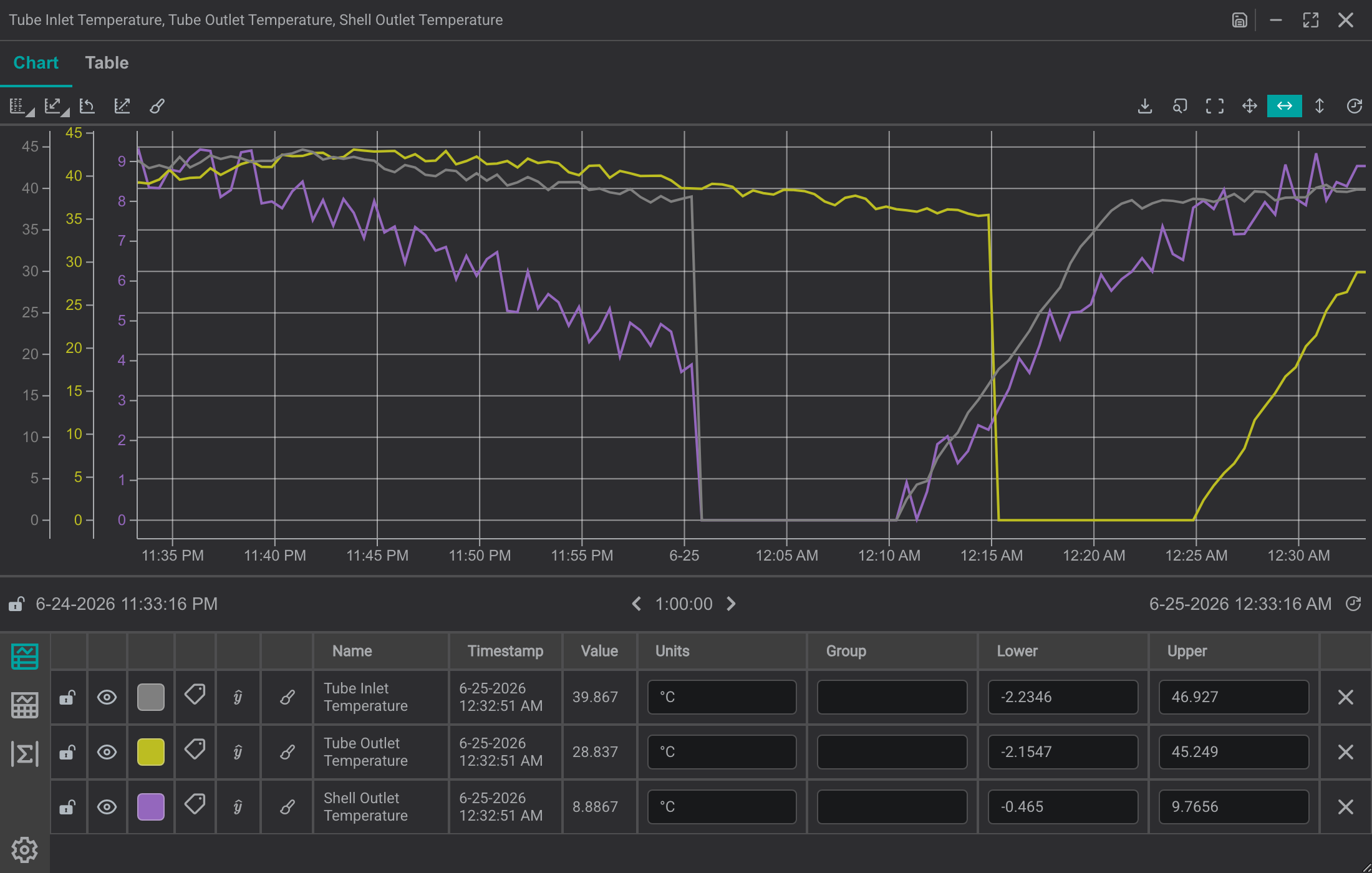
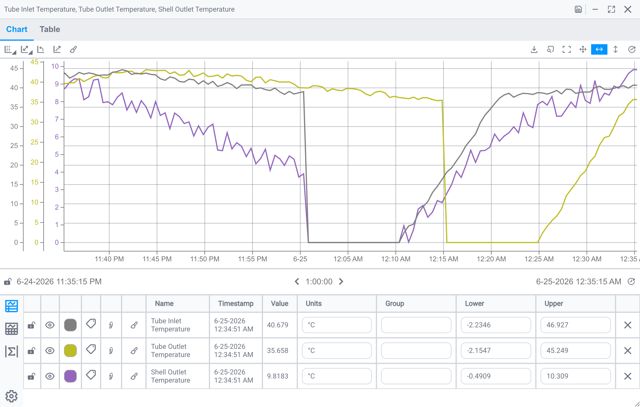
Group Scales by Unit of Measure
After you have added more than two signals, it can be useful to group their scales. A common scenario is placing signals on the same scale when they share a unit of measure.
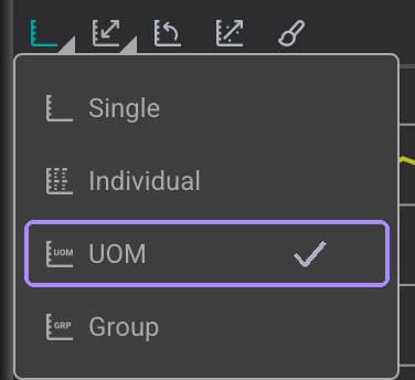
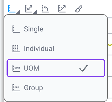
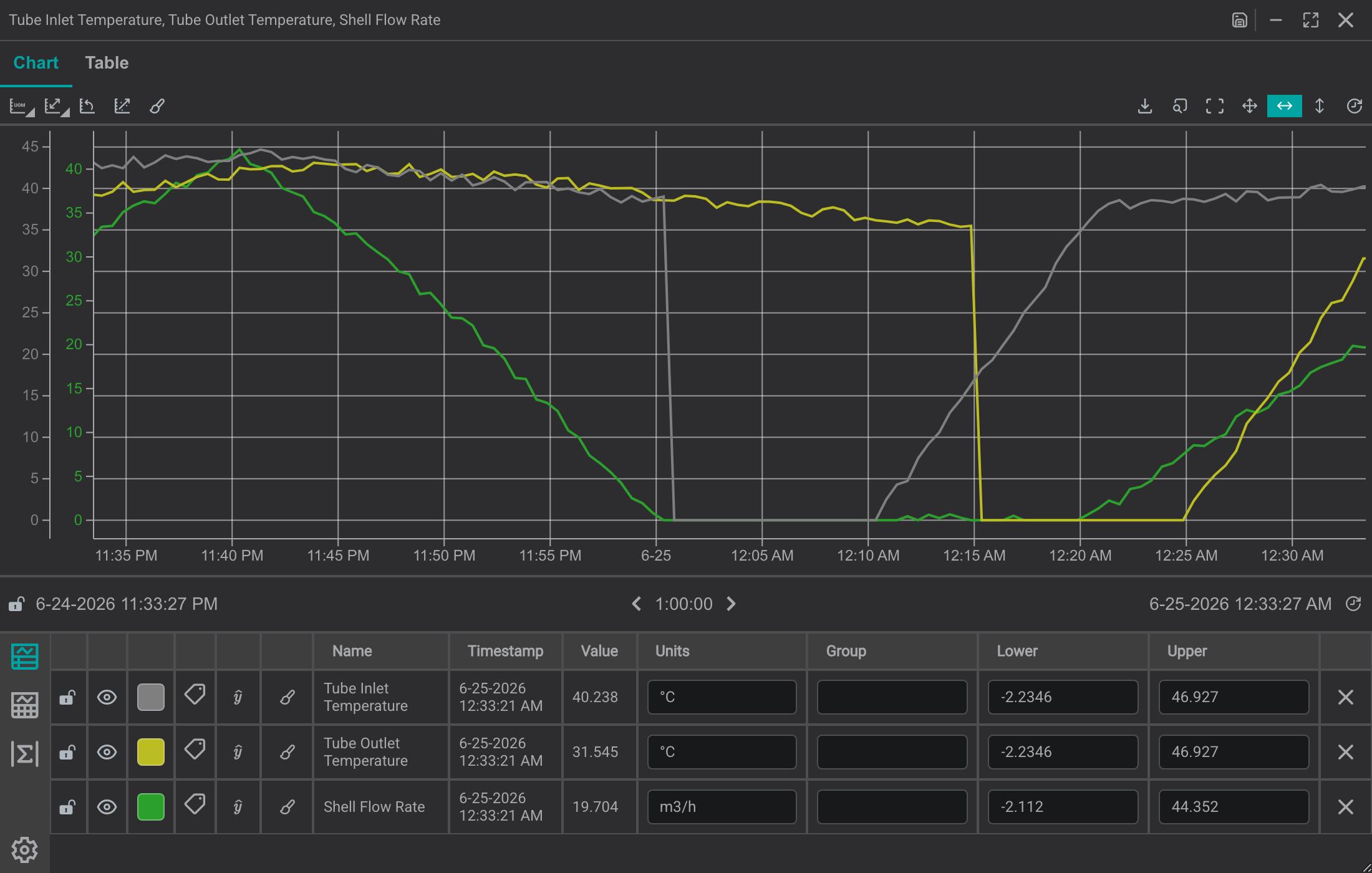
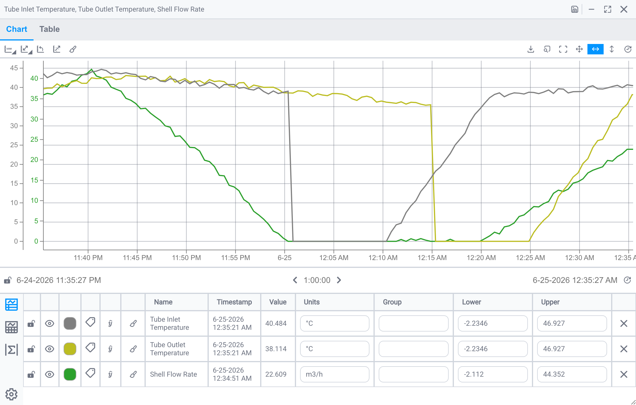
Use UOM grouping in the scale selector to keep related signals on the same axis and reduce visual clutter. When signals are grouped onto a shared scale, that scale takes the color of the first channel in the group. IOTA reads units from the data source. If units are incorrect, missing, or have different capitalization or spelling, edit the Units field in the legend manually and then apply UOM grouping.
Group Scales by a Custom Label
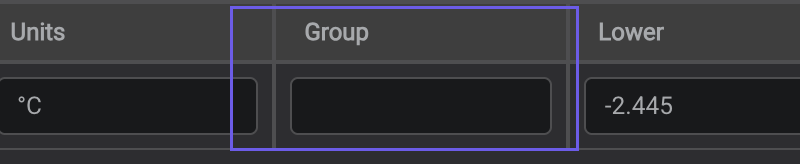
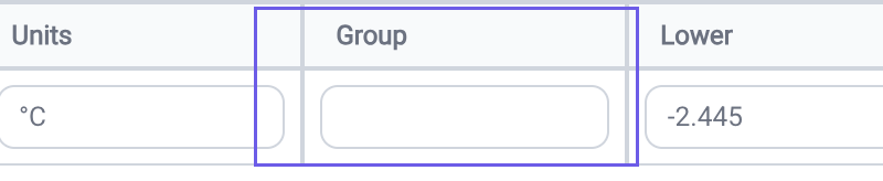
When grouping by unit of measure isn't the split you want, assign your own group labels instead. Set the scale selector to Group, then enter a label, any text or number, in the Group column of the table legend. Signals that share a label share a Y-axis, so you can pair up exactly the signals you want (for example, two flows on one axis and a pressure on another) regardless of their units.
Visualizing States
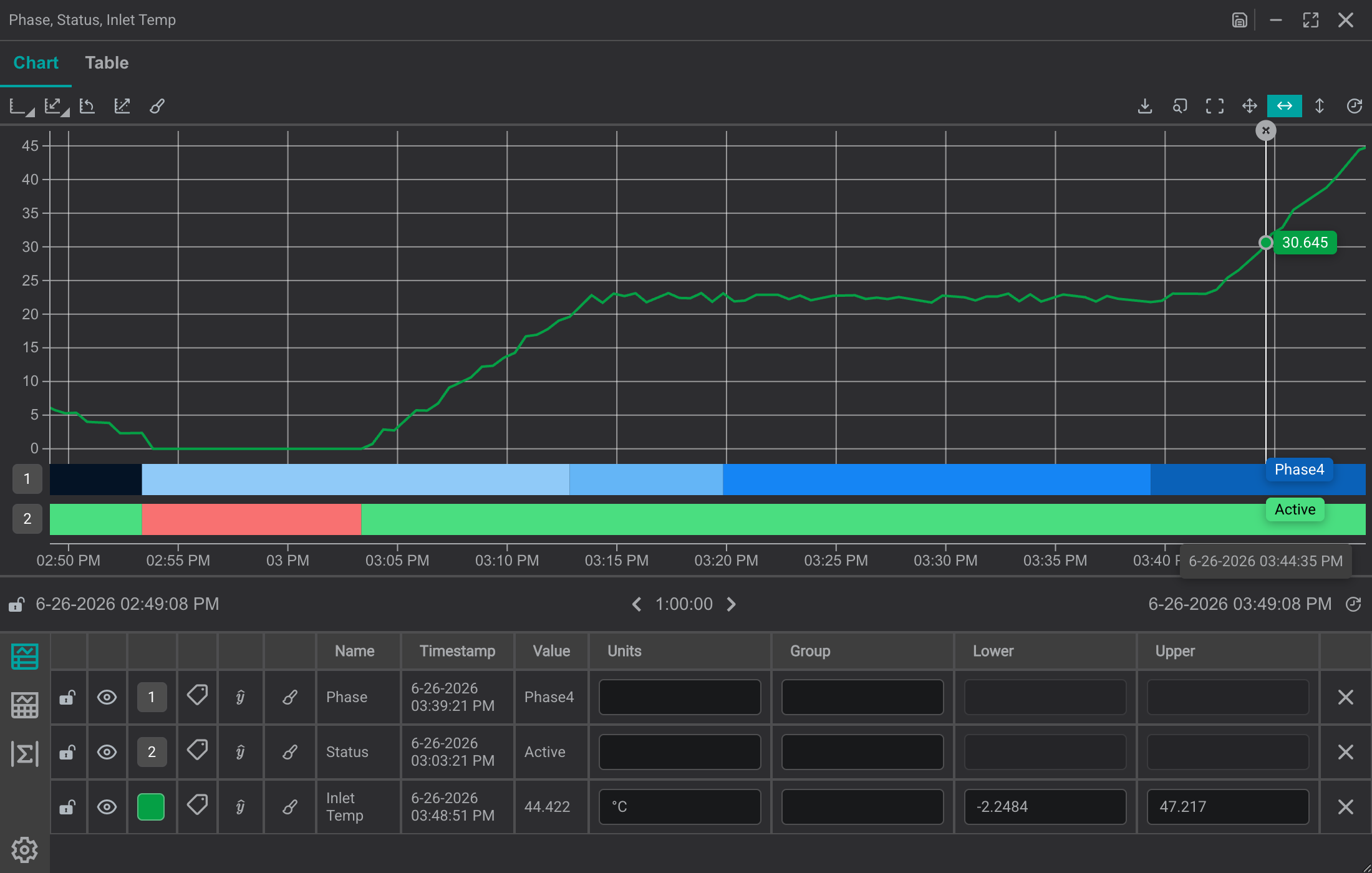
For signals that represent states (such as Active/Inactive, Open/Close, or various phases), choose the State Timebar plot type from the Plot Type column in the table legend (see Adjust Trace Step Settings). This option appears for Digital signals that support Digital Sets and for String signals. Then use the trace format icon to adjust the state colors.
Tips
To find anomalies and surface patterns (read values with cursors, color out-of-spec areas, and overlay regression and limit lines), continue to Analyzing a Trend.
What's Next
Once your traces are readable, continue to Analyzing a Trend to place cursors, add regressions, and read exact values.
Related
- Analyzing a Trend: cursors, regressions, and statistics
- Building a Trend: add signals and set the time range
- Line Chart Deep Dive: full chart configuration reference