
User Profile & Preferences
User Profile & Preferences
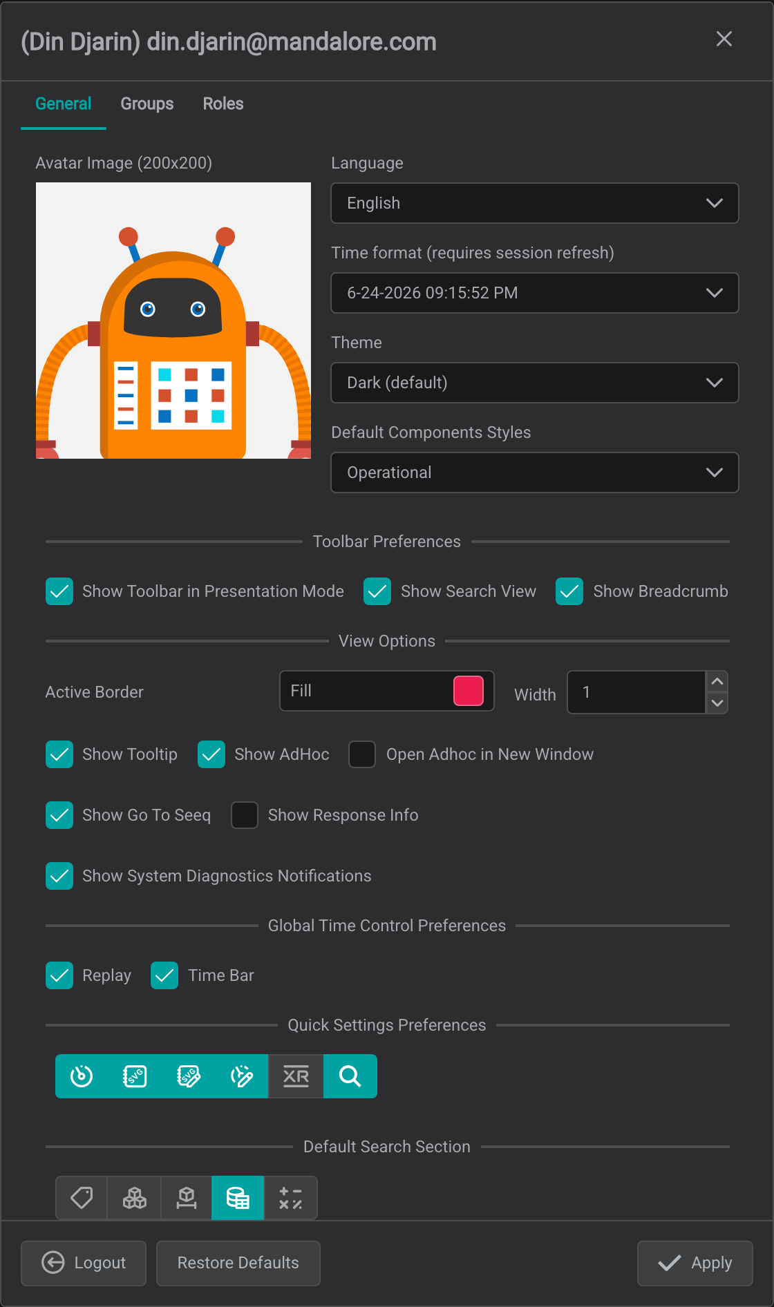
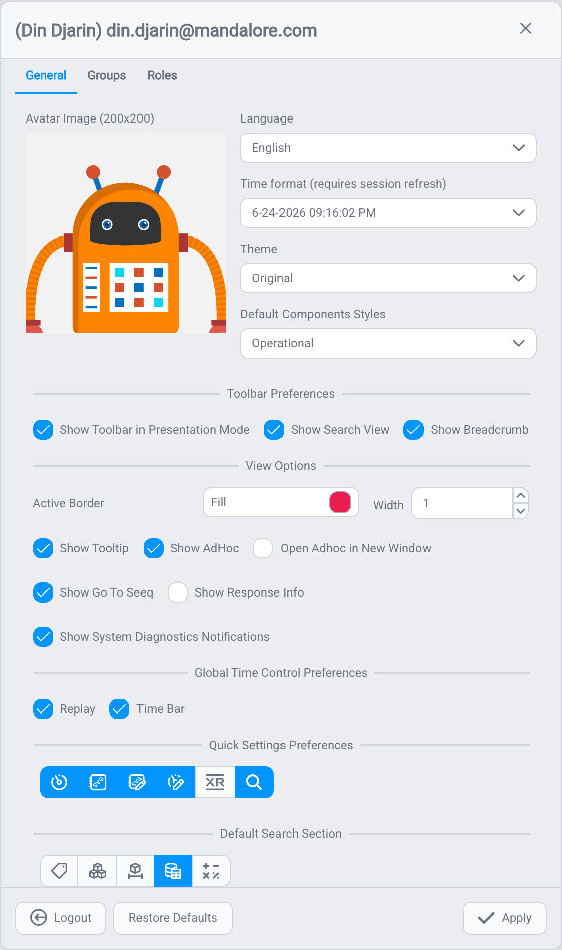
Your user profile lets you personalize how IOTA Vue looks and behaves. Open it from your avatar at the bottom of the side panel, change any settings, then click Apply. Use Restore Defaults to undo all of your changes.
Profile Picture
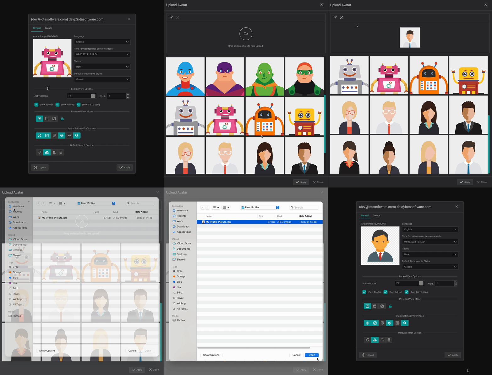
Change the picture shown on your avatar at any time:
- Open your user profile and click your current picture.
- Choose one of the built-in options, or upload your own: click the upload icon, or drag and drop an image file into the drop area.
- Click Apply to save.
Appearance
Your administrator sets a default theme and default component style for your account: the default is marked (default) in each list. You can always pick your own instead, or choose the default option to reset to what your administrator configured.
- Theme: switch the overall look of IOTA Vue, for example Original or Dark (default).
- Language: set the interface language.
- Time format: choose how dates and times are displayed across views and trends.
- Default Components Styles: the Component Style applied to your components by default (for example, Classic). This controls the layout, for instance, whether the ad hoc trend shows a compact regular legend or a full table legend. This setting also decides which style your ad hoc trends use; see How styles apply to ad hoc trends.
Selection Color and Active Border
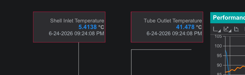
When you select a component, especially when you Cmd/Ctrl + click several components to trend them together, IOTA highlights the selection so you can see what you picked. The Active Border setting controls that highlight:
- Fill: the selection color.
- Width: the thickness of the selection border.
If you find the highlight distracting, you can turn it off: set Width to 0, or set the Fill color to transparent.


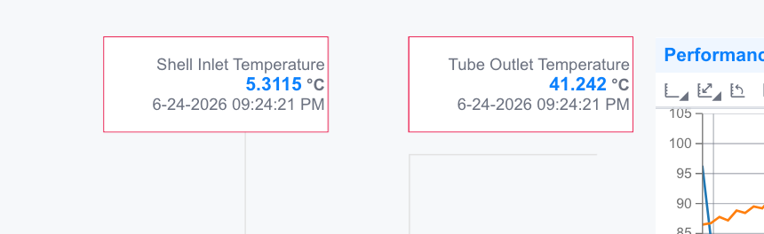
On a display, selected components are outlined in your chosen color: here two value components are selected for trending together:
View Options
These options control what appears while you work with displays and trends.
Ad hoc trends
- Show AdHoc: allow opening ad hoc trends from components.
- Open Adhoc in New Window: open an ad hoc trend in a separate browser window instead of as a floating popup over the display.
Reading more detail
- Show Tooltip: show the hover tooltip on data points.
- Show Go To Seeq: show the right-click option to open data in Seeq.
Troubleshooting
- Show Response Info: show data-response diagnostic information.
- Show System Diagnostics Notifications: show system notifications in the bell menu (see Troubleshooting & Notifications).
Global Time Control Preferences
These options add extra controls to the time control in the top bar:
- Replay: adds replay controls so you can play back a time period, with an adjustable playback speed.
- Time Bar: adds a slider to the time control for quickly moving to a different timestamp.
Toolbar Preferences
These control what appears in the top bar. Note that some are off by default, if you don't see the Search box or breadcrumb, enable them here:
- Show Search View: show the Search box in the top bar for quickly finding a view by name. Off by default.
- Show Breadcrumb: show the breadcrumb trail in the top bar. Off by default. (Which views appear in it is set per-view by the builder; see Viewer Workspace.)
- Show Toolbar in Presentation Mode: keep the toolbar visible in presentation mode, or hide it to maximize screen space on large, wall-mounted displays.


Builder preferences
The profile dialog also configures the Quick Settings toolbar and the default Search tab: builder-focused options covered in Workspace Setup.
What's Next
With your preferences set, see how the Viewer supports fast decisions in Decision Support in Control Rooms.
Related
- Decision Support in Control Rooms: the Viewer in operational settings
- Viewer Workspace: move between views and control the time range
- Troubleshooting & Notifications: when data or the system looks wrong