The Timeframe Annotation Table component provides comprehensive event management capabilities for PI AF event frames, allowing users to acknowledge events, add reason codes, and create annotations.
This component brings PI Vision-style event management workflows to IOTA Vue, enabling operators to track, document, and respond to events with full audit trail capabilities.
Supported data types
The following table outlines the data types supported by the Timeframe Annotation Table component:
| Channel Type | Supported? |
|---|---|
| Tag | ⚫ |
| Asset (Attributes) | ⚫ |
| Timeframe (Attributes) | 🟢 |
| Tag Search | ⚫ |
| Asset Search | ⚫ |
| Timeframe Search | 🟢 |
Warning
This page is under construction and may be incomplete.
Prerequisites
Before using the Timeframe Annotation Table component, ensure the following requirements are met in your PI AF system:
PI AF Version Requirement
- PI AF 2016 or later is required to use the event frame acknowledgement feature
Event Frame Configuration
- Event Frame Template: Event frames must be created from a template with acknowledgement explicitly enabled
- In PI System Explorer, navigate to your event frame template
- On the General tab, ensure the "Can Be Acknowledged" option is checked
- For detailed configuration steps, refer to the AVEVA documentation on event frame acknowledgement
- Reason Codes (Optional): If using reason codes, the event frame template must include:
- An attribute named
Reason(or similar) with data typeEnumeration Set - Configured enumeration values representing available reason codes (e.g., Mechanical, Operations, Electrical)
- An attribute named
Note: PI AF 2017 R2 and later supports hierarchical enumeration sets using pipe delimiters (e.g.,
Mechanical|Worn Bearing,Operations|Did Not Follow Procedure)
Security Configuration
- Service Account Permissions: The IOTA service account must have
Annotatepermissions on the relevant PI AF elements and event frames to enable write-back functionality for both acknowledgements and annotations- This permission is configured in PI System Explorer under the Security settings for your AF database
- Without proper permissions, users will see acknowledgement checkboxes but will be unable to check them
PI System Setup
Event frames are typically generated by PI AF analyses (Asset Analytics) that monitor different events (e.g., pump high amps, temperature excursions, equipment failures).
The event frame generator creates event frames based on start and end trigger conditions configured in the analysis.
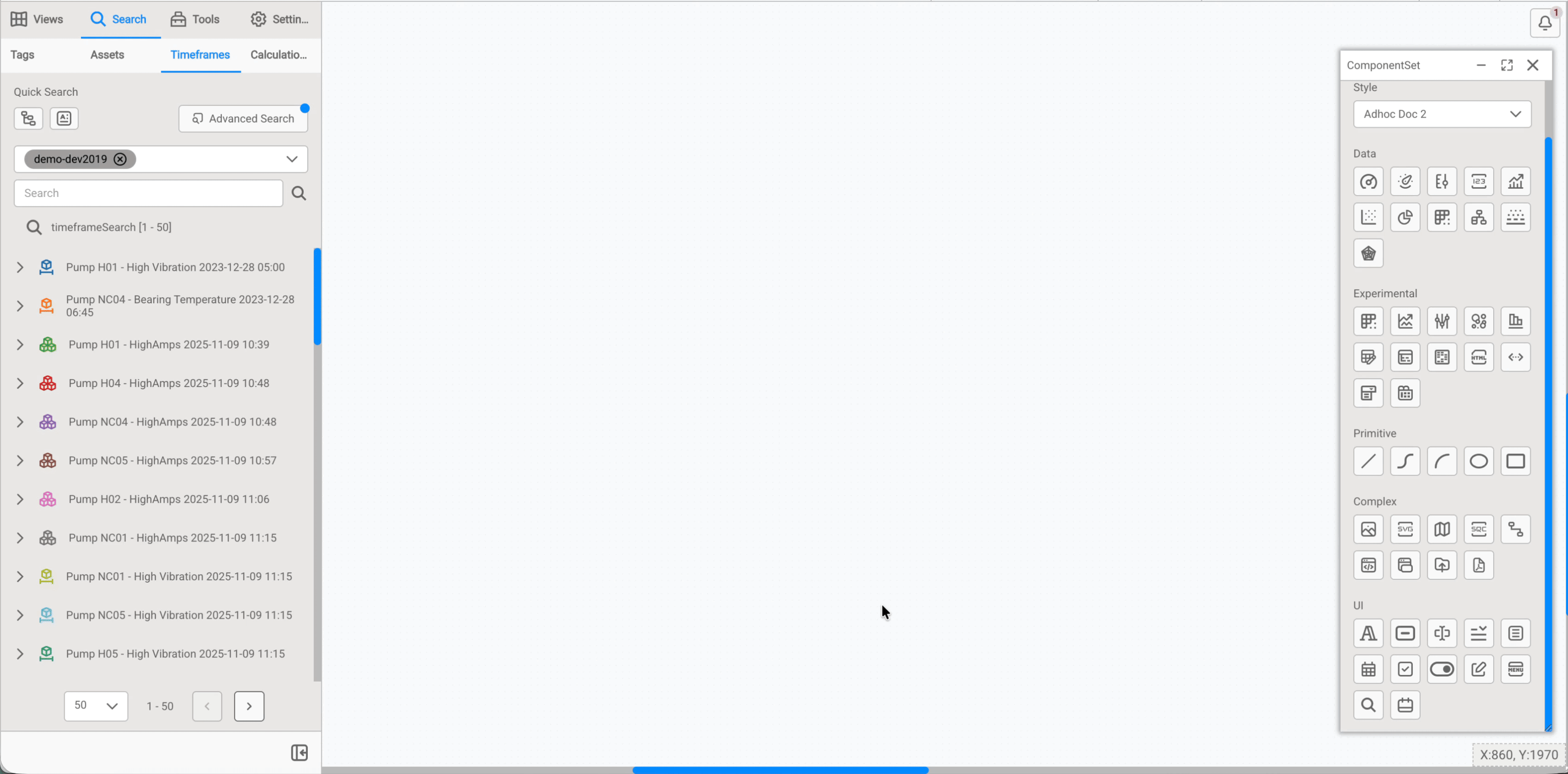
Quick Start
To quickly start using the Timeframe Annotation Table component:
- Drag and drop the component onto the work area
- Create a Timeframe Search:
- Navigate to Search → Timeframes tab
- Use Quick Search for simple searches, or click Advanced Search to filter timeframes by template, time range, attributes, and other criteria
- Configure the component:
- Drag and drop any single Timeframe onto the component
- The Attribute Mapping dialog opens:
- Select which attributes to display as columns (e.g., "Average Amps - Motor", "Duration")
- Optional: Select the
Reasonattribute to enable reason code dropdowns - Click Train Only
- Load the data:
- Drag and drop the entire search line (e.g., "timeframeSearch * [1 - 50]") onto the component
- The table populates with all matching event frames using your configured attributes
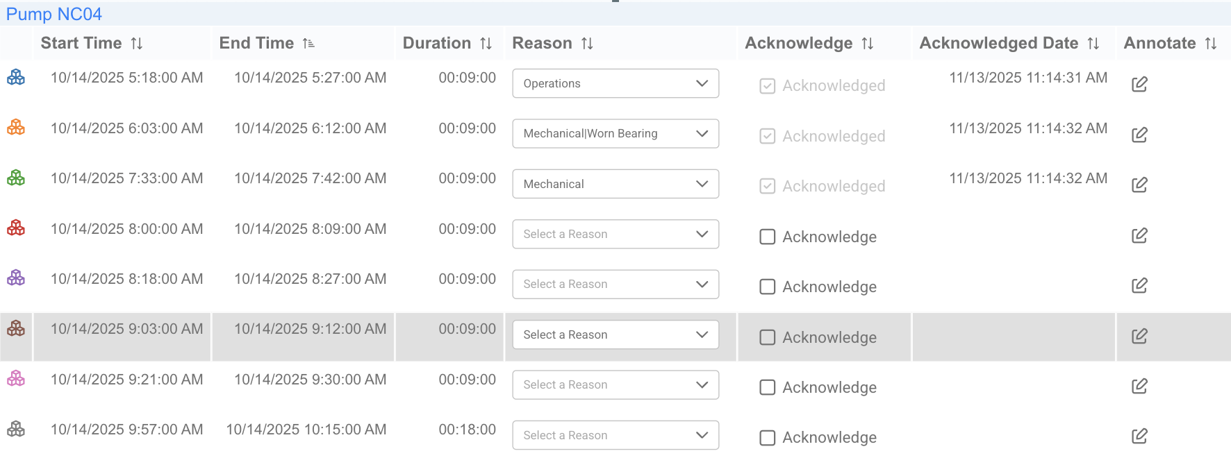
Result: The table displays with:
- Each row = one event frame
Acknowledgecolumn with checkboxesAnnotatecolumn with clickable annotation iconsReasoncolumn with dropdowns (if Reason attribute was selected)
Dynamic Updates
The component maintains a live connection to the search, automatically updating when new event frames match your search criteria or existing ones are modified.
Choosing between Timeframe Annotation Table and Timeframe component
- Use Timeframe Annotation Table when you need operator interaction features like acknowledgements, reason codes, and annotations for event management workflows
- Use the standard Timeframe component when you only need to visualize event durations and timing in a Gantt chart format without write-back capabilities
Generic Settings
Each IOTA Component has settings that are shared across most components. To view these settings, expand the corresponding section below:
Workspace
These settings are applicable to the whole view.
Grid Properties
The grid is provided for convenience when developing dashboards as visual guides and snapping capability.

By default the work area grid is enabled and can be customized or even disabled in this menu.
| Property Name | Description |
|---|---|
| Grid Color | Color of the grid |
| Grid Size | Size of the grid step |
| Snap to Grid | Enable/Disable snapping to the grid |
| Show Grid Lines | Show the grid as lines |
| Show Grid Dots | Show the grid as dots |
Align Controls
The Align controls provides a means to align and distribute selected objects on the display.

Align Objects
- You can align several components horizontally using the
Align-left,Align-centerorAlign-rightcontrols - You can align several components vertically using the
Align-top,Align-vertical-centerorAlign-bottomcontrols
Distribute Objects
- You can distribute several components on the vertical/horizontal axis by selecting them (select at least 3 components) and pressing
Align-vertical/Align-horizontal - You can make all the selected components the same width/height by selecting them and pressing
Adjust Width/Adjust Height
Tips
Hold the Ctrl button to select several components. The oldest component is used as a reference.
Anchor Points Options
The anchor points are eight squares around an object that allow you to resize the object. The anchor point options allow you to define the appearance of the anchor points.
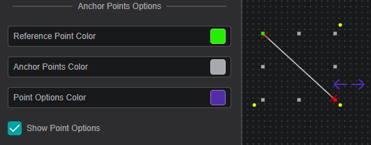
| Property Name | Description |
|---|---|
| Reference Point Color | Sets the color of the reference point (see Rotation and Position for more details) |
| Anchor Points Color | Sets the color of the rest of the seven anchor points |
| Point Options Color | Sets the color of the point options (only for Line and Bezier Curve) |
| Show Point Options | Show/Hide the point options |
Locked View Options
These options define the appearance of the component border in the locked view for the selected component.

| Property Name | Description |
|---|---|
| Active Border Fill | Sets the fill color of the border |
| Active Border Width | Sets the width of the border |
Variable

Every component has a unique variable name. This variable name can be used to reference the component in multi-state configurations and other scripts.
On creation, every component is given a default name. This can be overwritten to be more user-friendly. To do so simply overwrite the value in the variable input field.
Arrange / Remove
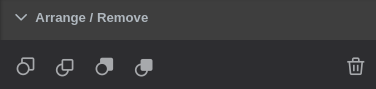
- Send Backward - move object one layer down
- Bring Forward - move object one layer up
- Send to Back - place object under all layers
- Bring to Front - place object above all layers
To send/bring objects to the front/back use the first four buttons. - Any set of components can be deleted by either using the
 button or
 delete/delkeyboard keys.
Rotation and Position

Reference Anchor Point- allows you to select one of the anchor points as a reference so that you can set anAngle(clockwise) of incline relative to this point.
By default the reference anchor point is the top left corner. You can also rotate the component by dragging one of the yellow corner points.- You can set the position of the component by setting the
XandYcoordinates relative to theReference Anchor Pointand the top-left corner of the work area. - You can drag any of the anchor points to change the width and height of the component, or you can set it manually by editing the
WidthandHeightboxes. - Set
Lock Aspect Ratioso that while changing width and height, the component width to height ratio stays the same Transformallows you to view the component as a mirror or a reflection of itself
Actions
Actions or multi-states are programmable conditional states handled by user-generated code.

Note
Actions that have script handlers are marked with a circle
in the top right corner.
The currently supported actions are described in the table below:
| Action | Trigger |
|---|---|
| OnCreate | When the component is created |
| OnFocus | When the component is selected |
| onClick | When the component is clicked or the selection is changed |
| onData | Each time the data changes for assigned channels |
| onTick | 20 times per second |
| onDblClick | On mouse double click |
| onHover | When the mouse is over the component (and not when the mouse is not) |
Further Reading
For helping you in writing your own actions, consider exploring the available Actions Deep Dive, as well as the Quick Start manual.
Also, multiple articles are available in IOTA's Knowledge Base.
Title
This section configures the title of your component.
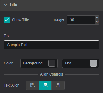
| Property Name | Description |
|---|---|
| Show Title | Show/hide the title line |
| Height | Height of the title line |
| Text | Text itself |
| Background Color | Background color of the title line |
| Text Color | Text color of the title line |
| Text Align | Alignment of the text within the title line: Left, Center, Right |
Global Time Control
To activate the Global Time Control panel click on  button in the upper area of the
 View:
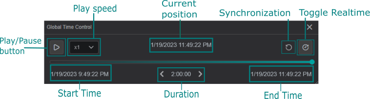
Additionally, you can configure the Global Time Control option in Settings for every component on the current display.

Use Component as Global Time Control: if enabled, the component is able to set the time context for all components on the current display.Ignore Global Time Control: when enabled, the option allows the component to function independent of global time set elsewhere.
The example below demonstrates the usage of the Global Time Control panel and how the value changes in the space of an hour:
Channels
The Channels section lists data that is assigned/mapped onto the component.
In this menu, you can change the data value color, adjust the display properties and un-assign or remove the data from the component.

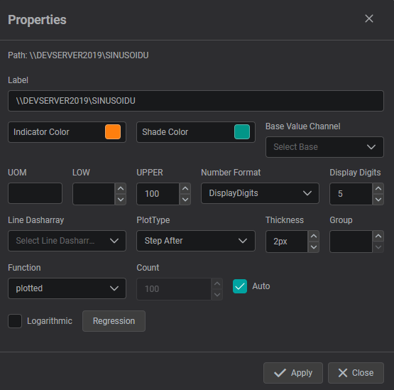
Properties
The properties menu for Channels allows you:
- to modify the Label of the DataSource
- to set UOM, lower and upper values
- to choose number format and displayed digits
- to adjust the line formatting for trend line components
- to configure the additional regression lines that can be plotted for supported components
Supported Multi-State Parameters
Each of the parameters listed below can be used as a multi-state, i.e. used in actions and scripts:
- Title and Text
- Text
- Rotation and Position
- Rotation
- Common
- Blink
- Hidden
- Visual Properties
- Border Color
- Border Width
- Border Radius
- Background Color
- Header Row Color
- Header Row Text color
- Body Row Color
- Body Row Text Color
- Font
- Font Family
- Font Size
- Italic
- Bold
- Underline
- Format
- Attributes
- Global Filter
- Number format
- Display Digits
- Acknowledgement and Annotation
- Record user in annotation on acknowledge
- Record user in annotation
- Global Time Control
- Ignore Global Time Control
Timeframe Annotation Table Settings
Component Specific
The Component Specific section provides configuration options for table behavior, displayed columns, and user tracking.
Acknowledgement and Annotation
Controls whether user information is automatically recorded when events are acknowledged or annotated.
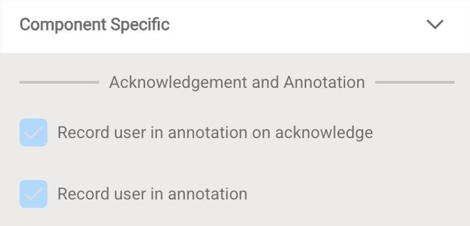
- Record user in annotation on acknowledge: When enabled (default), acknowledging an event automatically creates an annotation with the acknowledging user's name and timestamp, providing a complete audit trail.
- Record user in annotation: When enabled (default), the user's name is automatically added to any manually created annotation, ensuring accountability.
Displaying User Information
To view who acknowledged events and when, add the Acknowledged By and Acknowledged Date columns via the Extra Columns dropdown in the Transposed Table section below.
Value Table
Displays data with each row representing an attribute (showing Value and Timestamp). This mode is not recommended for the Timeframe Annotation Table component, as it's designed for single-asset attribute viewing rather than event management.
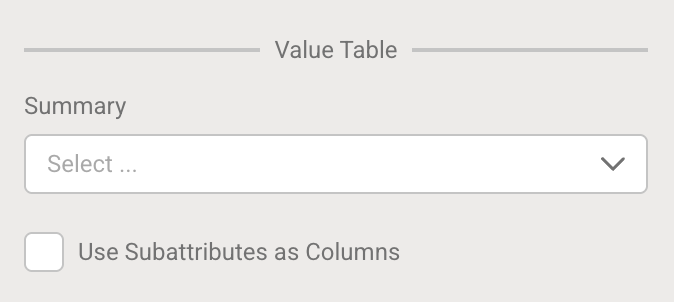
- Summary: Select descriptive statistics to display: Average, Min, Max, StdDev, PStdDev, Total, Count, Range
- Use Subattributes as Columns: When enabled, displays sub-attributes as separate columns
Historic Data Table
When enabled, creates a table with one row for each timestamp for the first mapped attribute, showing historical data points within event frame periods.
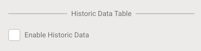
- Enable Historic Data: Check to display time-series data for the first attribute
Transposed Table
The recommended mode for this component. When enabled (default), each row represents one event frame, allowing acknowledgement, reason code selection, and annotations.
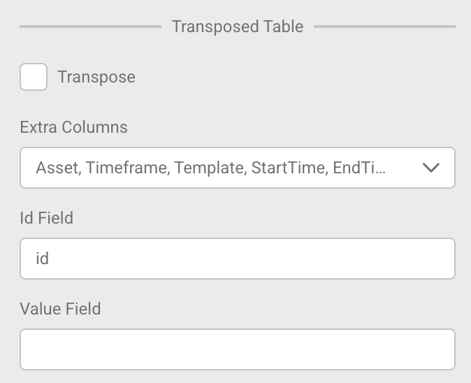
- Transpose: Check to enable transposed mode (enabled by default). Uncheck to switch to Value Table mode.
- Extra Columns: Select which columns to display in the table.
| Column | Description | Included by Default |
|---|---|---|
| Time Frame | Event frame name | ✓ |
| Start Time | When the event started | ✓ |
| End Time | When the event ended | ✓ |
| Duration | Length of the event | ✓ |
| Asset | Associated asset name | ✓ |
| Template | Event frame template | ✓ |
| Acknowledge | Checkbox to acknowledge event | ✓ |
| Annotate | Icon to add annotations | ✓ |
| Acknowledged By | Username of acknowledging user | Optional |
| Acknowledged Date | Timestamp of acknowledgement | Optional |
| Reason | Reason code dropdown | Optional* |
| Custom Attributes | Any other event frame attributes mapped during configuration | Optional |
Important
Reason column appears only if the Reason attribute was selected during Attribute Mapping.
- Id Field: Defines the unique identifier column used for table operations. Default:
id - Value Field: Specifies the field used for value display in certain table modes
Conditional Formatting
Conditional formatting allows you to apply visual styling to table rows based on column values, making it easy to highlight critical events or differentiate event types.
How to configure:
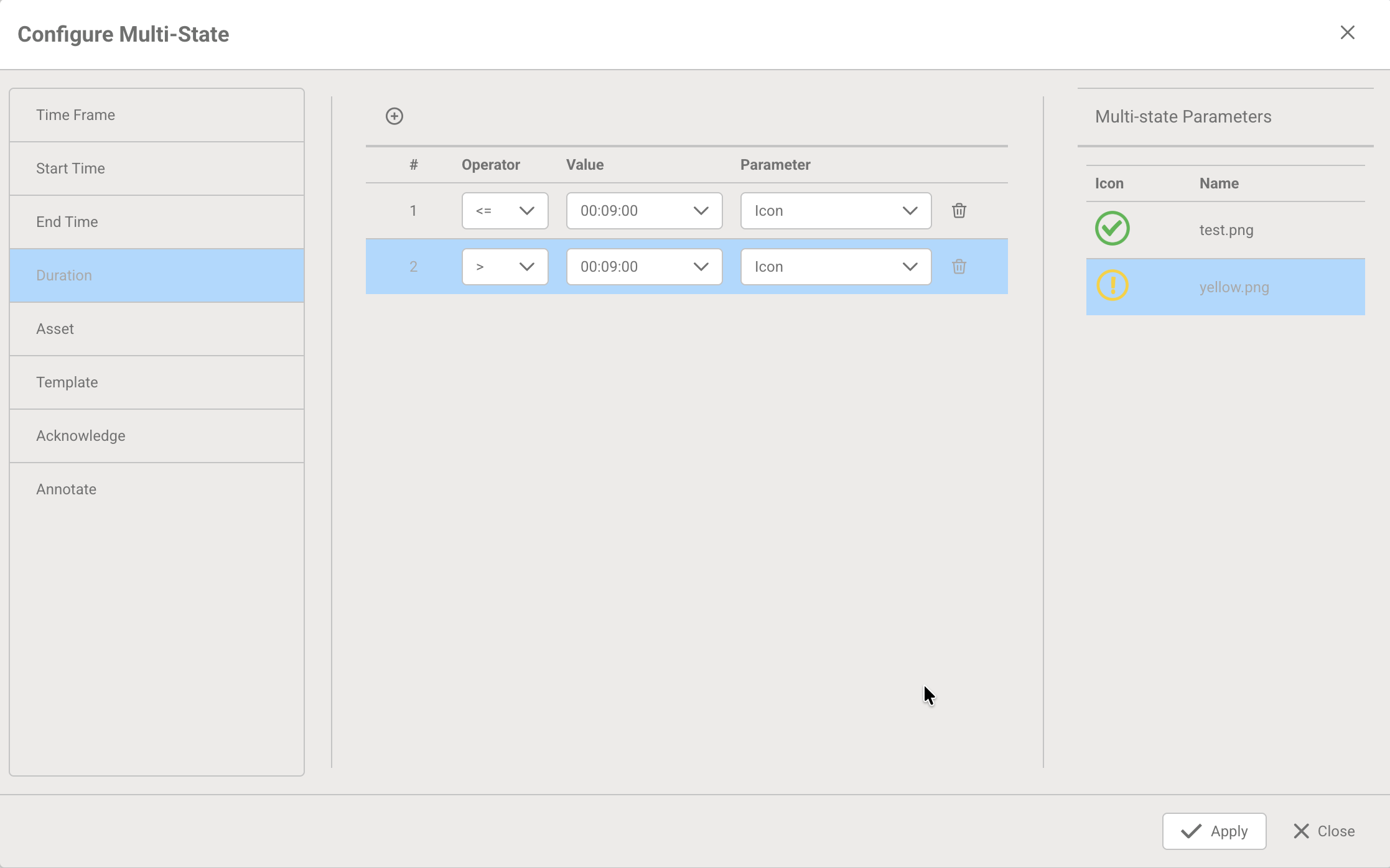
- Click Configure Multi-State to open the configuration dialog
- Select a column from the left panel to base your condition on (any column currently in your table, including event frame attributes like Duration, Reason, or any numeric values)
- Define the rule in the center panel:
- Choose an Operator (*, >=, <=, >, <, ==, !=)
- Enter a Value to compare against
- Select which Parameter to modify:
- BackgroundColor: Change the row background color
- TextColor: Change the text color
- Icon: Display an icon in the row
- Configure the parameter:
- For BackgroundColor or TextColor: Select a color from the dropdown
- For Icon: Click on the parameter dropdown in the right panel, then select from your uploaded icons (displayed with preview)
- Add multiple rules by clicking the + button to create threshold-based styling
- Click Apply to save your configuration
Rule Order Matters
Multi-state rules are processed in order from top to bottom. All matching conditions are evaluated, and later matching conditions overwrite earlier ones.
For threshold-based rules, always place the most general conditions first, then more specific conditions last so they take precedence.
Example - Correct order:
- * (all other values) → Green icon (default/fallback)
- Average Amps >= 5700 → Yellow icon (overwrites green for values ≥5700)
- Average Amps >= 5800 → Red icon (overwrites yellow for values ≥5800)
Example use cases:
- Show status icons: default green, yellow when Average Amps >= 5700, red when >= 5800
- Highlight unacknowledged events with a yellow background
- Color-code rows by reason code category
- Mark events exceeding duration thresholds with warning icons
Icons
Upload custom icons to use in conditional formatting rules.
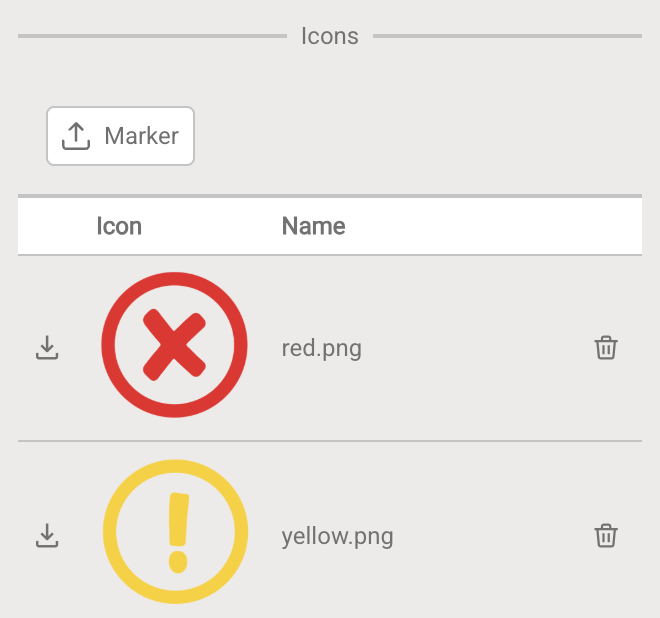
- Click the Marker button to upload icon images
- Once uploaded, icons become available in the Multi-State configuration
- Use icons to create visual indicators (e.g., red dot for critical, green dot for normal)
Navigation
Configure navigation actions that trigger when users click on table rows.
- Click Configure Navigation Link to open the configuration dialog
- Select navigation type:
- GoTo: Navigate to a specific view
- GoToId: Navigate based on view ID
- GoToUrl: Open a URL
- Available columns for navigation context match your configured table columns
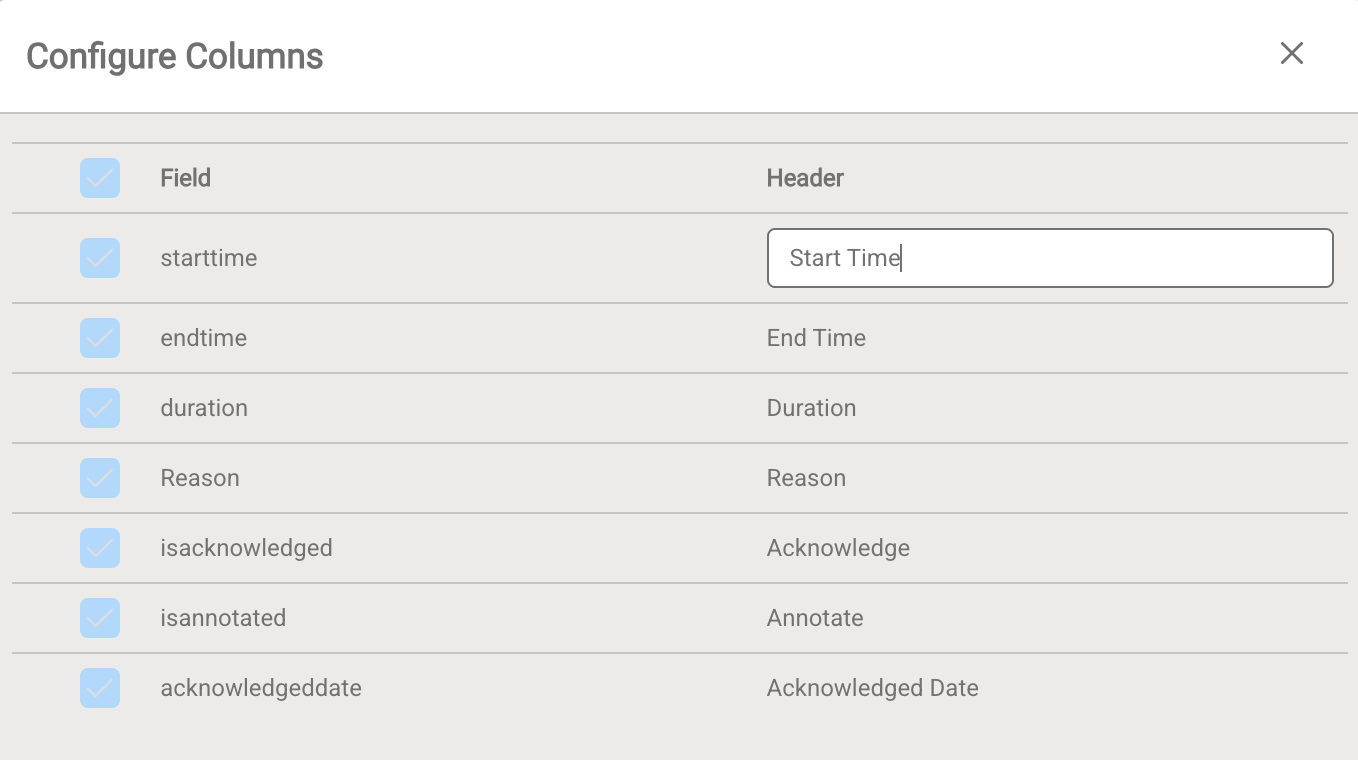
Columns
Customize column header names displayed in the table.
- Click Configure Columns to open the editor
- Double-click on any Header field to edit the display name
- Check/uncheck columns to show or hide them
- Click Apply to save changes
URL Query Parameter
Create bookmarkable links that automatically filter or select specific items in the table.
To create a link that automatically selects a specific event frame:
Assign a URL Query Parameter name to the component (e.g.,
selectedEvent)Integrate the parameter into your link URL using the event frame's identifier:
https://your-iota-url.com/display?selectedEvent=PumpHighAmps_2023-12-28When users open the link, the specified event frame is automatically selected
This is useful for:
- Creating direct links to specific events from notification emails
- Sharing links to particular downtime events with team members
- Building drill-down workflows from summary dashboards
Format
The Format section provides options for customizing displayed information.
Word Break
Control how text wraps within table cells.
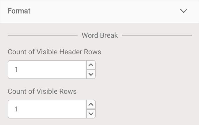
| Setting | Description | Default |
|---|---|---|
| Count of Visible Header Rows | Maximum number of text lines displayed in header cells | 1 |
| Count of Visible Rows | Maximum number of text lines displayed in body cells | 1 |
When text exceeds the cell width, it wraps to the next line at blank spaces. These settings determine how many lines are visible before text is truncated.
Table Controls
Enable or disable interactive table functionality.
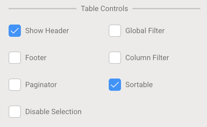
| Feature | When Enabled | Default |
|---|---|---|
| Show Header | Displays column headers at the top of the table | ✓ |
| Global Filter | Adds a search box to filter all table data plus a download button | |
| Footer | Shows a footer row with item count at the bottom | |
| Column Filter | Adds filter inputs at the top of each column | |
| Paginator | Enables page navigation for large datasets | |
| Sortable | Allows clicking column headers to sort (ascending/descending) | ✓ |
| Disable Selection | Prevents users from selecting rows |
Column Configuration
Column Visibility:
Choose which columns appear in the table. These settings complement the timeframe-specific columns (Acknowledge, Annotate, Reason) configured in the Component Specific section.
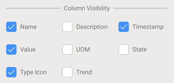
| Column | Description | Default |
|---|---|---|
| Name | Item name | ✓ |
| Description | Item description | |
| Timestamp | Time information | ✓ |
| Value | Data values | ✓ |
| UOM | Unit of measure | |
| State | Item state (historic tables only) | |
| Type Icon | Tag/Asset/Timeframe symbol | ✓ |
| Trend | Trend of historical data in cell |
Column Format:
Control what text is displayed for items in the table.
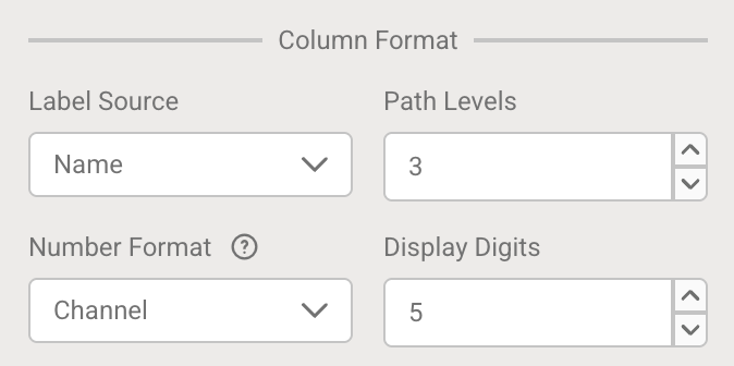
| Setting | Description | Options |
|---|---|---|
| Label Source | Determines the source for displayed labels | Name, ChannelLabel, Path, AssetPath, DataReference, Description |
| Path Levels | Number of hierarchy levels to display (when using Path or AssetPath) | 1-10 (default: 1) |
Path Levels Example:
For the hierarchy Company\Houston Site\Production Area\Pump 101:
- Level 1:
Pump 101 - Level 2:
Production Area\Pump 101 - Level 3:
Houston Site\Production Area\Pump 101
Number Formatting
Configure how numeric values are displayed in the table.
| Setting | Description | Default |
|---|---|---|
| Number Format | Format pattern for numeric values | Channel |
| Display Digits | Decimal places when using DisplayDigits format | 5 |
Available Number Formats:
| Format | Description | Example Output |
|---|---|---|
General | Standard numeric display | 2376.280 |
0 | Integer (no decimals) | 2376 |
0.0 | One decimal place | 2376.3 |
0.00 | Two decimal places | 2376.28 |
0.000 | Three decimal places | 2376.280 |
#,##0 | Thousands separator, no decimals | 2,376 |
#,##0.0 | Thousands separator + one decimal | 2,376.3 |
#,##0.00 | Thousands separator + two decimals | 2,376.28 |
#,##0.000 | Thousands separator + three decimals | 2,376.280 |
(#,##0) | Negative numbers in parentheses | (2,376) |
(#,##0.00) | Negative in parentheses + two decimals | (2,376.28) |
+#,##0;-#,##0;0 | Explicit positive/negative/zero format | +2,376 or -2,376 or 0 |
0% | Percentage, no decimals | 237628% |
00.0% | Percentage, one decimal | 237628.0% |
Scientific | Scientific notation | 2.38E+3 |
Channel | Uses channel's database configuration | 2376.28* |
System | Uses system-level formatting | 2376.28** |
DisplayDigits | Uses Display Digits setting | 2376.28000 |
*as configured in the database
**as configured in the system
Text Alignment
| Cell Type | Options | Description |
|---|---|---|
| Header Cells | Left, Center, Right | Alignment for column headers |
| Body Cells | Left, Center, Right | Alignment for data in table cells |
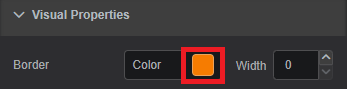
Visual Properties
The Visual Properties section provides options for customizing the component's appearance.
Border Color: Defines the component's border colorBorder Width: Controls the width of border frame. Default: 0 - invisible borderBorder Radius: Defines the curvature of the component's cornersBackground Color: Defines the component's background colorHeader Row Fill: Defines the color for the header rowHeader Row Text: Defines the color for the text in the header rowBody Row Fill: Defines the color for all other table rowsBody Row Text: Defines the color for the text in all other table rows
To pick color of your interest
To change color for specific visual property, click on the color box next to property description. The color picker dialog will be displayed.
Visual Properties: Color Picker Dialog Pick the color of interest. The video below shows how to choose a solid, gradient or theme color.
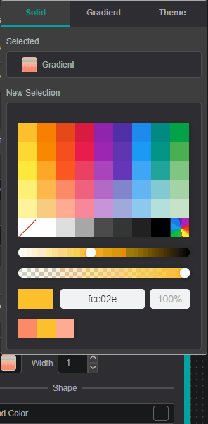
Color Picker Dialog: Workspace You can add
Gradient Stopsby double clicking and to remove - by pulling it up.To close the color-picker dialog - click on the property color box (Step 1).
Closing color-picker dialog
Clicking on the workspace area instead of Settings Tab area -
component settings will disappear since component focus will be lost.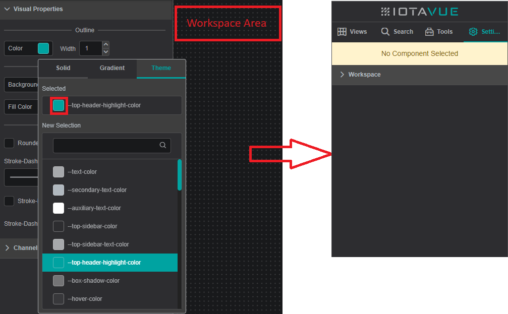
Color Picker Dialog: Workspace
Tooltip
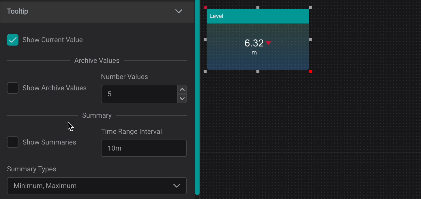
The Tooltip Setting provides data reference for PI AF attributes and descriptive statistics when user interacts with a component by hovering over it.
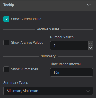
Show Current Value: Shows Current ValueShow Archive Values: Shows Archive Values, the number can be set inNumber ValuesShow Summaries: Shows Summaries for set Time Range Interval (can be set in seconds (s), minutes (m), hours (h), days (d), weeks (w), months (mo), years (y))
Summary Types:
Average: the average value in the set periodMinimum: the minimum value in the set periodMaximum: the maximum value in the set periodPercentGood: the percent good value in the set periodStdDeviation: The standard deviation of the value in the set periodPStdDeviation: The percent standard deviation of the value in the set periodTotal: The sum of the values in the set periodCount: The number of data points in the set periodRange: The difference between the largest and smallest value in the set period
Font
The Font section provides options for customizing the table font properties.
Font Properties
Font properties available for edit:
Font Family: Allows to select different font family. Default: ArialFont Size: Controls the font size. Default: 12Italic: Sets font to italicBold: Sets font to boldUnderline: Sets font to underline
Using the Component
Acknowledging Events
To acknowledge an event, simply click the checkbox in the Acknowledge column for the corresponding event frame.
When Record user in annotation on acknowledge is enabled, an annotation will automatically be created with the acknowledging user's information.
Note
Once an event frame is acknowledged, it cannot be "unacknowledged" through the IOTA interface or PI Vision. This design ensures data integrity and maintains a reliable audit trail.
Adding Reason Codes
If reason codes have been configured and trained:
- Locate the event frame you want to categorize
- Click the
Reasondropdown in the corresponding row - Select the appropriate reason code from the list
- The reason is automatically saved to the event frame
Note
Reason codes must be configured in the PI AF event frame template and selected during the Attribute Training process to appear in the table.
Creating Annotations
To add annotations to an event frame:
- Click the annotation icon (pencil/edit icon) in the
Annotatecolumn for the desired event frame - The Annotations dialog opens, displaying existing annotations with columns:
- Date: When the annotation was created
- Annotation: The annotation text
- Created By: The user who created the annotation
- To add a new annotation:
- Type your annotation text in the "New Annotation" field at the bottom
- Click Add annotation to add it to the pending annotations list
- Repeat as needed for multiple annotations
- Click Record annotations to save all pending annotations to the event frame
- Click Cancel to discard unsent annotations and close the dialog
Additional Features
The Timeframe Annotation Table component includes additional functionality for data management:
- Filter: Use the search bar at the top to quickly filter events based on any column value
- Download: Export the displayed data as a CSV file for offline analysis or reporting
- Multi-select: Hold down
Ctrl(Windows) /Cmd(macOS) while clicking to select multiple event frames
Best Practices
- Reason Code Structure: Organize reason codes hierarchically using the pipe delimiter (e.g.,
Mechanical|Worn Bearing,Operations|Did Not Follow Procedure) for better categorization and filtering.
Hierarchical enumeration sets are supported in PI AF 2017 R2 and later. - Annotation Detail: Encourage operators to provide specific, actionable information in annotations to support root cause analysis and continuous improvement efforts
- Audit Trail: Enable both user recording options to maintain a complete audit trail of all event management activities
- Attribute Mapping: When dropping event frames for the first time, carefully select which attributes to display as table columns for optimal operator workflow. Remember to select the
Reasonattribute if you want to enable reason code functionality. - Template Consistency: Use event frame templates consistently across your PI AF hierarchy to standardize event data capture and ensure all required attributes (including reason codes) are properly configured
Troubleshooting
Unable to Acknowledge Event Frames
If acknowledgement checkboxes appear but cannot be checked:
- Verify Template Configuration: Ensure the event frame template has the "Can Be Acknowledged" option enabled in PI System Explorer
- Check Permissions: Confirm the IOTA service account has
Annotatepermissions on the AF database and relevant elements - Database Connection: Ensure IOTA has proper connectivity to the PI AF Server
Reason Codes Not Appearing
If reason code dropdowns are missing or empty:
- Attribute Mapping: Verify the
Reasonattribute was selected during the Attribute Mapping process when dropping event frames onto the component.
If it wasn't selected, you'll need to reconfigure the component by dropping the timeframe search again. - Enumeration Set Configuration: Confirm the event frame template has a properly configured enumeration set assigned to the Reason attribute
Annotations Not Saving
If annotations fail to write back to PI AF:
- Security Permissions: Verify the service account has
Annotatepermissions - Network Connectivity: Ensure IOTA can communicate with the PI AF Server
- AF Server Version: Confirm you're using PI AF 2016 or later, which introduced the acknowledgement and enhanced annotation features