
InputTable
The InputTable is an editable table for manual data entry and script-populated data. Unlike the read-only Table, its cells accept typed input, dropdowns, tag searches, formulas, and buttons, and viewers can add and delete rows. Use it for lab-entry forms, write-back workflows, and standalone tables you fill from a script.
Experimental component
InputTable is currently experimental: its settings and behavior may change.
Quick Start
Drag the InputTable onto the canvas. Open Settings → Component Specific → Configure Columns to define the columns (field, header, type, width), turn on Show Toolbar to let viewers add and remove rows, then type values into the cells. To populate it from a script, use setValue / setColumns; see Global Scripts → Dynamic Table Columns.
Generic Settings
Each IOTA component shares a set of generic settings. Expand each section below:
Workspace
These settings are applicable to the whole view.
Grid Properties
The grid is provided for convenience when developing dashboards as visual guides and snapping capability.

By default the work area grid is enabled and can be customized or even disabled in this menu.
| Property Name | Description |
|---|---|
| Grid Color | Color of the grid |
| Grid Size | Size of the grid step |
| Snap to Grid | Enable/Disable snapping to the grid |
| Show Grid Lines | Show the grid as lines |
| Show Grid Dots | Show the grid as dots |
Align Controls
The Align controls provides a means to align and distribute selected objects on the display.
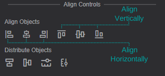
Align Objects
- You can align several components horizontally using the
Align-left,Align-centerorAlign-rightcontrols - You can align several components vertically using the
Align-top,Align-vertical-centerorAlign-bottomcontrols
Distribute Objects
- You can distribute several components on the vertical/horizontal axis by selecting them (select at least 3 components) and pressing
Align-vertical/Align-horizontal - You can make all the selected components the same width/height by selecting them and pressing
Adjust Width/Adjust Height
Tips
Hold the Ctrl button to select several components. The oldest component is used as a reference.
Anchor Points Options
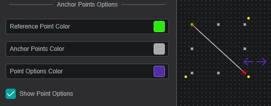
The anchor points are eight squares around an object that allow you to resize the object. The anchor point options allow you to define the appearance of the anchor points.
| Property Name | Description |
|---|---|
| Reference Point Color | Sets the color of the reference point (see Rotation and Position for more details) |
| Anchor Points Color | Sets the color of the rest of the seven anchor points |
| Point Options Color | Sets the color of the point options (only for Line and Bezier Curve) |
| Show Point Options | Show/Hide the point options |
Locked View Options
These options define the appearance of the component border in the locked view for the selected component.

| Property Name | Description |
|---|---|
| Active Border Fill | Sets the fill color of the border |
| Active Border Width | Sets the width of the border |
Variable

Every component has a unique variable name. This variable name can be used to reference the component in multi-state configurations and other scripts.
On creation, every component is given a default name. This can be overwritten to be more user-friendly. To do so simply overwrite the value in the variable input field.
Arrange / Remove
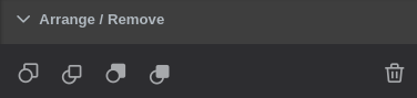
- Send Backward - move object one layer down
- Bring Forward - move object one layer up
- Send to Back - place object under all layers
- Bring to Front - place object above all layers
To send/bring objects to the front/back use the first four buttons. - Any set of components can be deleted by either using the
 button or
 delete/delkeyboard keys.
Rotation and Position
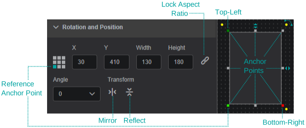
Reference Anchor Point- allows you to select one of the anchor points as a reference so that you can set anAngle(clockwise) of incline relative to this point.
By default the reference anchor point is the top left corner. You can also rotate the component by dragging one of the yellow corner points.- You can set the position of the component by setting the
XandYcoordinates relative to theReference Anchor Pointand the top-left corner of the work area. - You can drag any of the anchor points to change the width and height of the component, or you can set it manually by editing the
WidthandHeightboxes. - Set
Lock Aspect Ratioso that while changing width and height, the component width to height ratio stays the same Transformallows you to view the component as a mirror or a reflection of itself
Actions
Actions or multi-states are programmable conditional states handled by user-generated code.

Note
Actions that have script handlers are marked with a circle

The currently supported actions are described in the table below:
| Action | Trigger |
|---|---|
| OnCreate | When the component is created |
| OnFocus | When the component is selected |
| onClick | When the component is clicked or the selection is changed |
| onData | Each time the data changes for assigned channels |
| onTick | 20 times per second |
| onDblClick | On mouse double click |
| onHover | When the mouse is over the component (and not when the mouse is not) |
Further Reading
For helping you in writing your own actions, consider exploring the available Actions Deep Dive, as well as the Quick Start manual.
Also, multiple articles are available in IOTA's Knowledge Base.
Channels
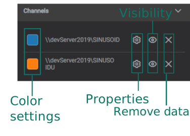
The Channels section lists data that is assigned/mapped onto the component.
In this menu, you can change the data value color, adjust the display properties and un-assign or remove the data from the component.
Properties
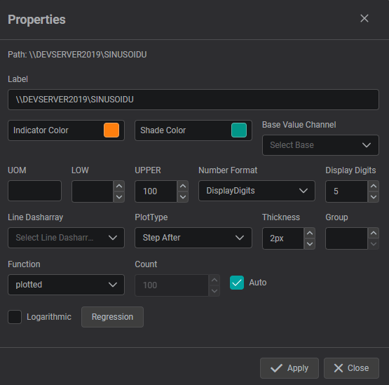
The properties menu for Channels allows you:
- to modify the Label of the DataSource
- to set UOM, lower and upper values
- to choose number format and displayed digits
- to adjust the line formatting for trend line components
- to configure the additional regression lines that can be plotted for supported components
InputTable Settings
Format
Show Toolbar: show the add-row / delete-row buttons.Show Header,Show Footer(the footer displays error text),Grid Lines.
Component Specific
Selection Mode: None, Single, or Multiple.- Configure Columns button: opens the columns dialog (below).
Configure Columns
Add, remove, and reorder columns; for each column set Field, Header, Type, and Width (%). Column types:
| Type | Cell behavior |
|---|---|
input | Free text / number entry |
timestamp | A date-time value (accepts relative-time input) |
dropdown | A list of options you define (value / label pairs) |
button | A clickable button (set its icon and label) |
tagsearch | Pulls a live snapshot value for a searched tag |
formula | A spreadsheet-style formula: can reference other components by their variable name |
url | A link (choose to show an icon and/or the value) |
A per-column options dialog sets each column's default value and the type-specific options.
Visual Properties & Font
Border, background, row / header colors, and separate font settings for the title, header, and labels.
Behavior
- Row data lives in the component's value and can be read by other components (via pins /
getOutput) or written from a script (setValue). - Formula cells use a spreadsheet engine and can reference another component's data by its variable name.
- For script-populated standalone tables, prefer InputTable over the read-only Table; see Global Scripts.
Related
- Table: the read-only data table
- TreeTable: an editable table with a hierarchy column
- Global Scripts: populate columns and rows from a script