
Organizing Complex Displays
Organizing Complex Displays
As displays grow in complexity, a single flat canvas can become difficult to navigate. IOTA Vue offers several patterns for organizing content into sections: keeping related components together while maintaining a shared data context.
Tab Component
The Tab component (in the UI section of the Components toolbox) divides a single display into named sections. Viewers click a tab to switch between sections without leaving the display: every component stays loaded and connected, sharing one asset context and one time range.
The example: one exchanger vs. the whole fleet
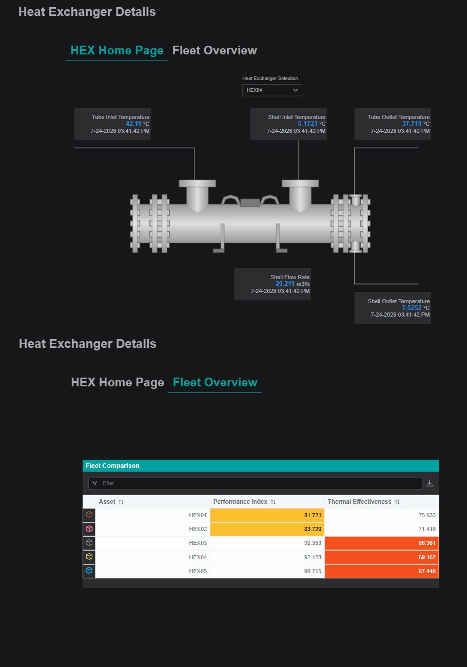
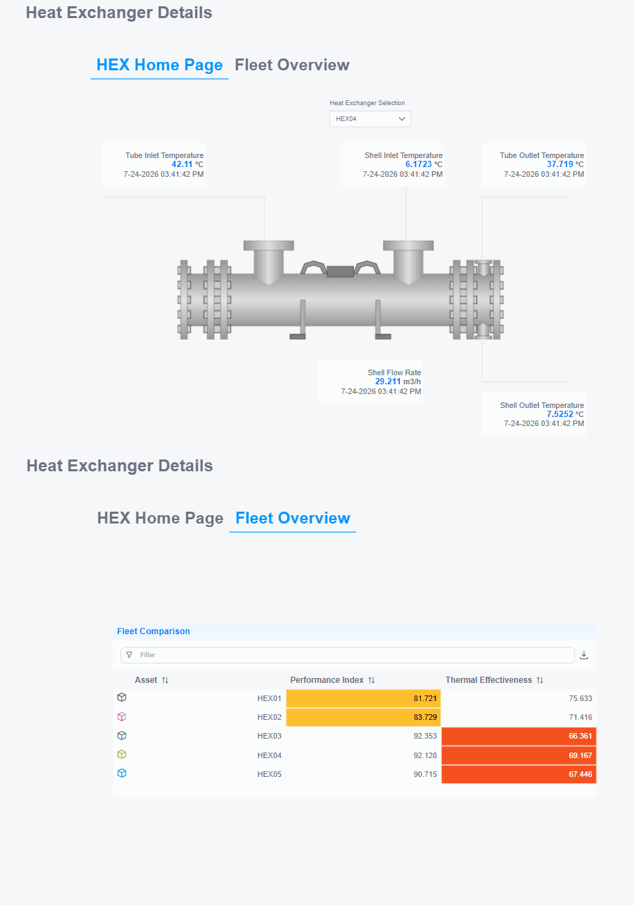
The Heat Exchanger Details – Asset based with Tab display packs two related views into one, as tabs:
- HEX Home Page: the single-exchanger drill-down: a Heat Exchanger Selection dropdown plus the schematic and live value tiles (tube and shell inlet/outlet temperatures, shell flow rate). Pick an exchanger to inspect it in detail.
- Fleet Overview: the fleet roll-up: the Fleet Comparison table listing every exchanger (HEX01–HEX05) with its Performance Index and Thermal Effectiveness side by side.
In view mode, a viewer clicks between the two tabs: the display stays put and switching is instant:
Why use tabs
These two views belong to the same fleet and the same time range, so tabs keep them together on one display instead of two separate ones a viewer has to navigate between. Switching is instant, the URL stays the same, and, because it's a single display instance, the GTC time range is shared across both tabs: adjust the range on the Fleet Overview, switch to the Home Page, and the detail reflects it immediately. Split into two displays, the viewer would re-sync the time range (and re-pick the asset) on every jump.
Reach for tabs when sections share context and switching should feel instant; reach for navigation when a section is really a separate display (a different asset, or too heavy to load alongside the rest).
Setting up tabs
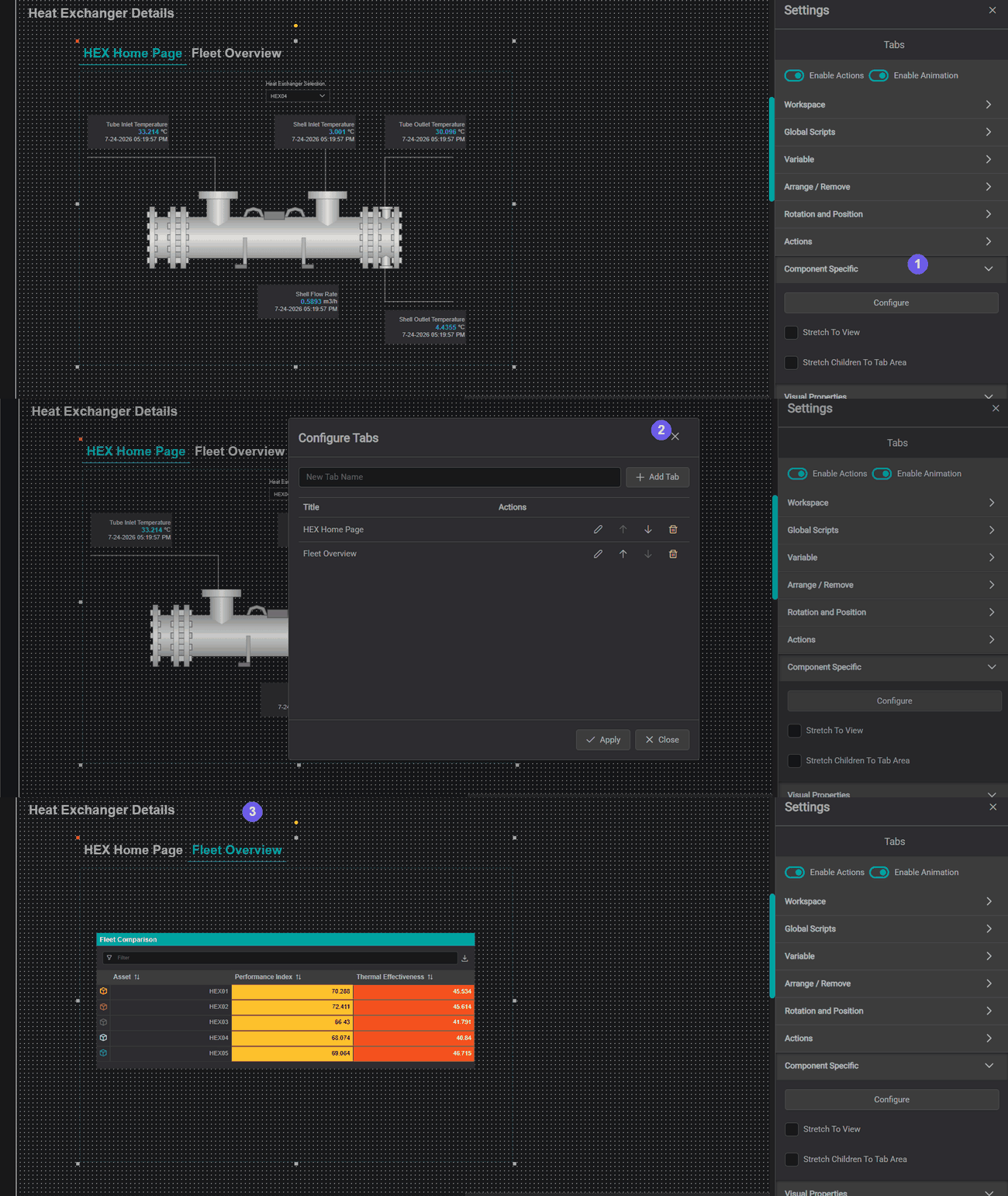
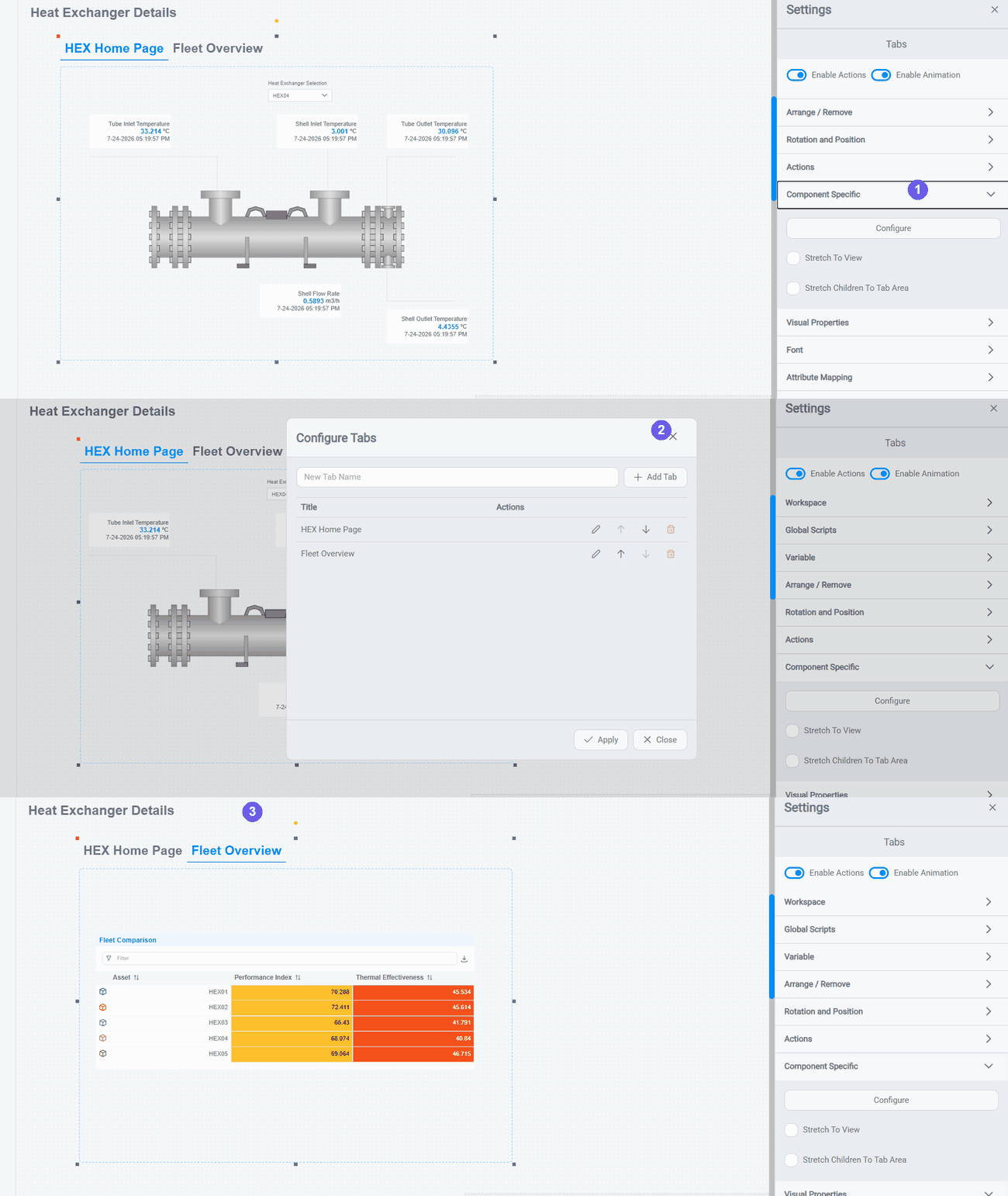
- Drag a Tab component (Components toolbox → UI) onto the canvas, then select it and open Settings → Component Specific → Configure to open the Configure Tabs dialog.
- In the dialog, type a name in New Tab Name and click Add Tab for each section: here, HEX Home Page and Fleet Overview. Rename (✎), reorder (↑ ↓), or delete (🗑) a tab as needed, then click Apply.
- Back on the canvas, click a tab to switch to it and place that section's components: the dropdown, schematic, and value tiles on HEX Home Page; the Fleet Comparison table on Fleet Overview. Components placed on a tab are only visible when that tab is active.
Fit content to the tab area
The Tab's Component Specific settings also include Stretch To View (sizes the tab area to the display) and Stretch Children To Tab Area (resizes the components inside to fill it). Like every component, the Tab also carries the shared generic settings: Workspace, Actions, Channels, and more.
Passing data between tabs
Because every tab lives on the same display, the GTC and Interactions work across all of them:
- The GTC is shared automatically: all time-aware components respond to time changes regardless of which tab is active.
- An Interaction can drive a component on another tab using the standard
onClick → SetChannelspattern, with no extra configuration. The target updates in the background even while its tab is hidden, so switching to it shows the current state immediately.
Tips
To keep a component on a hidden tab in sync with a selection on the active tab, wire an Interaction from the source to the target: the hidden tab updates behind the scenes and is already current when the viewer switches to it.
When to use tabs
| Use tabs when... | Consider navigation instead when... |
|---|---|
| Content belongs to the same asset and time context | Each section represents a separate asset or display |
| You want to keep the viewer on one URL | Deep-linking to specific sections is important |
| Switching sections must feel instant | Each section has too many components to load together |
Subviews: Embedding a Saved View Inside Another
The SubView component (in the Complex group) embeds an entire saved IOTA view inside a region of the current display. The outer display provides the layout and controls; the SubView renders the inner view's own components, live and interactive, in the area you give it.
Reach for a SubView for reusable display blocks: a standard equipment detail, a trend panel, or a shared KPI section you want to drop into many parent displays without rebuilding the layout each time. It is also how you surface an existing PI Vision screen inside a modern IOTA display (covered at the end of this section).
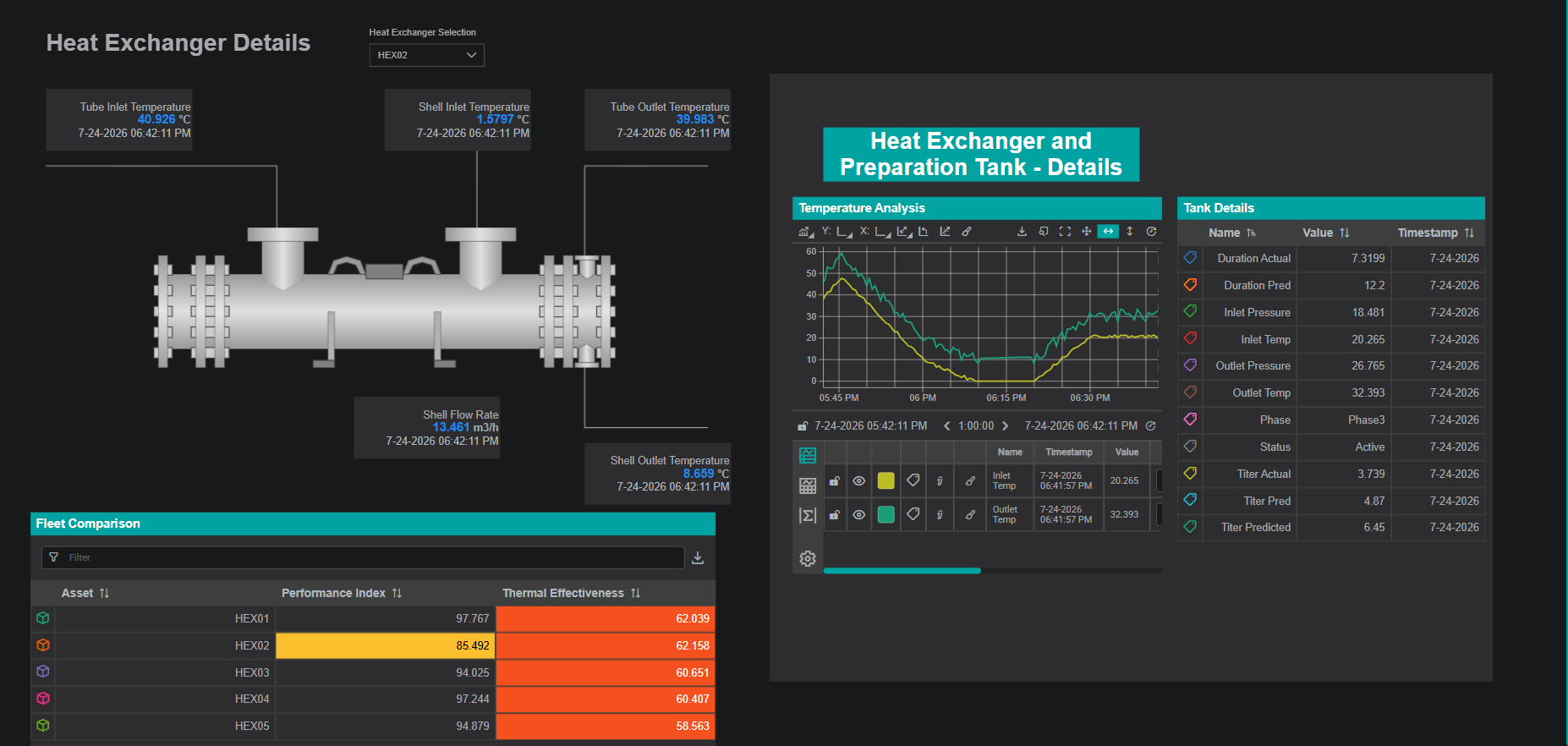
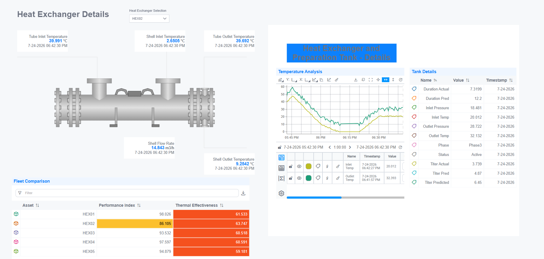
Setting up a SubView
First build, or identify, the inner view you want to embed. Then:
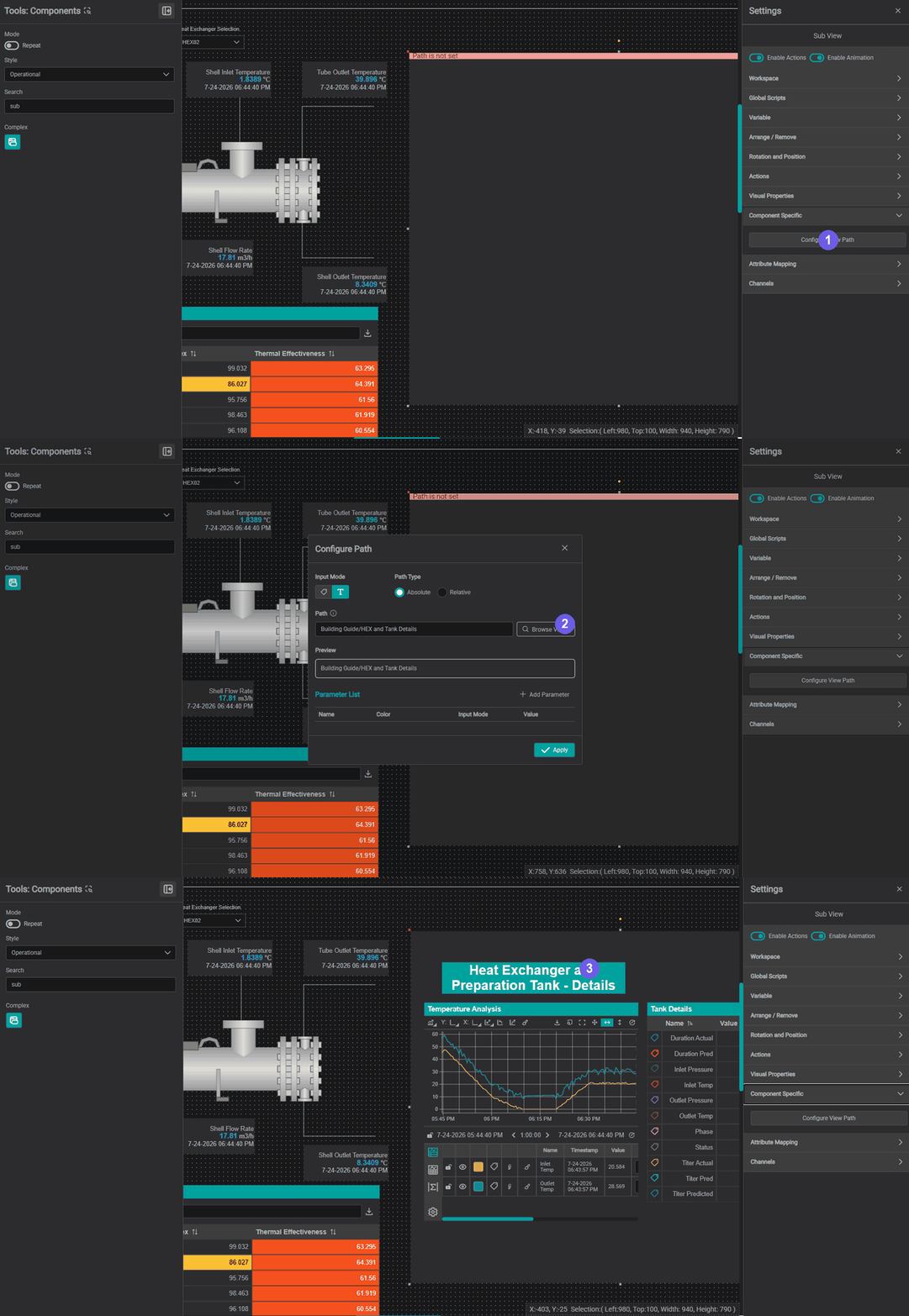
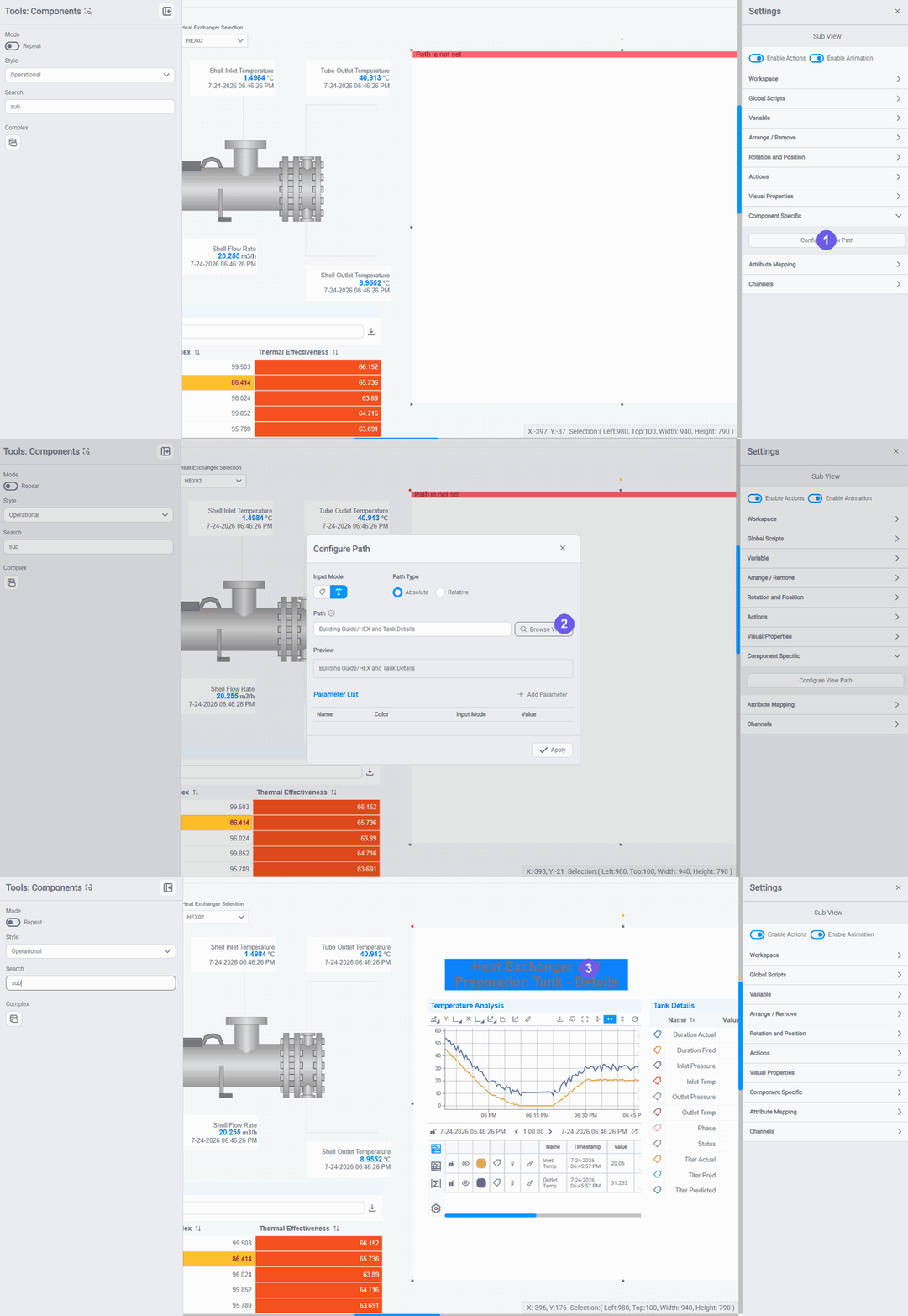
- Drag a SubView component (Components toolbox → Complex) onto the canvas, it shows "Path is not set", then open Settings → Component Specific → Configure View Path.
- In the Configure Path dialog, set the Input Mode and Path Type, type or Browse to the inner view's path, and click Apply (see Choosing the path below).
- The SubView loads and renders the inner view. Size it to match so nothing is clipped (next section).
Match the SubView size to the inner view
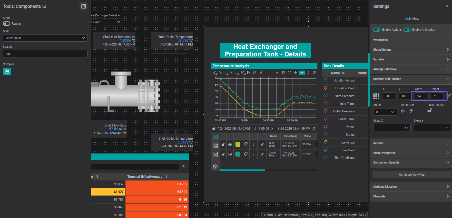
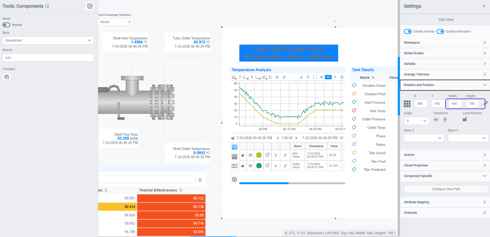
A SubView renders the inner view at its native (1:1) size and clips anything outside its bounds: it does not shrink the inner view to fit. If the SubView component is smaller than the inner view's workspace, the edges are cropped.
The two sizes live in different places:
- The SubView component's size: set on the display where you placed it, in the component's Settings → Rotation & Position (Width × Height).
- The inner view's size: set on the inner view itself, in Edit → Background (its workspace Width × Height).
Open the inner view's Edit → Background to read its dimensions, then set the SubView's Rotation & Position Width and Height to match. Match them and the whole inner view shows with nothing cut off.
The inner view stays interactive
Components inside a SubView are live, not a static picture. A viewer can work the embedded Line Chart exactly as on the display it came from (pan and zoom, change the scale, adjust trace formatting, drop cursors), and every component keeps updating with live data. (You can see the embedded chart's full toolbar in the example above.)
Choosing the path: absolute vs relative
Configure View Path decides how the SubView finds the inner view:
- Absolute: a fixed, full path to one specific view (for example
Building Guide/HEX Details). The SubView always embeds that exact view, no matter where the outer display lives. - Relative: a path resolved against the current view's location (a child or sibling of the outer view). The same SubView then resolves to a different inner view depending on where its parent sits in the hierarchy: which is what makes a block reusable across an asset tree.
To vary the embedded view per asset, bind an asset attribute instead of a fixed path: either Channel mode (an attribute whose value is a view path) or a {placeholder} token in a custom path bound to an attribute, and feed the SubView the asset with a SetChannels interaction. The embedded view is a function of the resolved path, so a new asset re-resolves the path and reloads. (The Configure Path dialog, with its Input Mode and Absolute / Relative options, is shown in the setup animation above.)
Showing a PI Vision display in a SubView
Because a SubView embeds any saved IOTA view, you can point it at a view that live-renders a PI Vision display: an IOTA view whose Reference tab renders a PI Vision screen (see Live Rendering). The SubView then shows that PI Vision display inside your IOTA layout, letting you bring existing PI Vision screens into a modern IOTA asset hierarchy without rebuilding them. The same rules apply: match the SubView to the rendered display's size so nothing is clipped, and the embedded screen stays interactive.
Choosing the Right Pattern
| Pattern | Best for | Shared context |
|---|---|---|
| Tabs | Grouping sections of one display by topic | Full: GTC, Interactions, and all components share one display instance |
| Subviews | Reusable display blocks embedded across multiple parent displays | Inner view loaded by path; asset/context fed in via a channel |
| Navigation | Moving between distinct displays | Explicit: context is passed at navigate time |
| Asset Groups | Replicating one layout per asset in a fleet | Full within each replicated layout |
For navigation between separate displays, see Navigation Between Displays.
For asset-based display replication, see Asset Groups.
What's Next
Once your display is organized into tabs and subviews, you can bring in content from outside IOTA: web apps, PI Vision renderings, and documents. Continue to Integrating with External Applications →.
Related
- Actions & Interactions: wire components so one drives another with SetChannels, SetTime, or Select
- Integrating with External Applications: use URL parameters to pass context into a display from Power BI or other tools
- Asset Groups: repeat one layout across a fleet of assets
- Navigation Between Displays: link displays and pass context across them