
Calculation Preview
Calculation Preview
The Calculation Preview runs the task's calculation without writing anything and
shows you what came out, as numbers, or as a chart.
The tab is labelled Calc Preview in the console, shortened so the tab strip stays
narrow. This guide spells it out.
It appears on any task that has a calculation, whatever that task then does with
the result: writing back to channels, writing a table, writing a JSON document. If
there is a calculation in the pipeline, this tab is there, directly after
Calculation.
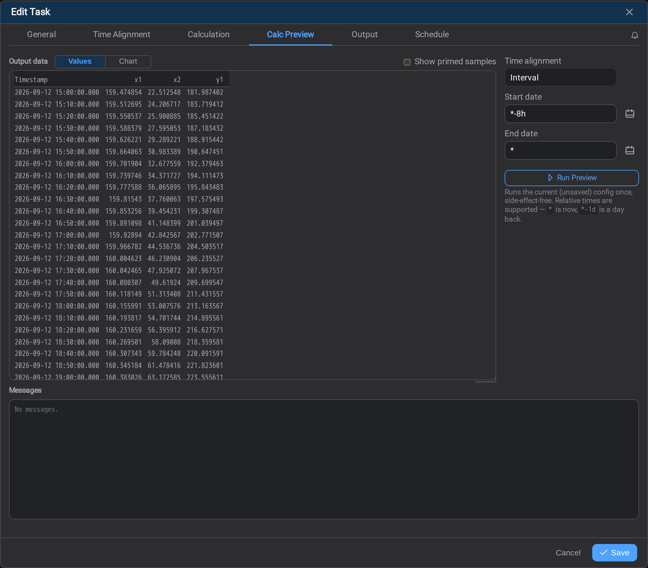
Use it every time before saving
A task that produces no rows and a task that produces wrong rows both look identical
from the Tasks list: successful. The preview is where the difference is visible, and
it costs nothing to look.
Not the same as the Preview tab
A task that writes a table or a JSON document also has a plain Preview tab, after
Mapping. They are two tabs answering two questions, and a task that both calculates
and maps carries both:
| Tab | Sits after | Answers |
|---|---|---|
| Calc Preview | Calculation | Are the computed values right? |
| Preview | Mapping | Do those values land in the shape I meant? |
A write-back task has only the first: there is no mapping to preview. A task with no
calculation has only the second. See Preview for that one; the rest
of this page is about the calculation.
What a preview run is
It runs the configuration in front of you, not the saved one. Edit the script,
change an offset, run the preview again: nothing has to be saved first, and nothing
is written to the destination either way. That is what makes this tab the whole
debugging loop for a task.
Set the window with Start date and End date. Relative times are supported:* is now, *-1d is a day back, so *-8h → * follows the clock instead of
pinning the preview to a date you will forget to move.
Time alignment is shown beside the window but is not editable here. A run always
uses the task's own mode, so what you see is what the schedule would produce: change
it on Time Alignment and run the preview again.
Values, or a chart
The Calculation Preview offers two readings of the same run.
| View | Shows |
|---|---|
| Values | Every event and its value, as text: the exact numbers, in order |
| Chart | The inputs and the outputs plotted on one time axis |
The chart is the faster way to catch the errors that matter. An output that is flat
while its inputs move, a result an order of magnitude off, a series that stops halfway
through the window: all of them are obvious in a picture and easy to miss in a column
of numbers. The Values view is where you go once the picture looks wrong and you need
the actual figures.
Show primed samples
Show primed samples adds the readings each input already held when the window
opened: the rows a start offset
went back and fetched.
They are drawn on a yellow ground in Values, and as a yellow band at the left edge of
the Chart. They are shown because they were read, and they are marked because they
were not written: output stamped before the window start is discarded.
Turn it on when a calculation looks like it started late. Usually it did not, and the
first output is simply the first point at which every input had a value.
A worked example: an hourly average
A channel is recorded every ten minutes and you want the hourly mean written back as a
new channel. This is the smallest useful dataframe calculation, and it exercises the
preview end to end.
1. Time Alignment: a ten-minute grid, with history
Mode Interval, step 10m, so the task reads the channel on a ten-minute grid.
Start offset 1h tells the run to read one hour before the window as context.
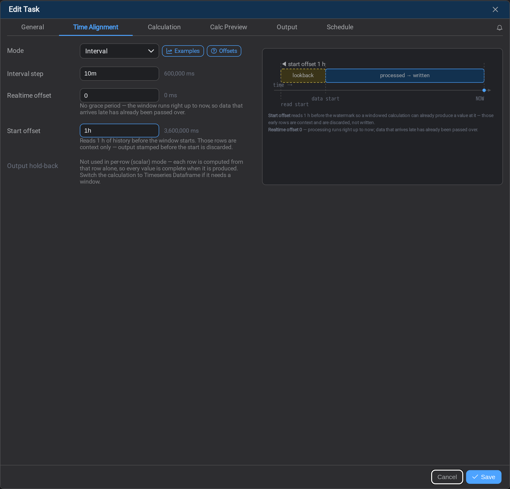
The diagram on the right redraws itself as you type: the dashed yellow block is the
lookback, the solid block is what gets processed and written.
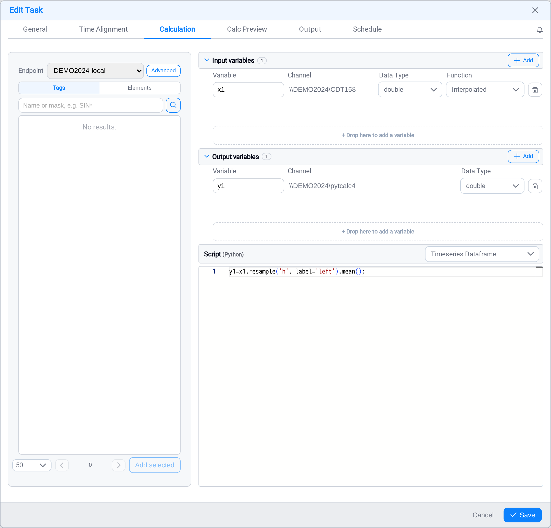
2. Calculation: one input, one output, one line
One input variable x1 bound to the source channel, read Interpolated so every
grid point has a value; one output variable y1 bound to the channel being written.
The script mode is Timeseries Dataframe: that is what makes x1 a
timestamp-indexed series rather than a single number, and resample needs a series.
y1 = x1.resample('h', label='left').mean();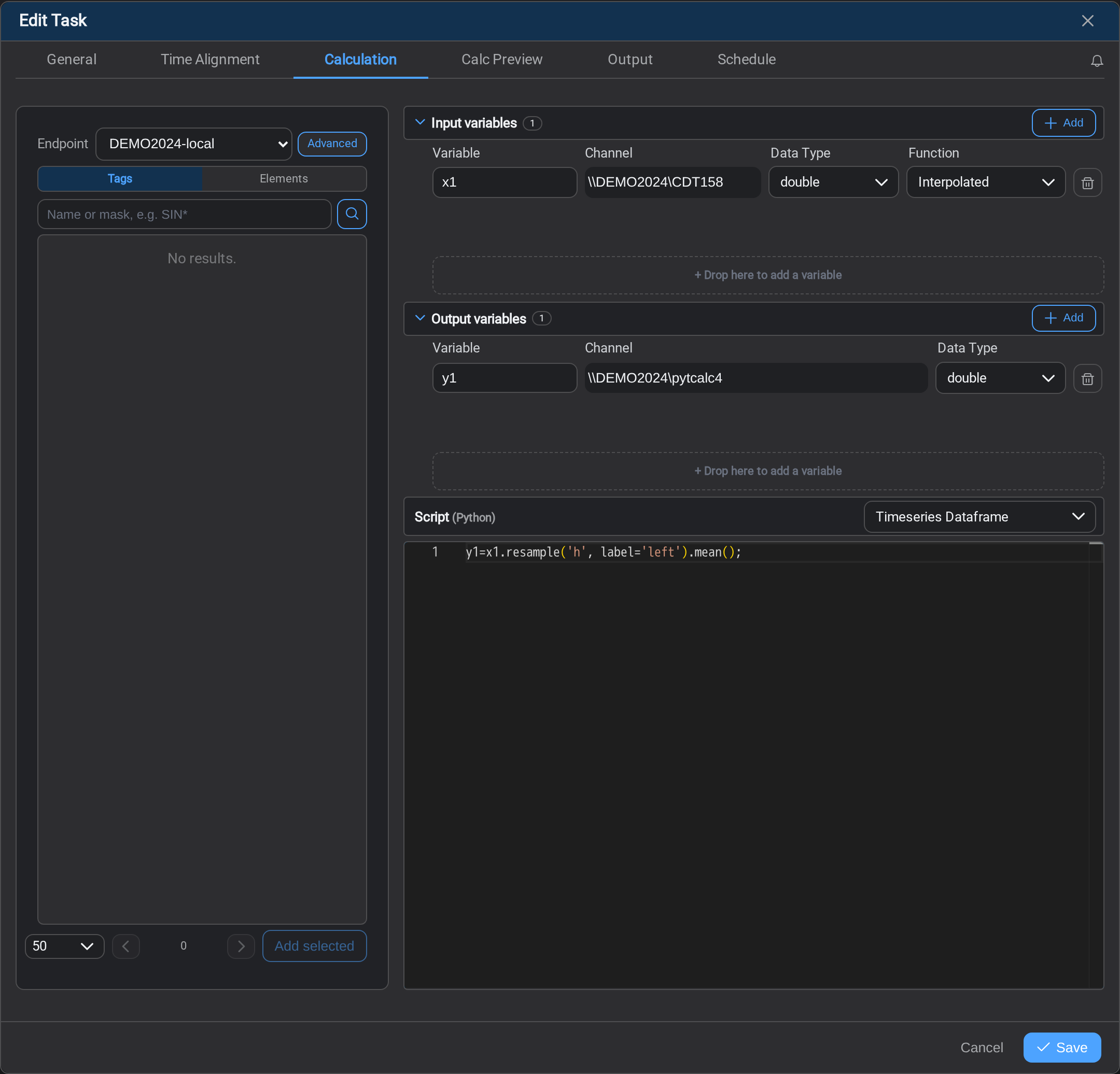
label='left' stamps each hourly average at the start of the hour it covers, so
the value at 00:00 describes 00:00–01:00.
3. Values: what was read, and what was written
Set the window to *-2d → *, turn Show primed samples on, and run it.
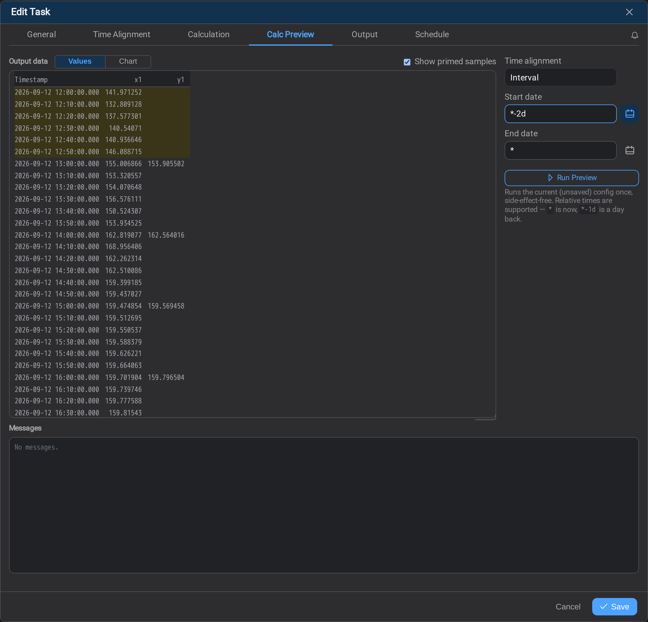
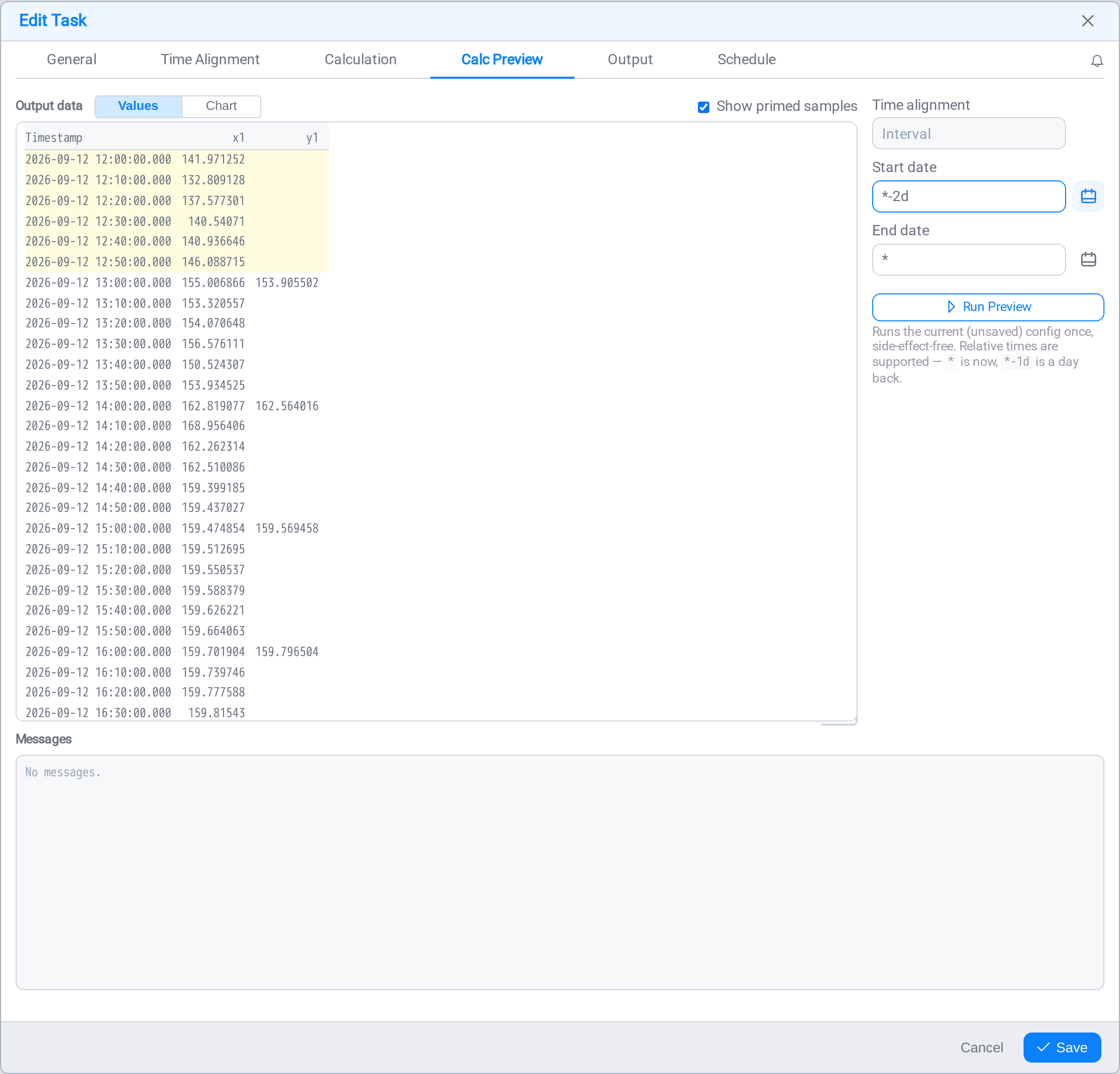
Three things are visible at once.
The six yellow rows are the lookback. 12:00 to 12:50 is the hour the start
offset went back and read. They carry an x1 and no y1: they are context, and
nothing stamped before the window start is written.
The output starts at 13:00, not at the window start. The window opens partway
through the 12:00 hour, so that hour's bucket (stamped 12:00, before the start), is
discarded as well. The first hour the task can actually write is the first one that
begins inside the window.
The arithmetic is checkable from the screenshot. y1 at 13:00 is 153.905502,
and the six x1 readings from 13:00 to 13:50 are 155.006866, 153.320557,154.070648, 156.576111, 150.524307 and 153.934525. Their mean is 153.9055023
: the hour stamped 13:00 is computed from the six samples inside it.
The primed hour did not feed that average
With label='left' a bucket looks forward from its timestamp, so no written average
here ever needed the hour before it. The start offset is what backward-looking
windows need: rolling, ewm, diff, and label='right' resamples.
A default left-labelled resample has the opposite problem and wants an
output hold-back
instead, so an hour that is still filling is not written from partial data.
This is exactly why the primed rows are worth turning on: they show what the run
read, which is the only way to see whether the history you are paying for is
reaching the calculation at all.
4. Chart: the same run as a picture
Switch to Chart and the shape of the result is immediate.
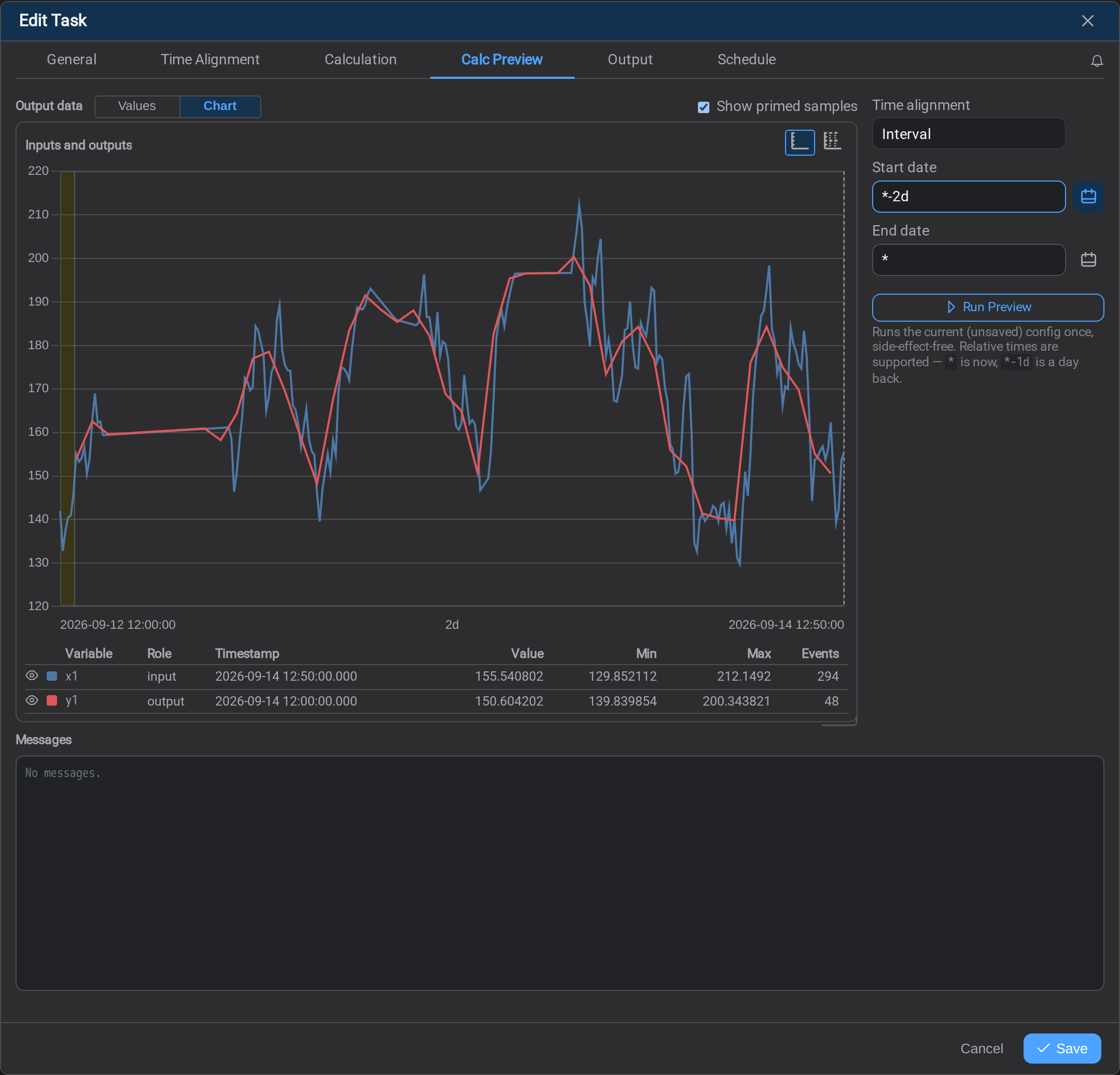
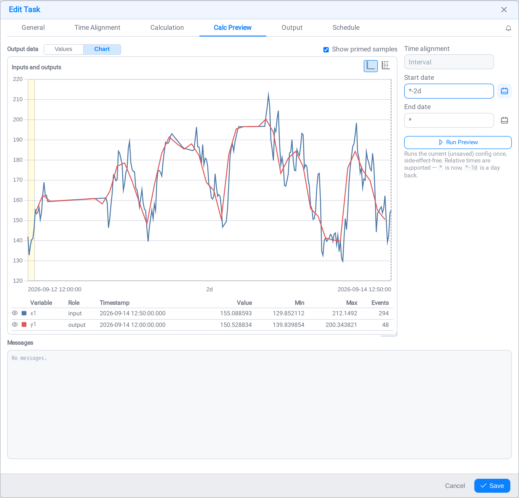
The input traces every ten-minute wobble; the output is the smooth hourly line through
it. The yellow band at the left edge is the primed hour again: the same rows that were
yellow in the Values view, in the same colour, so the two readings agree.
Underneath, each variable is listed with its Role, input or output, and the
count of Events it produced. That count is the quickest check that a window did
what you expected: across two days a ten-minute input gives 294 readings and an
hourly output gives 48. An output count that is not the input count divided by six
means the resample is not bucketing the way you think it is.
When it produces nothing
A preview that returns no rows says so above the grid rather than leaving you with an
empty table and no explanation. The note names what was missing: a channel with no
data in the window, a pattern that matched nothing. A blocking problem is marked
differently from a warning: one means "it cannot run", the other "it ran and there was
nothing there".
Per-cell problems in a mapping are reported the same way, in that
tab's own messages: a column that could not be resolved is named once, with the reason,
rather than silently writing the column type's default: which is how a broken column
comes to look like a grid full of plausible zeros.
Debugging with print()
A calculation's print() output lands in this tab, not in the logs. Together with
the fact that a preview runs unsaved configuration, that makes the loop tight: edit the
script, run the preview, read the prints, adjust, with no save and no schedule.
See Debugging with print() for what is worth
printing when a dataframe is not the shape you assumed.
What's Next
Once the preview shows the numbers you expected, decide where they go. Continue to
Task Output →.
Related
- Task Calculation: the script and the two variable modes
- Time Alignment: which rows the calculation runs against
- The offsets: which offset a windowed calculation actually needs
- Task Mapping: the columns or document a task writes
- Logs: per-asset warnings a successful run can hide